Photography

Friday Five: Architecture Up-close by Alex Upton

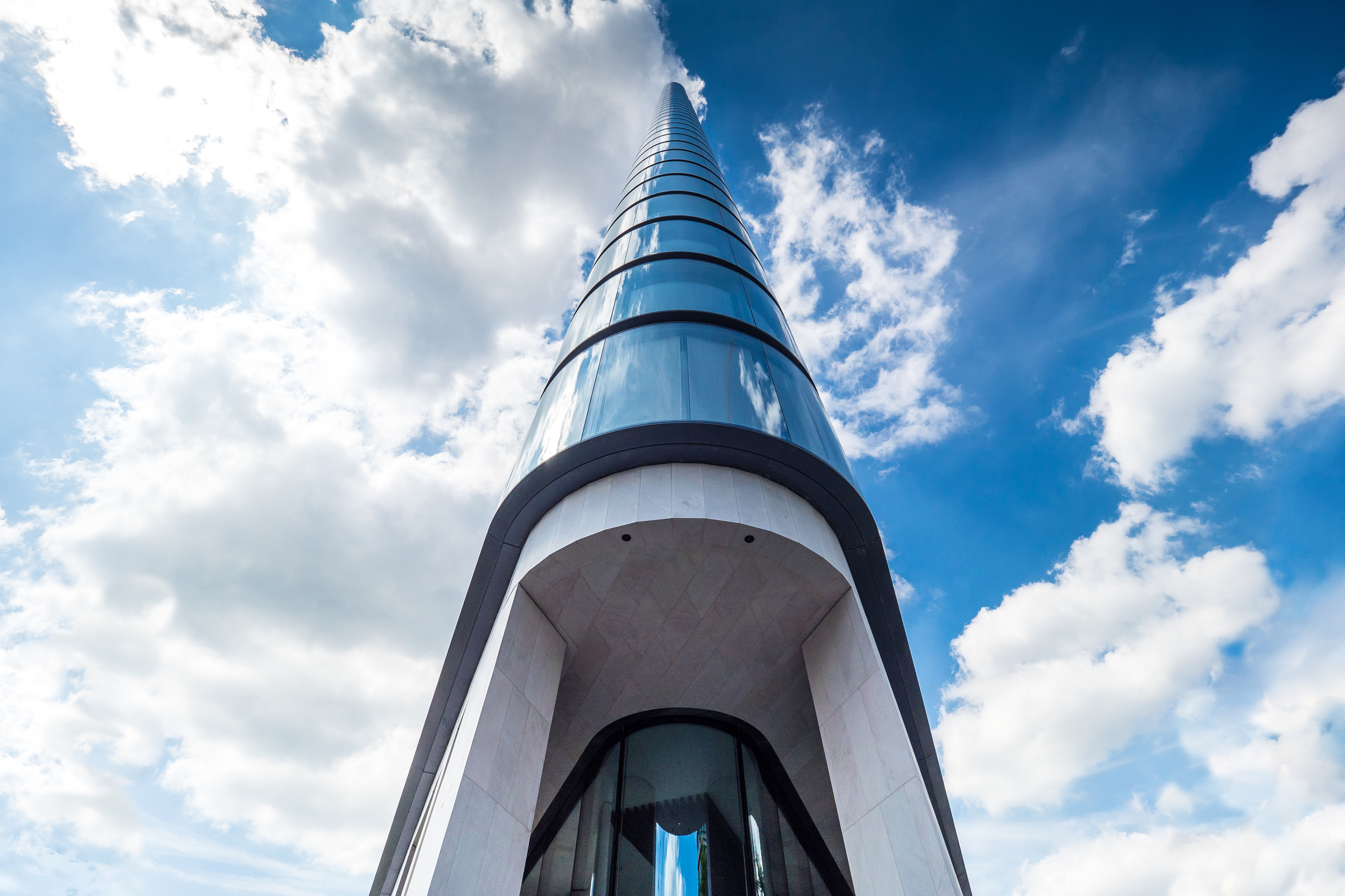
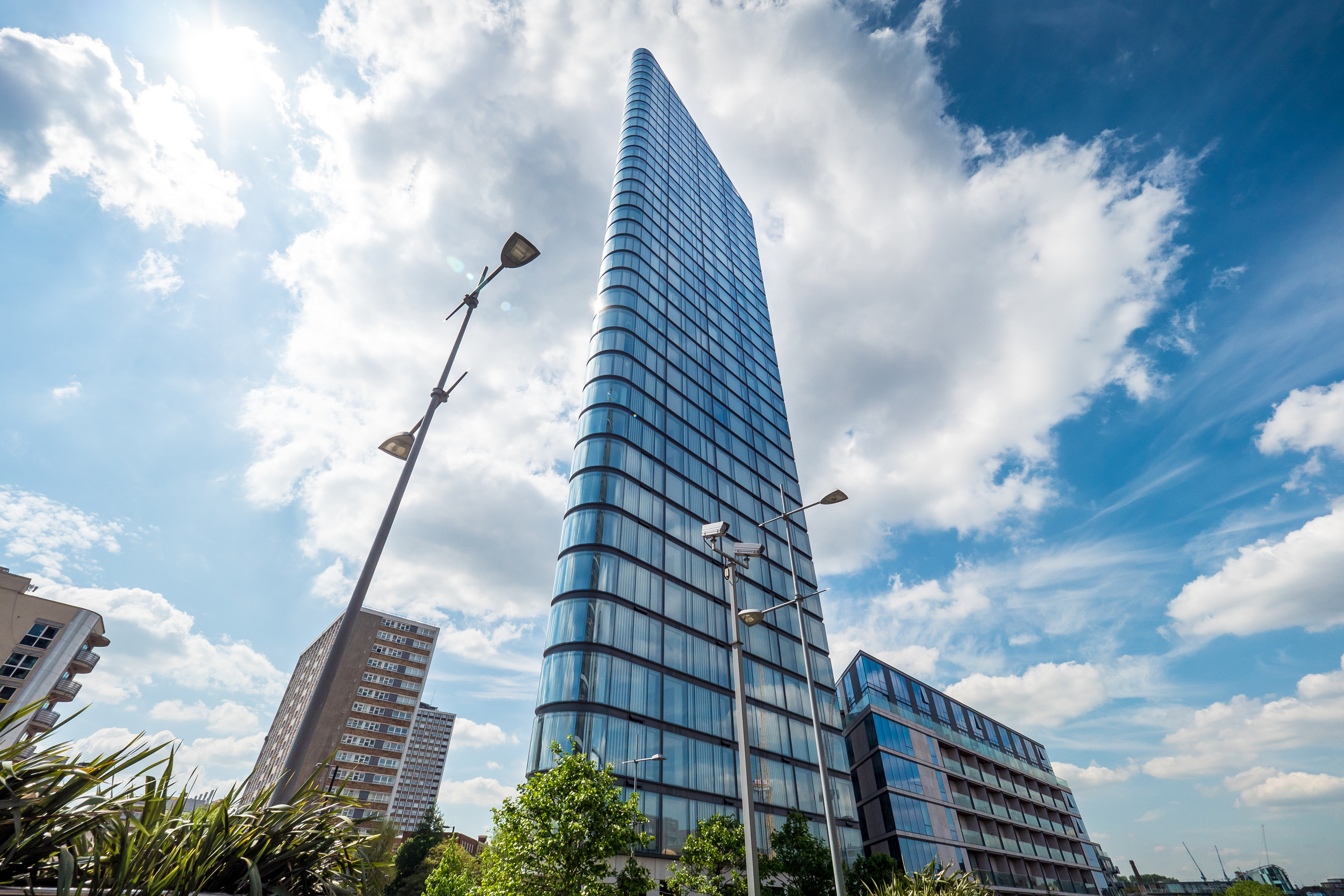
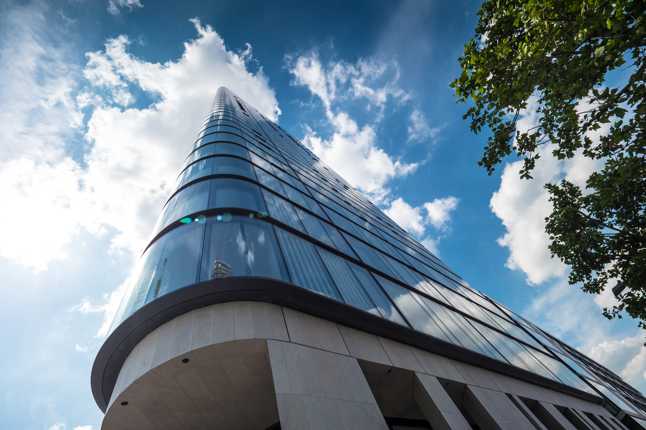
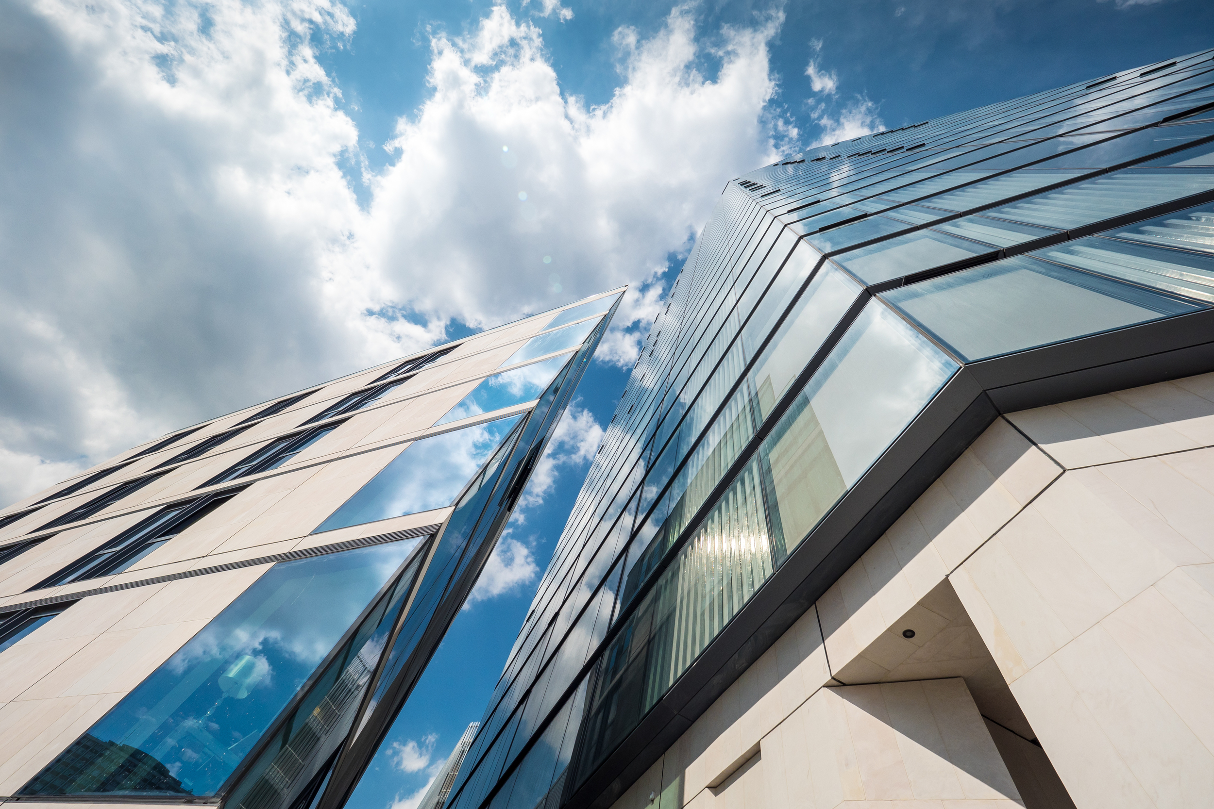
Ok its no longer Friday! but lets not allow dates to get in the way of a catchy name. Being an architectural photographer living in London there's never a short supply of wonderful buildings to shoot and such abundance has led to several hard-drives worth of images. Rather than adding them directly to my portfolio i'll begin to share some exclusively here adapting a theme where possible. So here's the first five with this weeks theme focusing on up-close geometries in architecture.

5 Broadgate -  Copyright © Alex Upton

5 Broadgate -  Copyright © Alex Upton

5 Broadgate

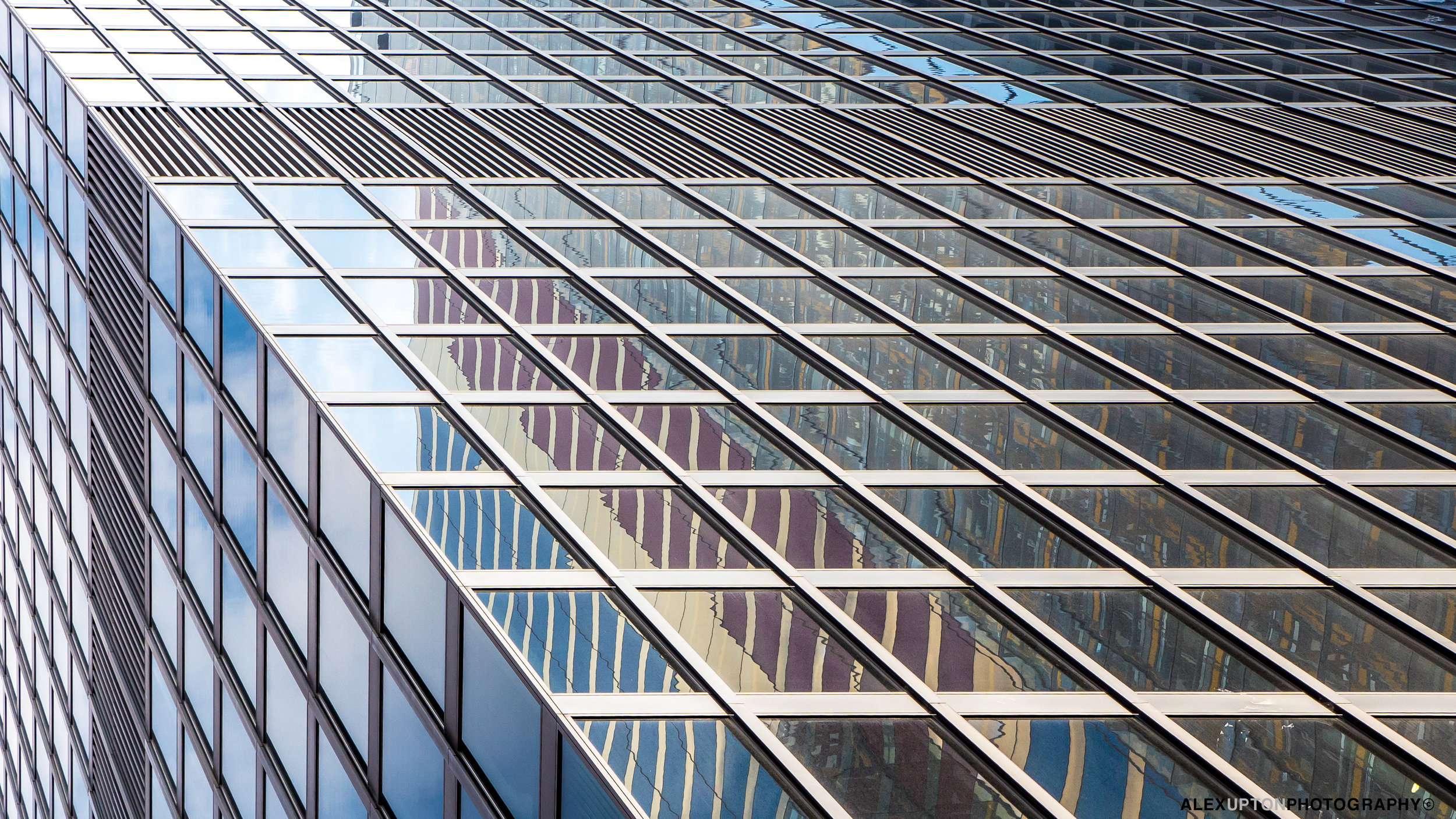
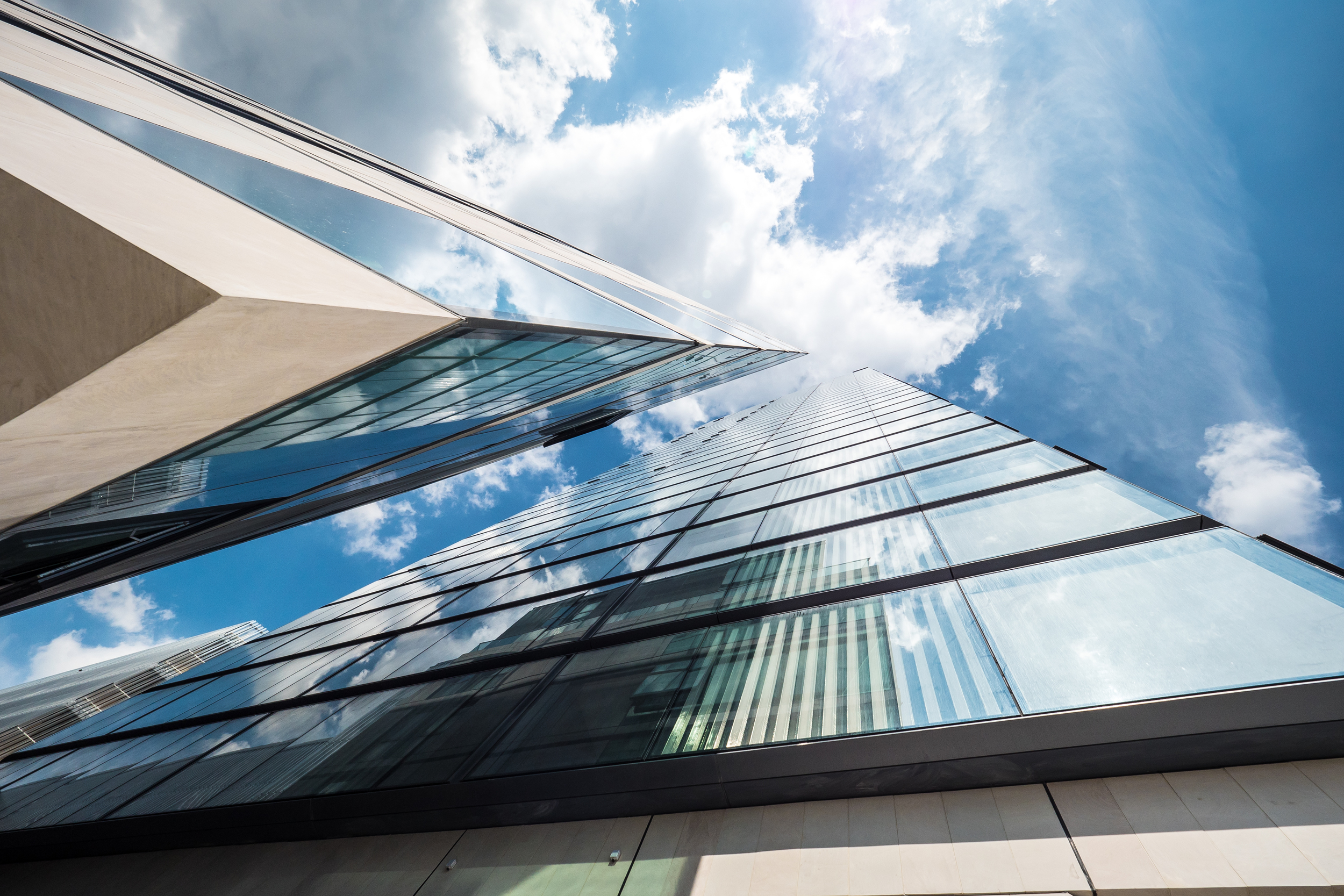
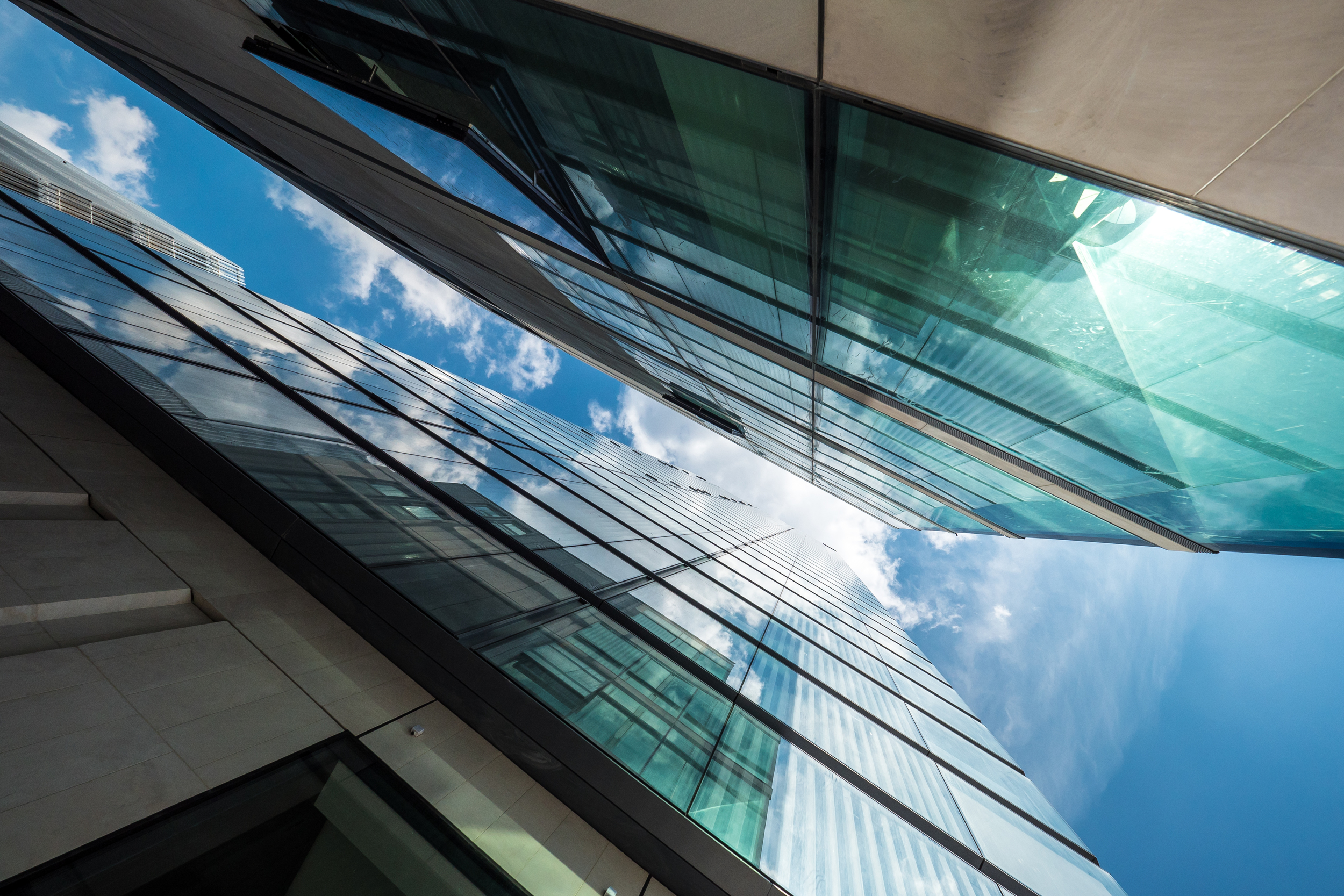
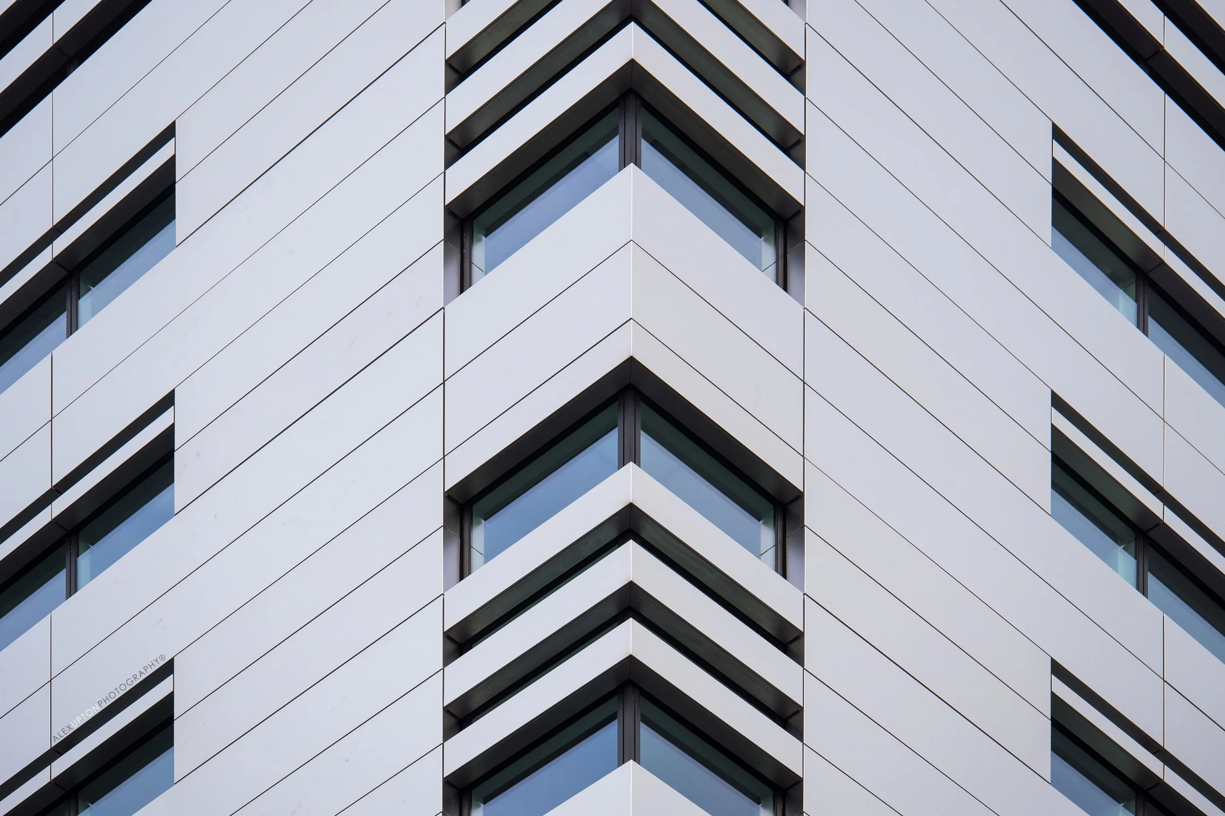
Located in the City of London, Make Architects' 5 Broadgate building, home to Swiss Bank UBS, is a giant aluminium-clad office building which looks like it has descended from outer-space. The facade features a series of intersecting windows which appear as cuts in its ultra-modern surface. The irregular detailing makes for great close-up compositions. 

10 Upper Bank Street -  Copyright © Alex Upton

10 Upper Bank Street -  Copyright © Alex Upton

10 Upper Bank Street

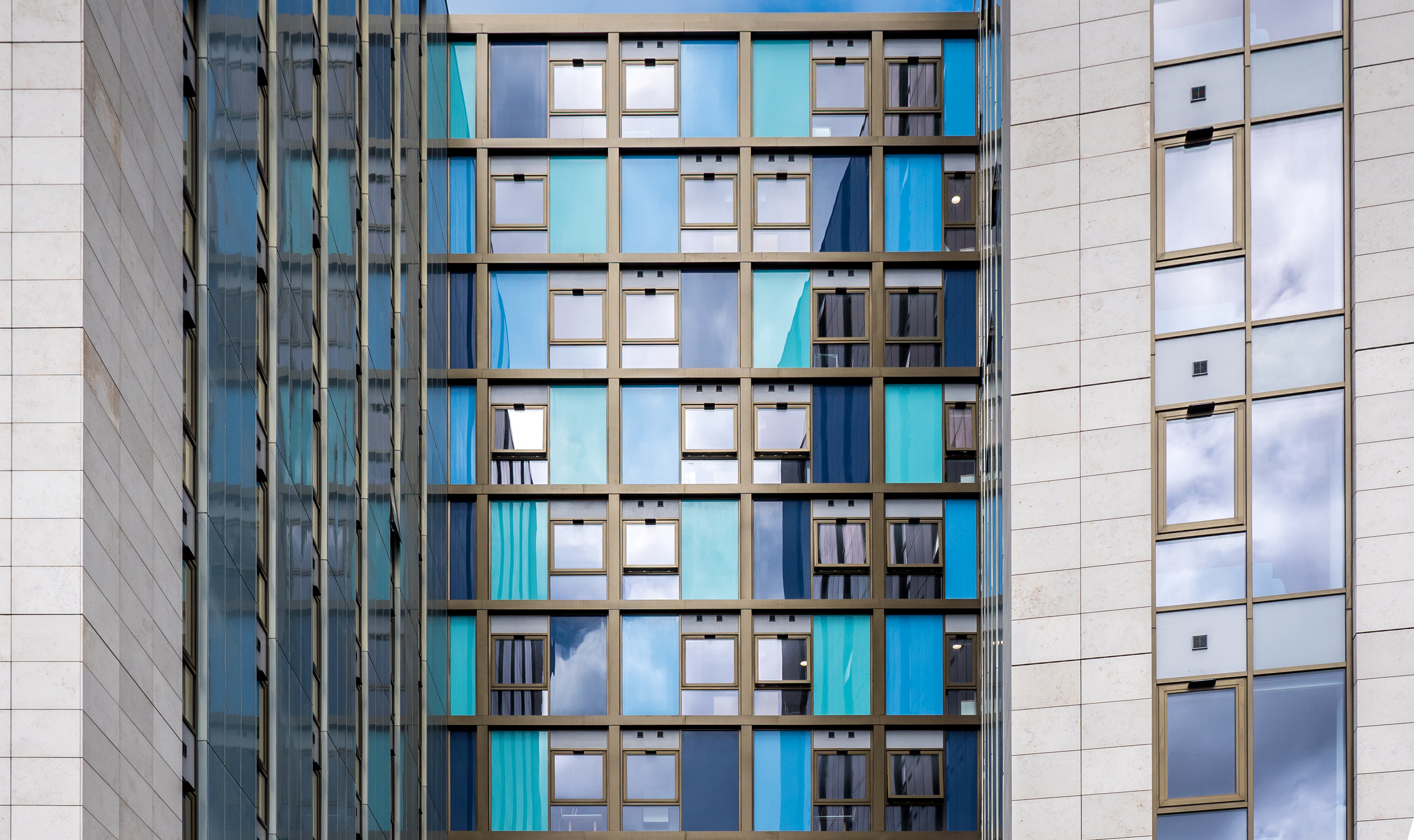
This KPF Architects (Kohn Pedersen Fox Associates) designed tower in Canary Wharf inconspicuously blends in with the neighboring skyscrapers. What distinguishes it is the numerous white fins that run vertically down its facade 32-storey facade, up-close these can be contrasted with the lower glazed portion of the building as photographed here.

R7 Handyside Facade

R7 Handyside

Injecting some colour into the already diverse, yet harmonious, architectural landscape of King's Cross is Duggan Morris Architects' R7 Handyside building. The building's metal-clad facade is composed of red and pink sections which contrast nicely breaking down the buildings large mass.

One Pancras Square Facade

One Pancras Square

Another building forming part of the King's Cross masterplan is David Chipperfield's One Pancras Square. Its distinctive 396 cast iron columns recall traditional materials and structures and the woven patterns which adorn them are a "reminder of the site’s industrial past and a nod to Gottfried Semper’s theory about the role of weaving in the evolution of man-made structures." Here the structure is contrasted with some of the more traditional brick buildings which surround it.

The Francis Crick Institute Facade

The Francis Crick Institute

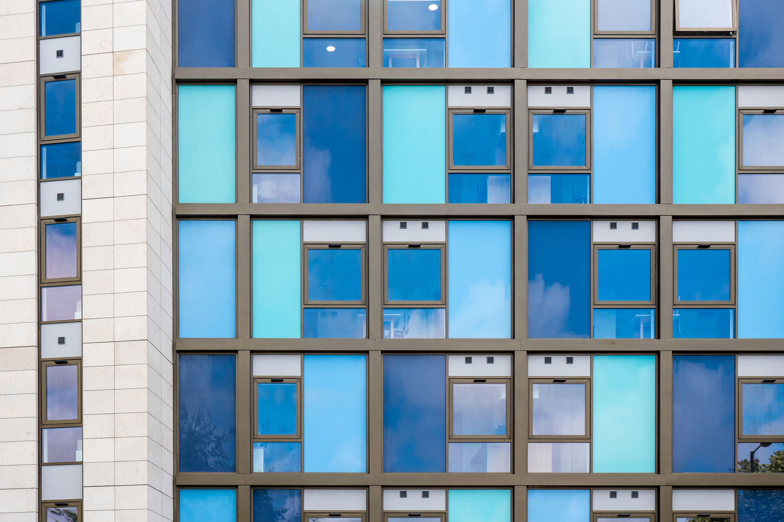
Staying in King's Cross here we have HOK Architects' Francis Crick Institute, home to one of Europe’s largest biomedical research centers. The building viewed from above is shaped like a giant X shaped chromosome. Here the fins stretching across the glass portion of the facade create some wonderful patterns when isolated from the rest of the building.

For image sales or prints of any of these photographs please contact me.
Stapleton House by Architecture PLB by Alex Upton

Stapleton House: Photography: Copyright © Alex Upton

Stapleton House: Photography: Copyright © Alex Upton

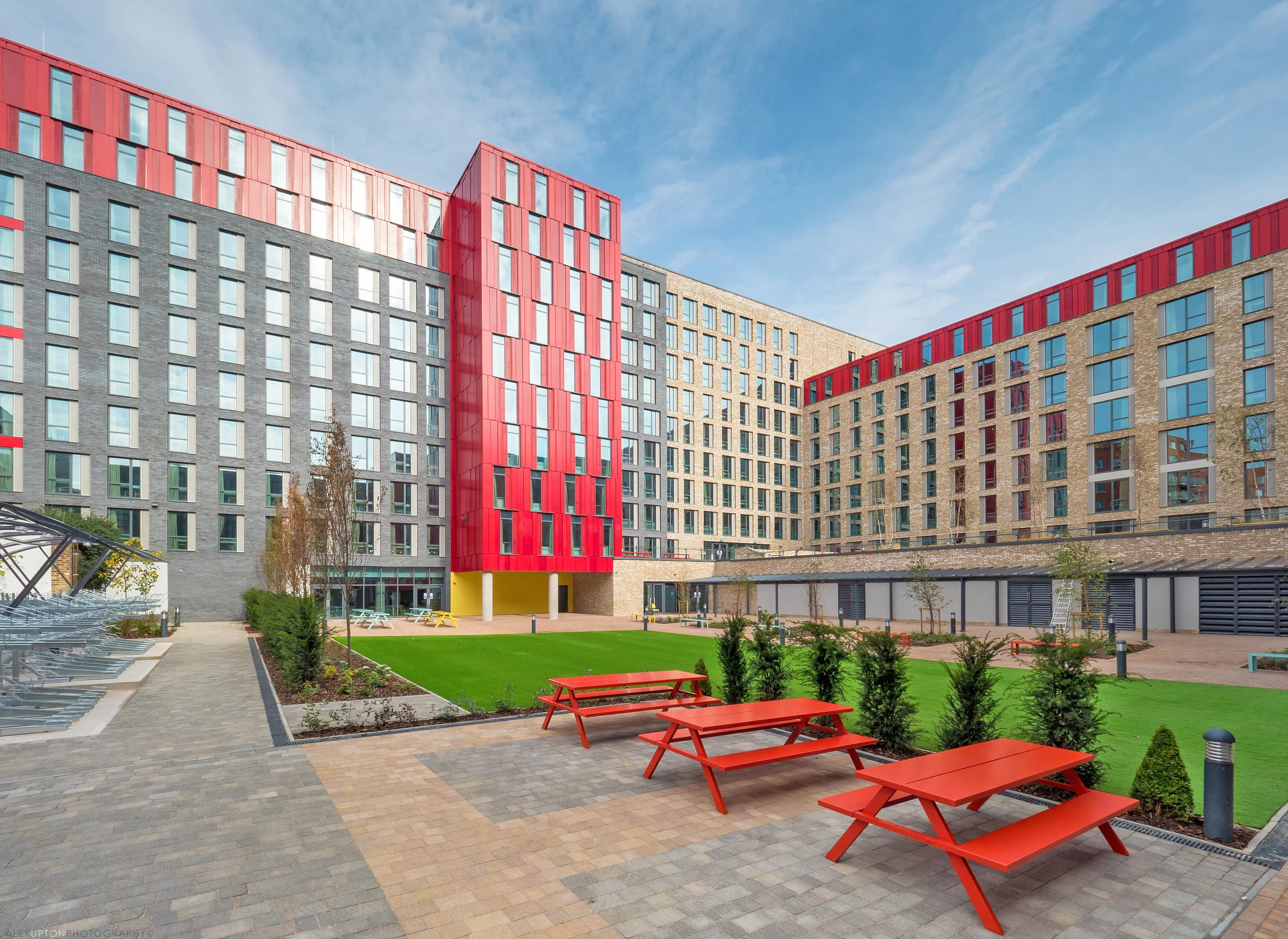
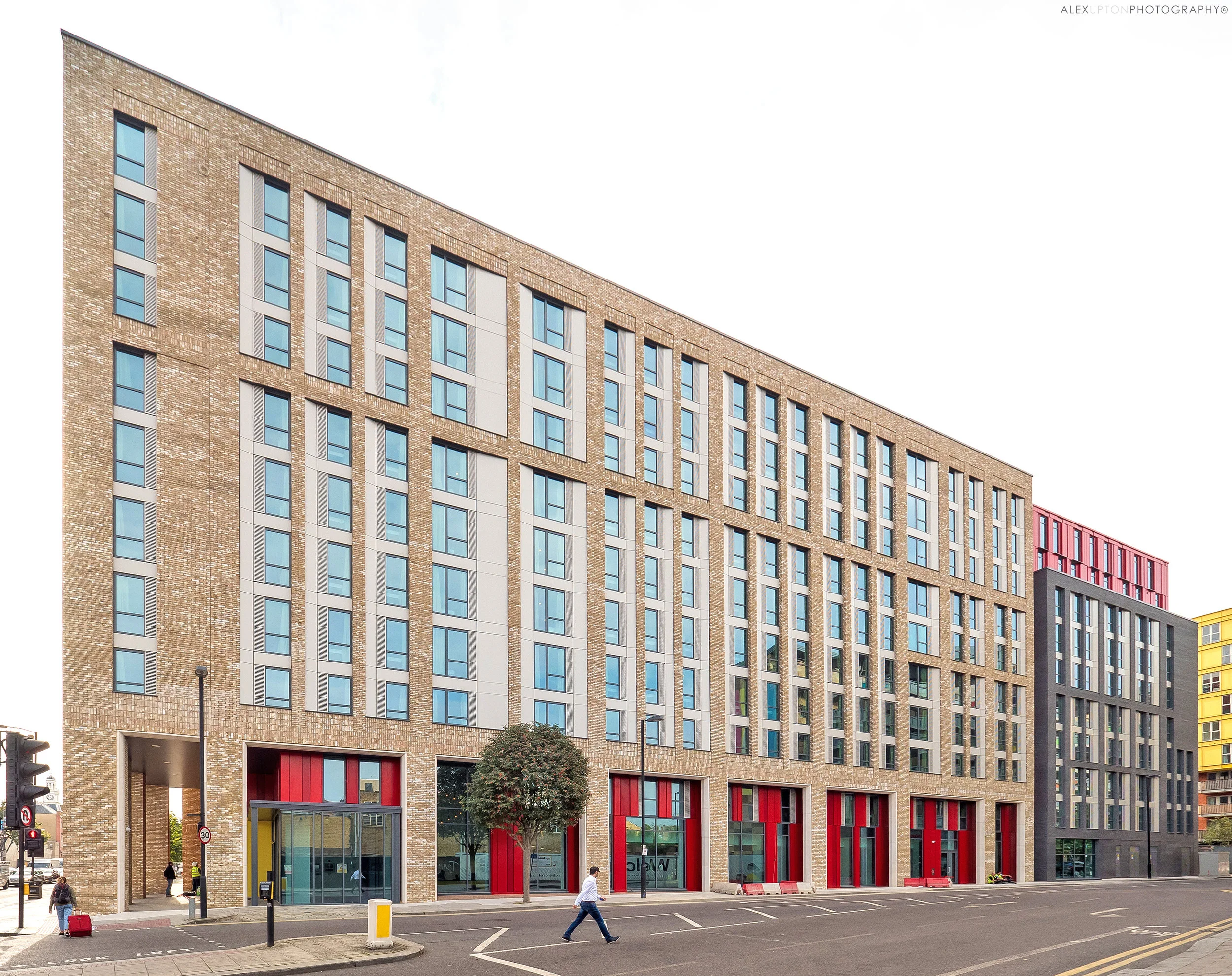
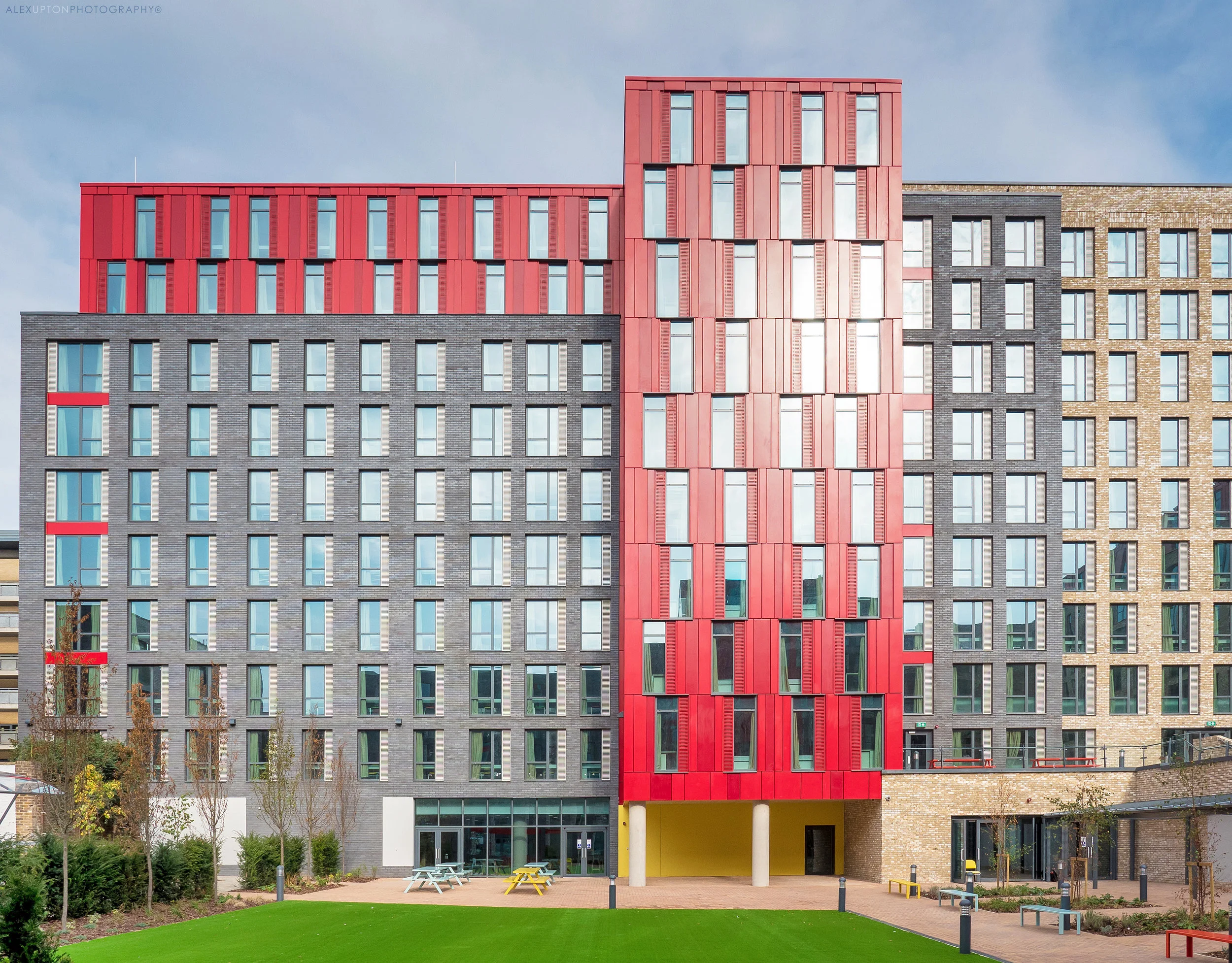
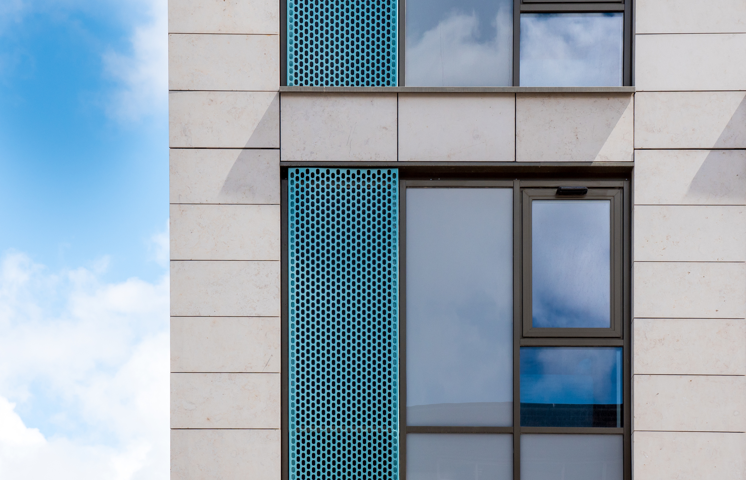
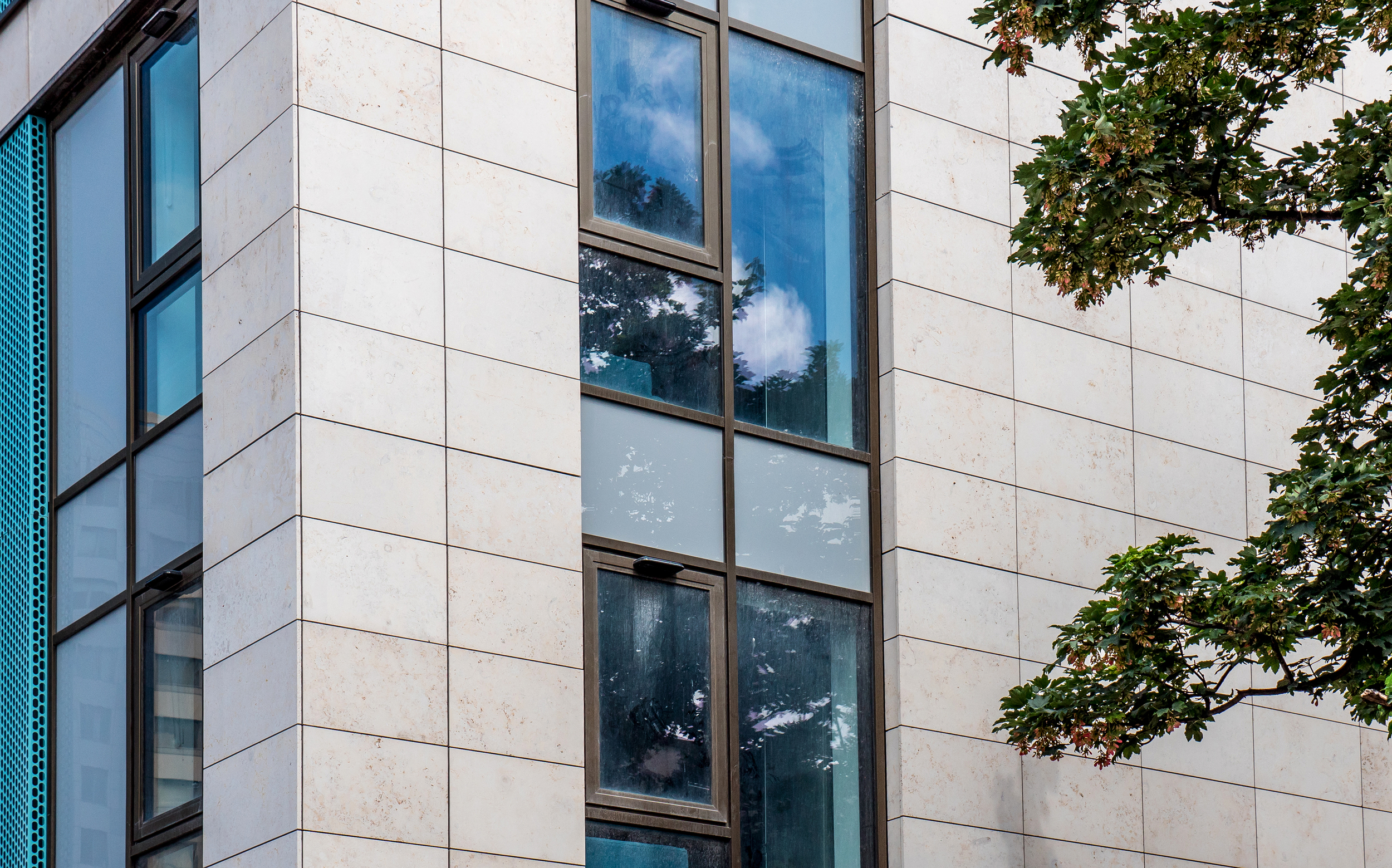
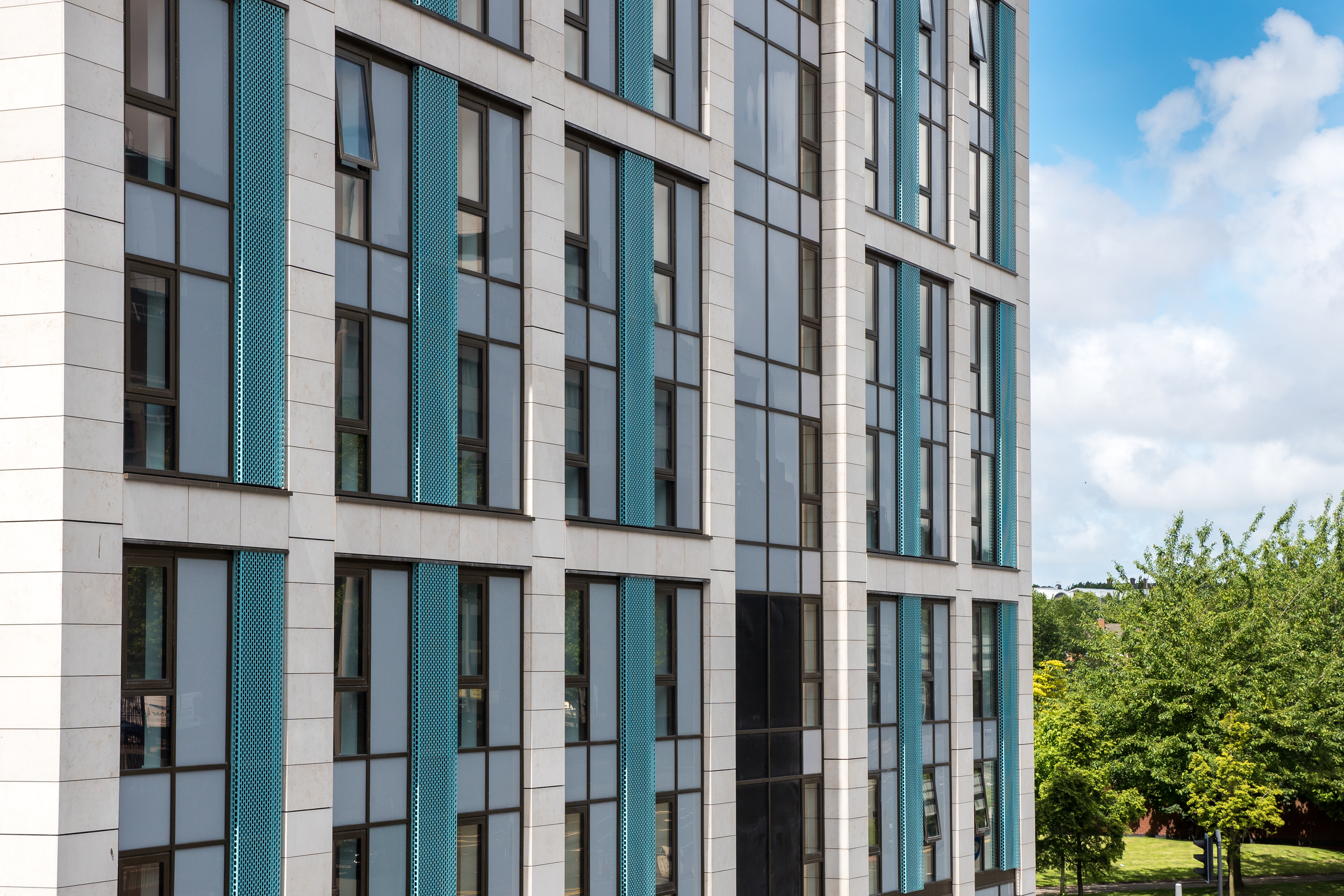
In the closing days of summer 2016, days which possessed a warmth that is now a distant memory, I was commissioned by cladding specialists Taylor Maxwell to photograph Stapleton House, a very large student accommodation building located at a busy junction on Holloway Road, Islington. The building which was designed by Architecture PLB provides 862 bedrooms for students and is strategically located opposite the London Metropolitan University campus so as to mitigate the chances of any excuses made by students for not turning up to lectures on time. The building forms part of The Unite Group’s growing portfolio of London Student housing and like many of these new student living quarters it attempts to embody the diversity and liberal expressions of its youthful inhabitants through its own architectural liberalism, albeit within the constraints of the developers budget.
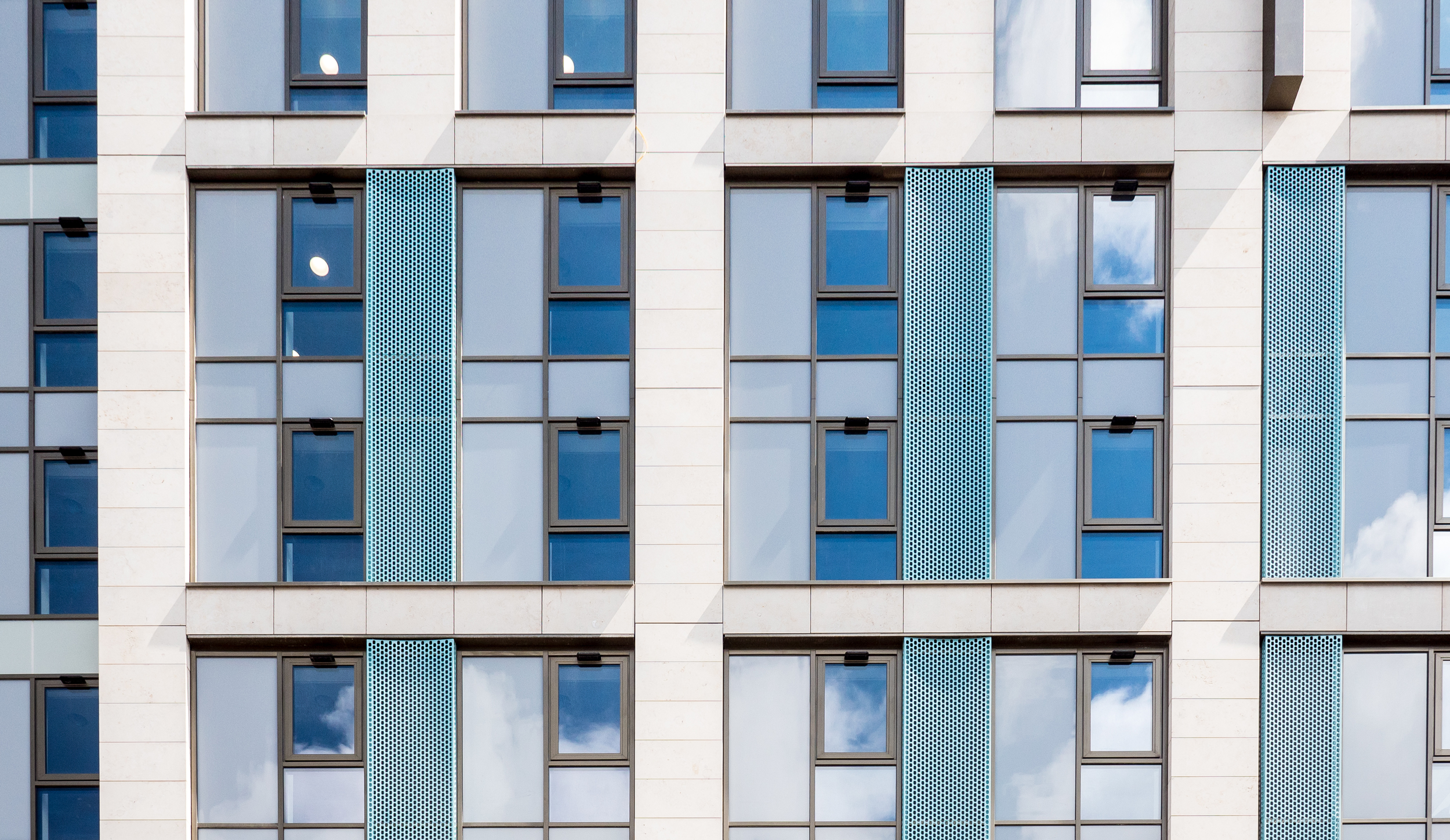
Stapleton House Facade: Photography: Copyright © Alex Upton

Stapleton House Facade: Photography: Copyright © Alex Upton

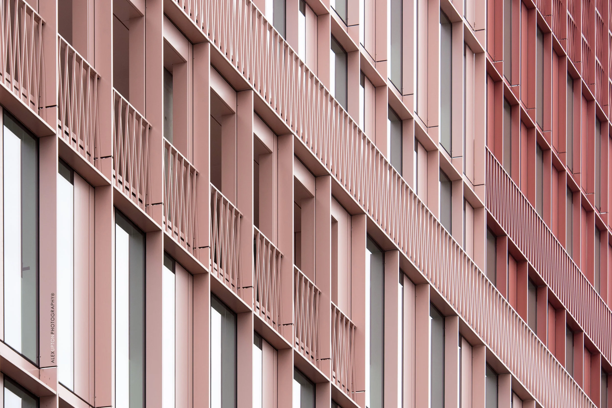
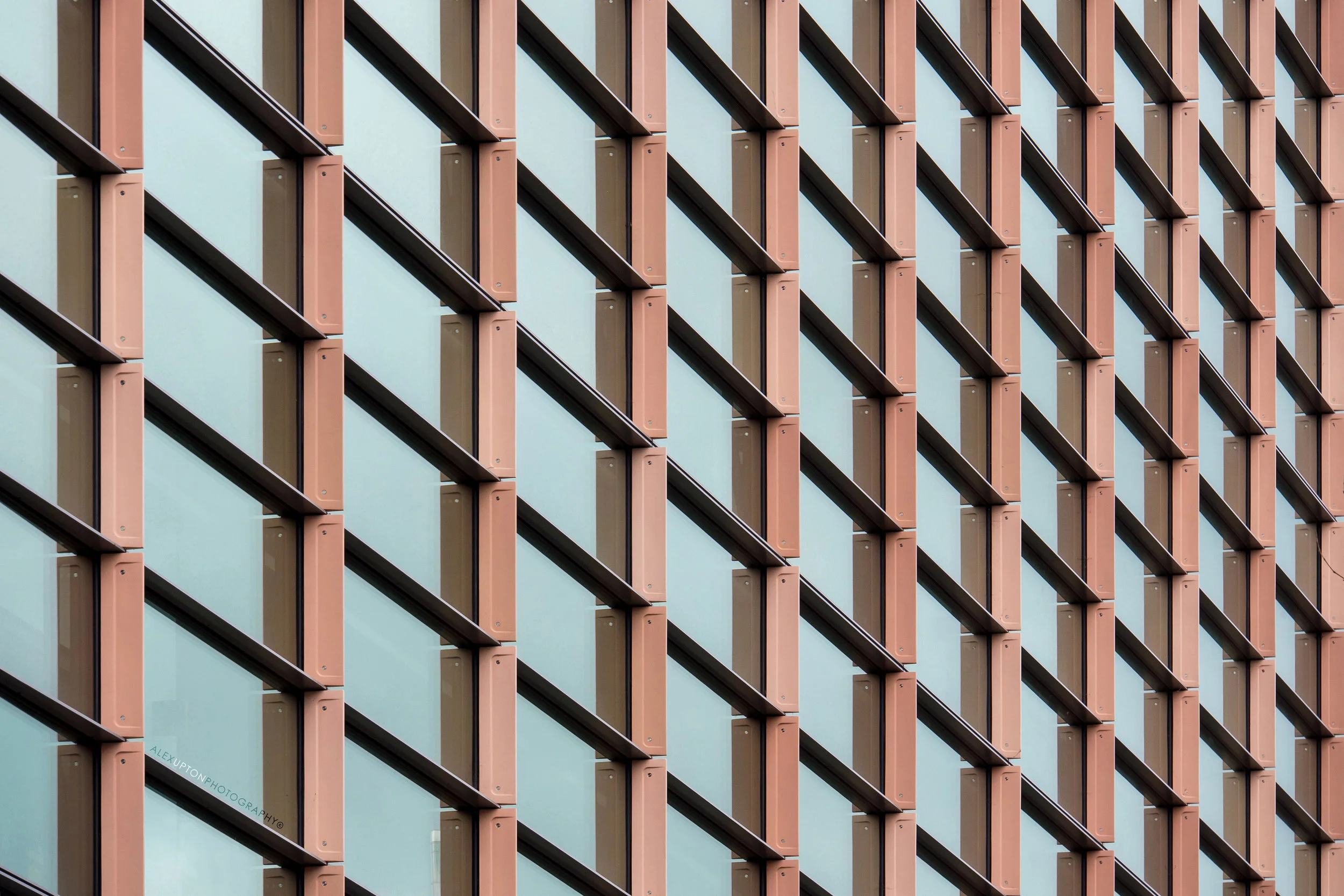
As with many student housing projects, including Byrom Point which I previously photographed, the buildings break down their otherwise large overbearing masses through interspersing a variety of forms, materials and colours. With Stapleton House the buildings external road facing elevation is reconfigured on the external courtyard facing elevation; the same materials are utilised but reassembled and given different levels of prominence in relation to each other. These materials include a variety of brick, stone and red metal cladding which combine to create a vibrant and diverse space. This kind of architecture stands in stark contrast with the monolithic student builds of years gone by where students were uniformly housed in oppressive towers of brown and grey.
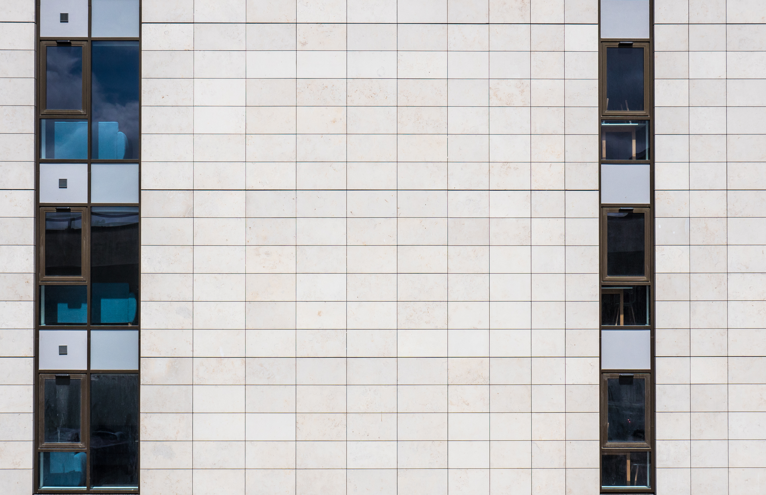
Stapleton House: Photography: Copyright © Alex Upton

Stapleton House: Photography: Copyright © Alex Upton

Stapleton House is so large and detailed I could have easily spent all day photographing its many facets, it is one of those buildings that through its contrasts and divisions offers the architectural photographer an overwhelming set of possibilities for framing and composition and requires restraint for each image can necessarily be quite different and equally pleasing. This hints at a level of success on part or the architects, developer and material suppliers as it certainly hasn’t created a building that could be in any sense labeled boring, not in the eyes of an architectural photographer anyway.

Stapleton House: Photography: Copyright © Alex Upton

Stapleton House: Photography: Copyright © Alex Upton

As well as being gracious in its abundance of detail the building also imparted a sense of nostalgia on me for my days living in university halls - with time generously clouding those moments of utter despair when at 6:00am I was still awake listening through ears muffled by screwed up tissue paper to the monotonous bass produced by a communal kitchen DJ five floors above. Thankfully through the cherry picking of memories I was instead remind of the more positive experiences that come from communal living such as the exchange of ideas, culture and the making of new friends. It is within these more architecturally considered student living spaces that such interactions can be encouraged and take place. With the boom in student numbers accelerating and the ensuing creation of newer more spacious living spaces it is important that the considerations shown in buildings such as Stapleton House aren’t neglected in the rush to profit from rental fees, fortunately, while most student housing developments won’t come close to winning the RIBA’s sterling prize anytime soon, they are starting to show a creative divergence from their older utilitarian counterparts of the 20th century. To see more architectural photographs from my visit to Stapleton House please head to the projects section of my portfolio.

One Tower Bridge by Squire and Partners by Alex Upton

One Tower Bridge: Photography: Copyright © Alex Upton

One Tower Bridge: Photography: Copyright © Alex Upton

Development: One Tower Bridge
Architect: Squire and Partners
Location: Southwark, London
Developer: Berkeley Homes

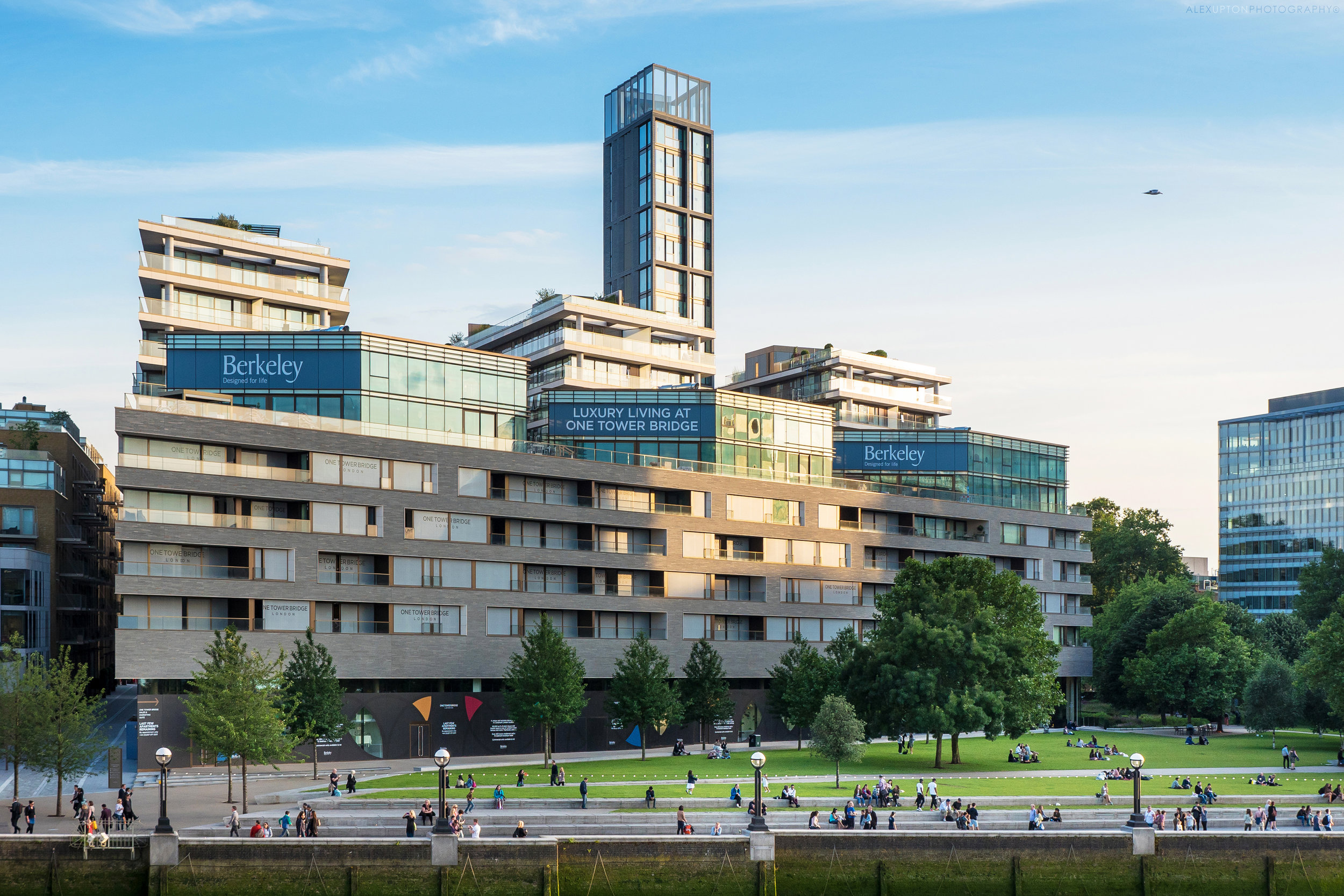
As its title not-so-subtly proclaims One Tower Bridge is a luxury residential development situated in close proximity to the historic landmark and Grade I listed Tower Bridge. As if being in the company of one iconic London landmark wasn't enough to enhance its prestige, the development also finds itself sitting parallel to the Tower of London - located just over the river - and slightly west from Foster & Partners’ City Hall and More London. With such distinguished neighbours it comes as no surprise that the apartments on offer here lean towards the more affluent end of the market.

One Tower Bridge: Photography: Copyright © Alex Upton

One Tower Bridge: Photography: Copyright © Alex Upton

The development which includes 400 apartments, retail and cultural space is formed from nine architecturally varied and independent blocks, each utilising different materials and forms to break up the potential monotony of such a large site. Sat behind the three eleven-story blocks with projecting stone balconies are two buildings clad in a yellow London stock brick, it was these two buildings - Windsor House and Lancaster House - that I was commissioned to photograph on behalf of the brick supplier Taylor Maxwell.

One Tower Bridge: Photography: Copyright © Alex Upton

One Tower Bridge: Photography: Copyright © Alex Upton

This section of the development with its projecting timber balconies and basketweave brickwork references the former warehouses that once lined the riverbank, some surviving examples of which are located not far away along the historic riverside street that is Shad Thames, although these warehouses now also find themselves being utilised as high-end living quarters.

One Tower Bridge: Photography: Copyright © Alex Upton

One Tower Bridge: Photography: Copyright © Alex Upton

Situated between the two buildings is a new pedestrian route named Duchess Walk, which architects Squire and Partners have positioned to maximise views through the site from Tooley Street to Tower Bridge. Walking down this alley you can see the high quality architectural detailing and spruce potted shrubbery which only such a development can afford. If you crane your neck upwards from the framed view of Tower Bridge towards the projecting balconies which cascade off towards the horizon you may be graced with the presence of a lucky occupant looking down upon you from 'The Tower' also known as building number five.

One Tower Bridge: Photography: Copyright © Alex Upton

One Tower Bridge: Photography: Copyright © Alex Upton

This section of the development which rises above all the others is a thin, multistory, mini-edifice which from a distance has the appearance of a fire station drill tower. Fortunately on closer inspection its appearance is much more dignified if not looking somewhat incompatible with the rest of the design. The peak of the tower appears to contain a miniature sky garden and viewing platform which must accommodate great views in all directions.

One Tower Bridge: Photography: Copyright © Alex Upton

One Tower Bridge: Photography: Copyright © Alex Upton

Squire and Partners’ scheme was not the first proposal for the site, the first being outlined a number of years before by Ian Ritchie Architects, which would have seen a cluster of small Dalek-like residential towers – more in keeping with City Hall, but not Tower Bridge – lining the riverbank. Although initially approved it later met resistance from the London Borough of Southwark and the scheme was eventually terminated. This highlights the difficulties for an architect in addressing such a location, context is paramount and if the building tries to outdo its neighbour – a structure which was also seen as contentious and outlandish upon its conception – then it is inevitably going to be open to heightened criticism, objection and the inevitable refusal. This seems to leave only one option open to both developer and architect; create something which is high quality yet indiscreet, something that contextualises itself within the locations past at the expense of its present. Such token gestures can at times be restrictive and stifle innovation and creativity producing an architecture which is subservient to its surroundings, but such restrictions can also offer a framework to channel new ideas and make sure a project doesn’t submit to the developer’s predisposition to maximise profit and the expense of good architecture. One Tower Bridge seems to settle somewhere in the middle of this predicament, it is undoubtedly of a high quality, with careful attention to detail and utilises materials and elements which reference the sites history, although as a whole, while not even slightly unpleasant it seems somewhat restrained and muted from being what it wants to be. To see more of my architectural photographs of One Tower Bridge please head over to the projects section of my portfolio.

New Ludgate by Fletcher Priest & Sauerbruch Hutton Architects by Alex Upton

One New Ludgate: Photography: Copyright © Alex Upton

One New Ludgate: Photography: Copyright © Alex Upton

Development: 1 & 2 New Ludgate
Architects: Fletcher Priest & Sauerbruch Hutton Architects
Location: New Ludgate, City of London
Developer: Land Securities

The winter months can be both cruel and kind to the architectural photographer. With the sun reclining lower in the sky early afternoons can provide some of the year’s best light for photographing buildings, with golden hues and dynamic shadows tracing their every surface illuminating them in a manner to which the summer sun does not cater. Yet in the absence of these infrequent conditions a stubbornly persistent smudge of impenetrable, uniform grey often hangs over the city leading to many rescheduled shoots. On such days it seems appropriate to catch up on some neglected updates from projects I photographed earlier in the year, one such project is the New Ludgate development in the City of London.

One New Ludgate: Photography: Copyright © Alex Upton

One New Ludgate: Photography: Copyright © Alex Upton

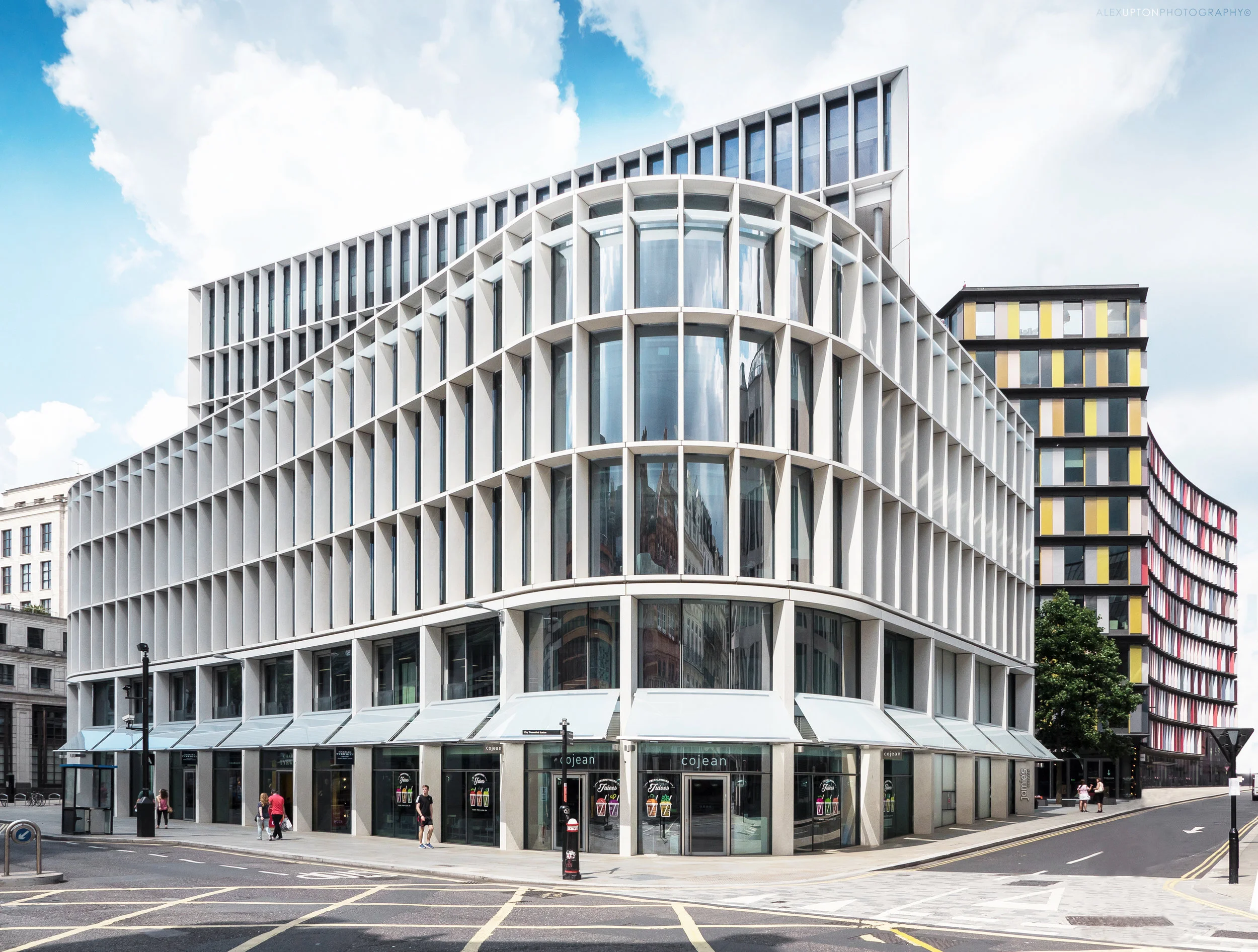
New Ludgate is a mixed use development by Land Securities combining both office, retail and restaurant space within two distinct yet complimentary buildings. Situated in the City of London just a short walk from St Paul’s Cathedral the site was once home to the 15th century Belle Sauvage public house and coaching inn. The master plan for the site was drawn up by Fletcher Priest Architects and takes into account the sites sensitive location; their building – One New Ludgate – steps back from the protected view of St Paul’s reinstating the streets curvature which was used by Wren to show his building to full effect. 

Two New Ludgate: Photography: Copyright © Alex Upton

Two New Ludgate: Photography: Copyright © Alex Upton

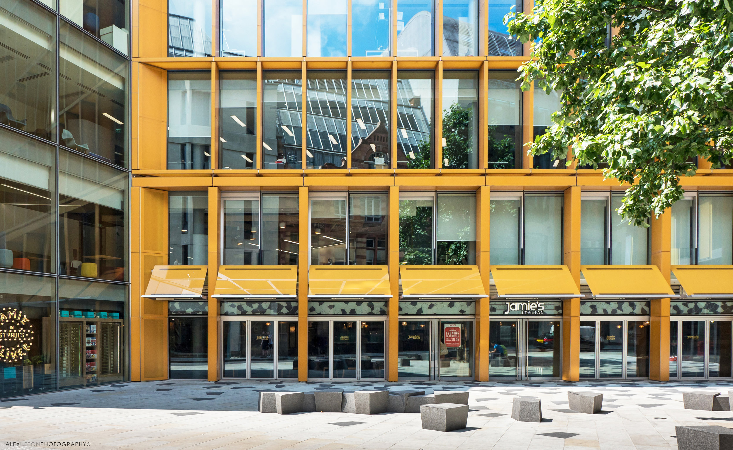
The Portland Stone façade of One New Ludgate stands in contrast with the colourful amber glass façade of it’s neighbour - Two New Ludgate - designed by Sauerbruch Hutton Architects. The fact that both buildings utilise a grid like structure to cover the façade brings about a convergence in their design which would otherwise have been lost. From an architectural photographers point of view it is these glass shutters and external masonry which make for some of the most interesting images.

New Ludgate Public Realm: Photography: Copyright © Alex Upton

New Ludgate Public Realm: Photography: Copyright © Alex Upton

Although the site is essentially restrained by its relatively small footprint and the need to maximise floor space there is still adequate attention given to the public realm which offers stone seating to the city workers on their lunch breaks and trees which return a bit of nature to densely urban part of the city. The surrounding paving is made up of quadrilateral polygons of different shades which when hit by the light reflecting of the buildings create a nice interplay of light and form.

One New Ludgate: Photography: Copyright © Alex Upton

One New Ludgate: Photography: Copyright © Alex Upton

Collaborative efforts in architecture can often be fraught with competing visions and a sense that one needs to outdo the other, but on this site both buildings are addressed in a sensible and restrained manner leading to a distinct yet harmonious outcome. As both buildings retreat from the views of their iconic neighbour they become slightly more animated and playful yet still retain their dignity in the presence of their elders. To see more of my architectural photographs of New Ludgate please head over to the projects section of my portfolio.

1 Undershaft (Aviva Tower) by OAG by Alex Upton

1 Undershaft - Photography: Copyright © Alex Upton

1 Undershaft - Photography: Copyright © Alex Upton

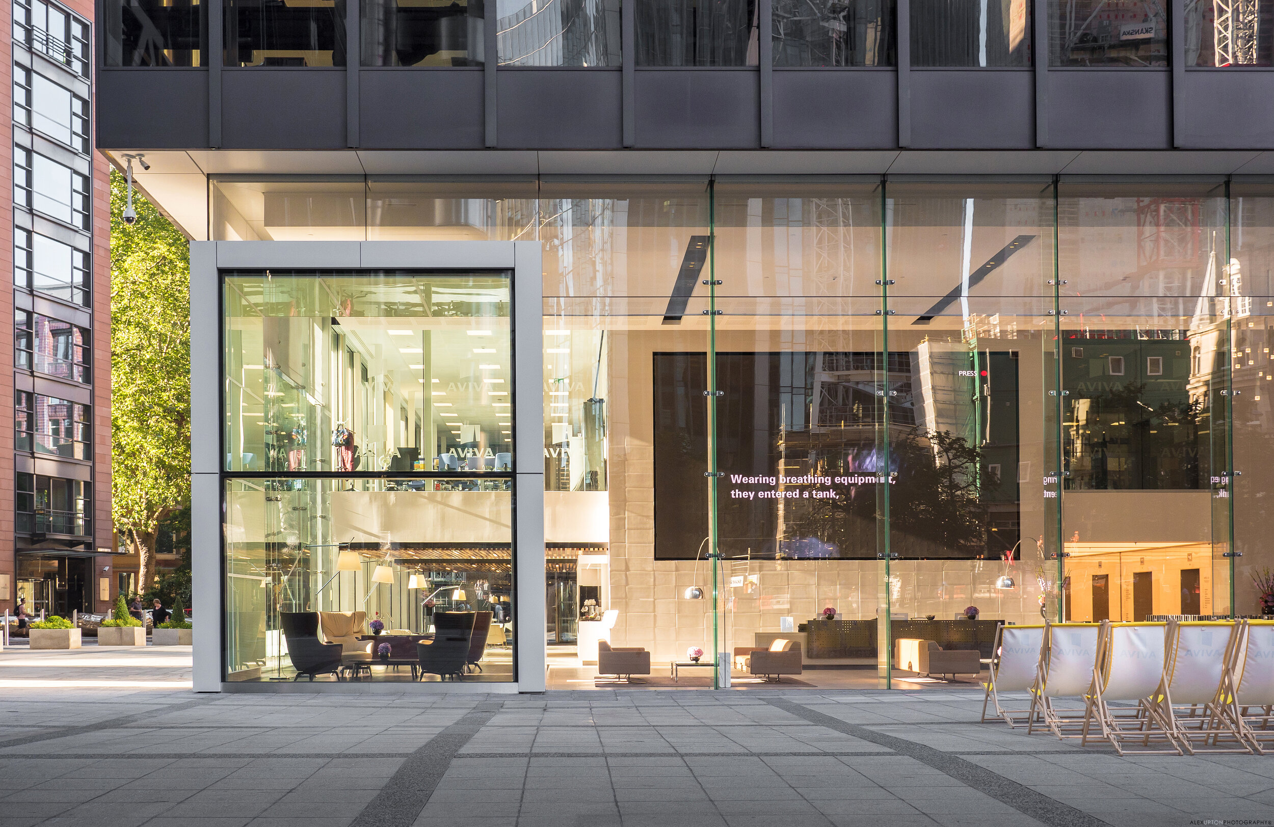
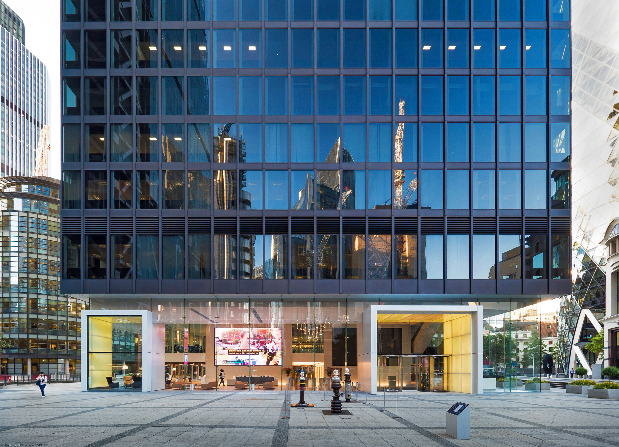
1 Undershaft, also know as both St Helen's and Aviva Tower recently underwent a internal and external renovation spanning the first and second floor lobby area. Bespoke glazing specialists OAG commissioned the following set of images to document their contribution to the site.

1-undershaft-aviva-tower

The 23 storey tower, home to insurance giant Aviva was originally completed in 1969 by architects Gollins Melvin Ward. With its restrained modernist styling 1 Undershaft can appear austere in the company of Norman Foster's 30 St Mary Axe and Richard Rogers 122 Leadenhall, yet its simplicity and rigid geometry offer a somewhat calming presence not offered by its flamboyant neighbours.

Aviva Tower Facade Detail

With the need to bring the buildings interior and entry level space into the 21st century OAG working with COMO have introduce 7.6 metre high glass fins, weighing in at just under a tonne each to create a impressive transparent facade. Internally with the assistance and digital expertise of Light Lab OAG have transformed the space into a technical haven with LED back lit panels surrounding the entrance and projecting feature pods which add colour and depth to the surface.

1-undershaft-architecture

Internally a giant display projects various data streams to passers by, at the time of photographing the building the Olympic Games were being televised with seating outside for the weary office workers to lay back in, relax and recuperate. Undoubtedly there are some Deleuzian theoretical gems waiting to be extracted from the notion of city workers sitting watching other city works through a screen like facade which in itself contains another screen - insights relating to levels of opacity in financial markets, multi layered screens and work / leisure time divisions abound, but I will leave such endeavours to those more qualified. 

11-undershaft.jpg

Occupied by over 3000 office workers the transformations to 1 Undeshaft were carried out with little disturbance to the buildings daily functioning. What could have simply been a functional facade has become and interactive, dynamic space, which is both impressive for its scale, quality, innovation and bold style. Inviting the public to engage with the building does away with the notion that the facade should be a barrier between those on the inside and those on the outside. For further photographs documenting the renovation head over to 1 Undershaft listed in my projects gallery.   

1 Undershaft

Afterword: The future of 1 Undershaft 

After suffering heavy damages in the 1992 Baltic exchange bombing the Towers continued existence looks under threat once again with the emergence of plans for its replacement by a 72 storey tower set to be the City of London's tallest building if completed. This eventuality is still yet to be approved and remains as of now a distant prospect, so for time being at least the towers occupants, and the passing public can enjoy its hi-tech renovation. 

Byrom Point by Falconer Chester Hall Architects by Alex Upton

Development: Byrom Point Student Accommodation
Architects: Falconer Chester Hall Architects
Location: Great Crosshall Street, Liverpool
Client: Taylor Maxwell

Byrom Point - Photography: Copyright © Alex Upton

Byrom Point - Photography: Copyright © Alex Upton

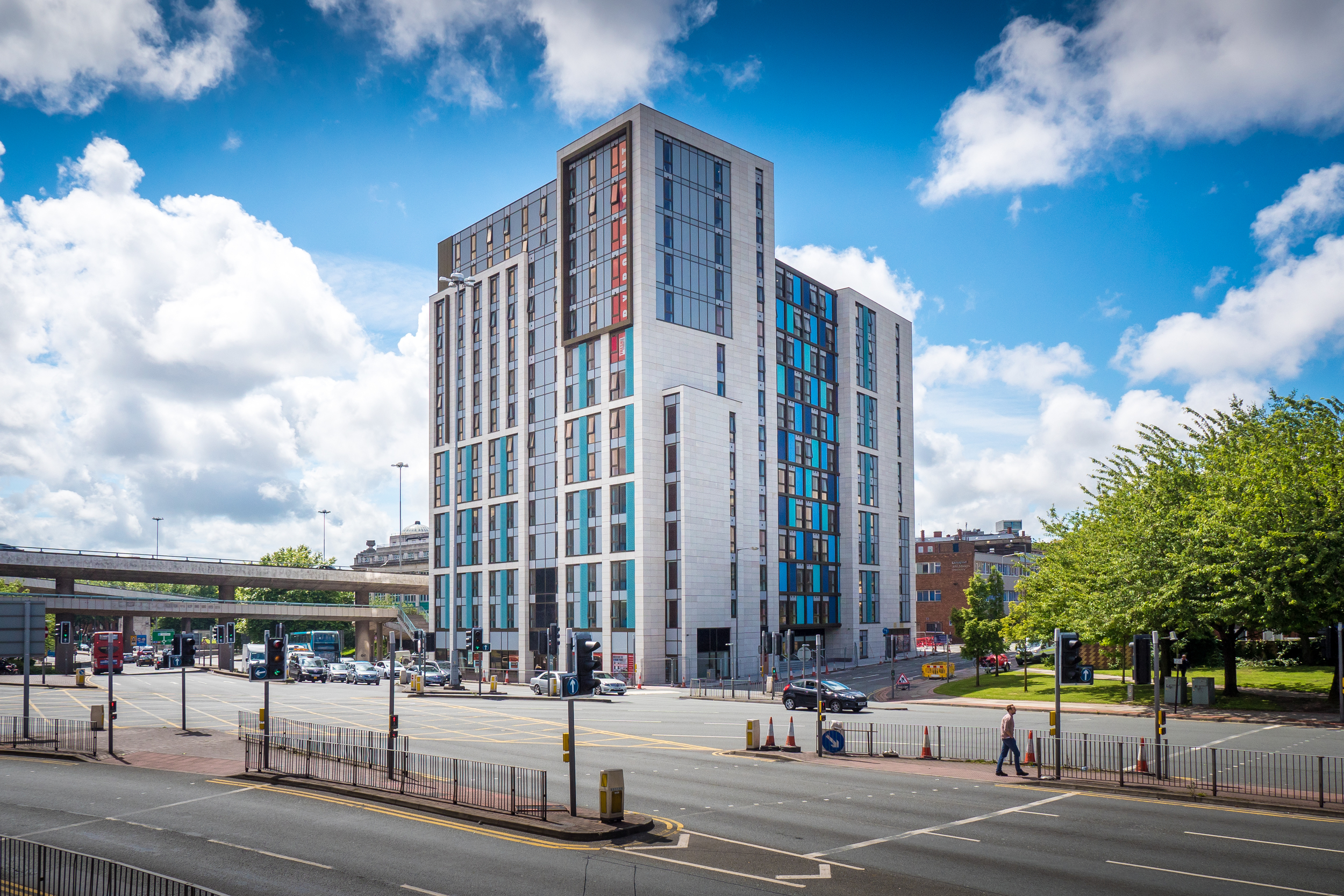
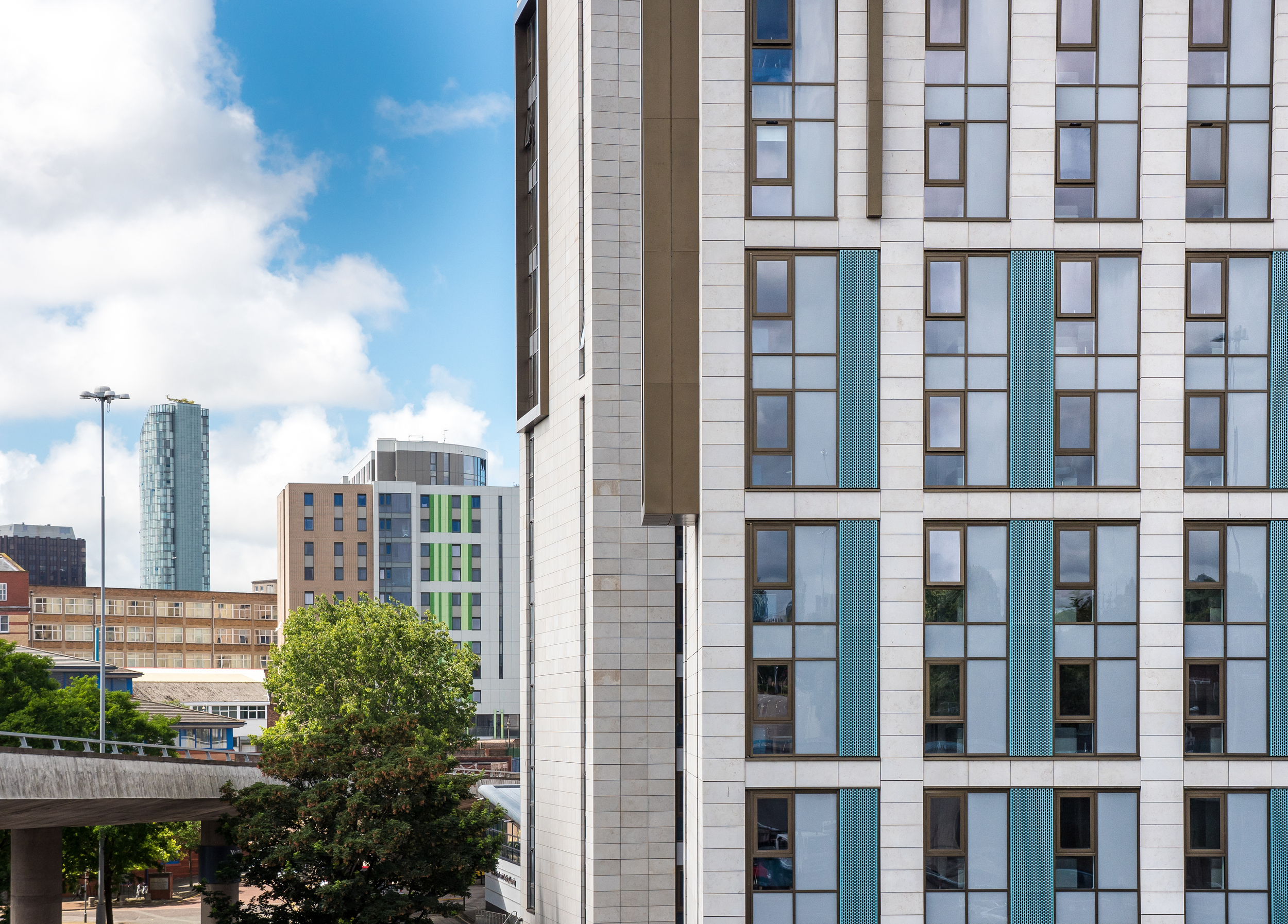
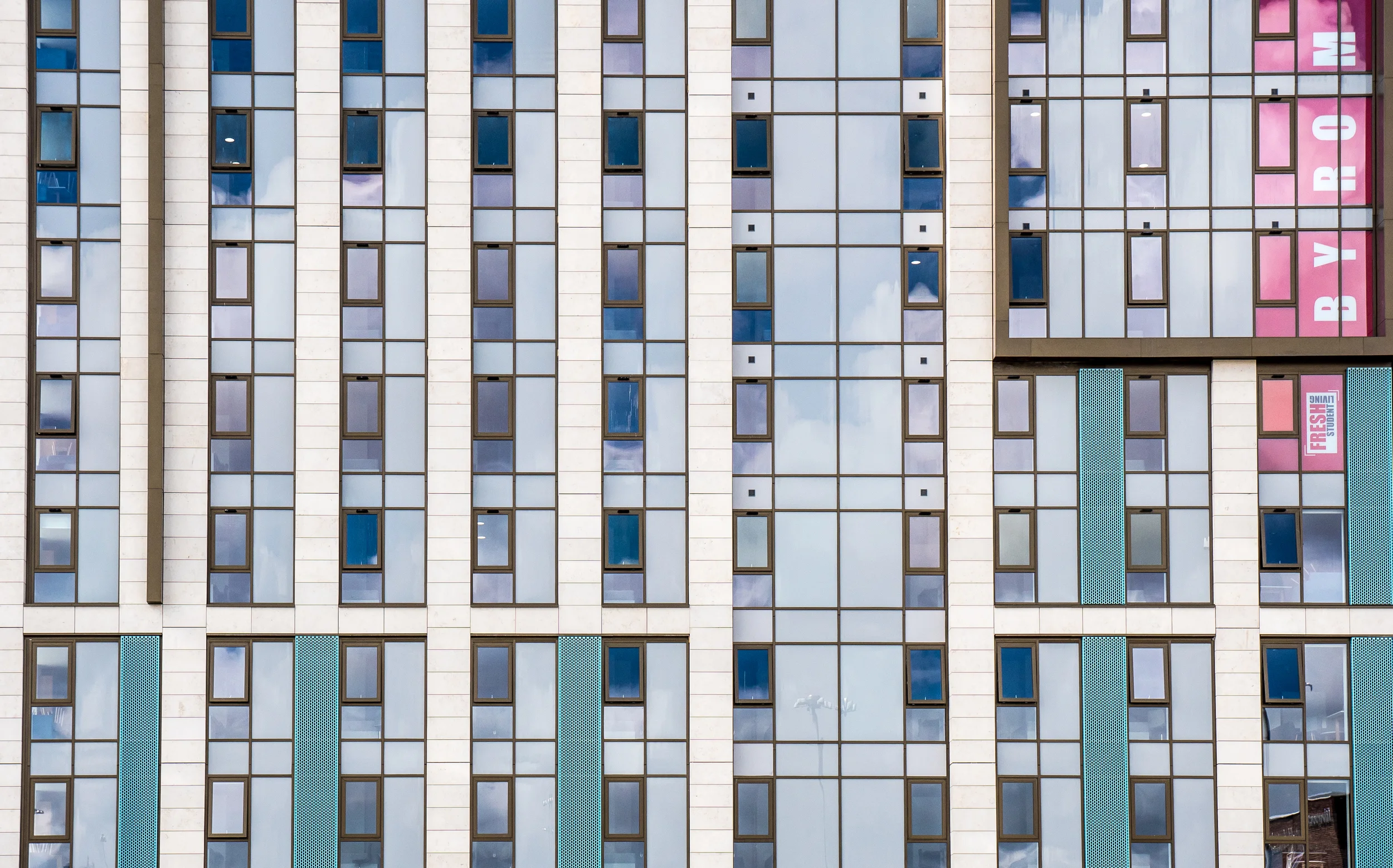
Byrom Point Student Accommodation is a mixed used scheme which contains 398 bed spaces for students and 361 sqm of retail at street level. The building is located at the crossroads of Byrom Street and Great Crosshall Street in Liverpool and was designed by Falconer Chester Hall Architects. I was recently commissioned by Taylor Maxwell to photograph the stone cladding they provided for the buildings exterior.

Byrom Point - Photography: Copyright © Alex Upton

Byrom Point - Photography: Copyright © Alex Upton

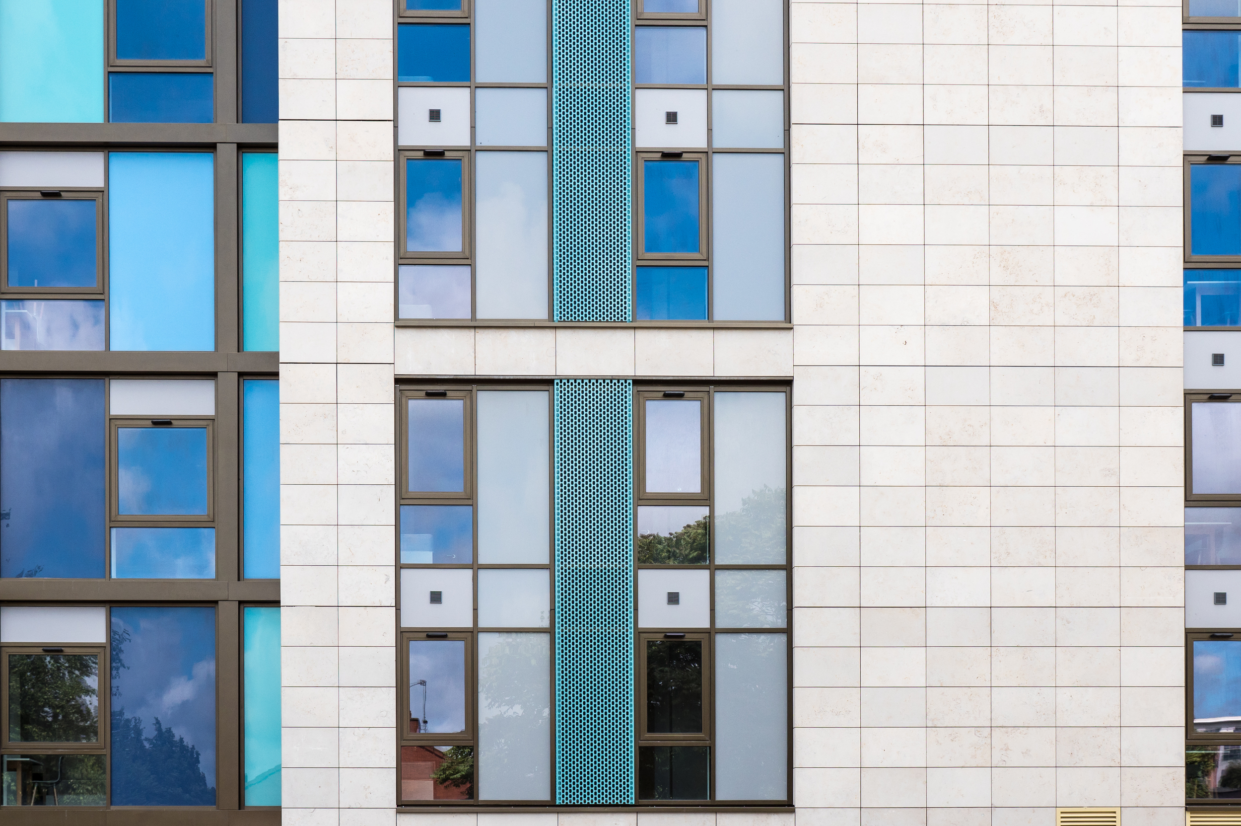
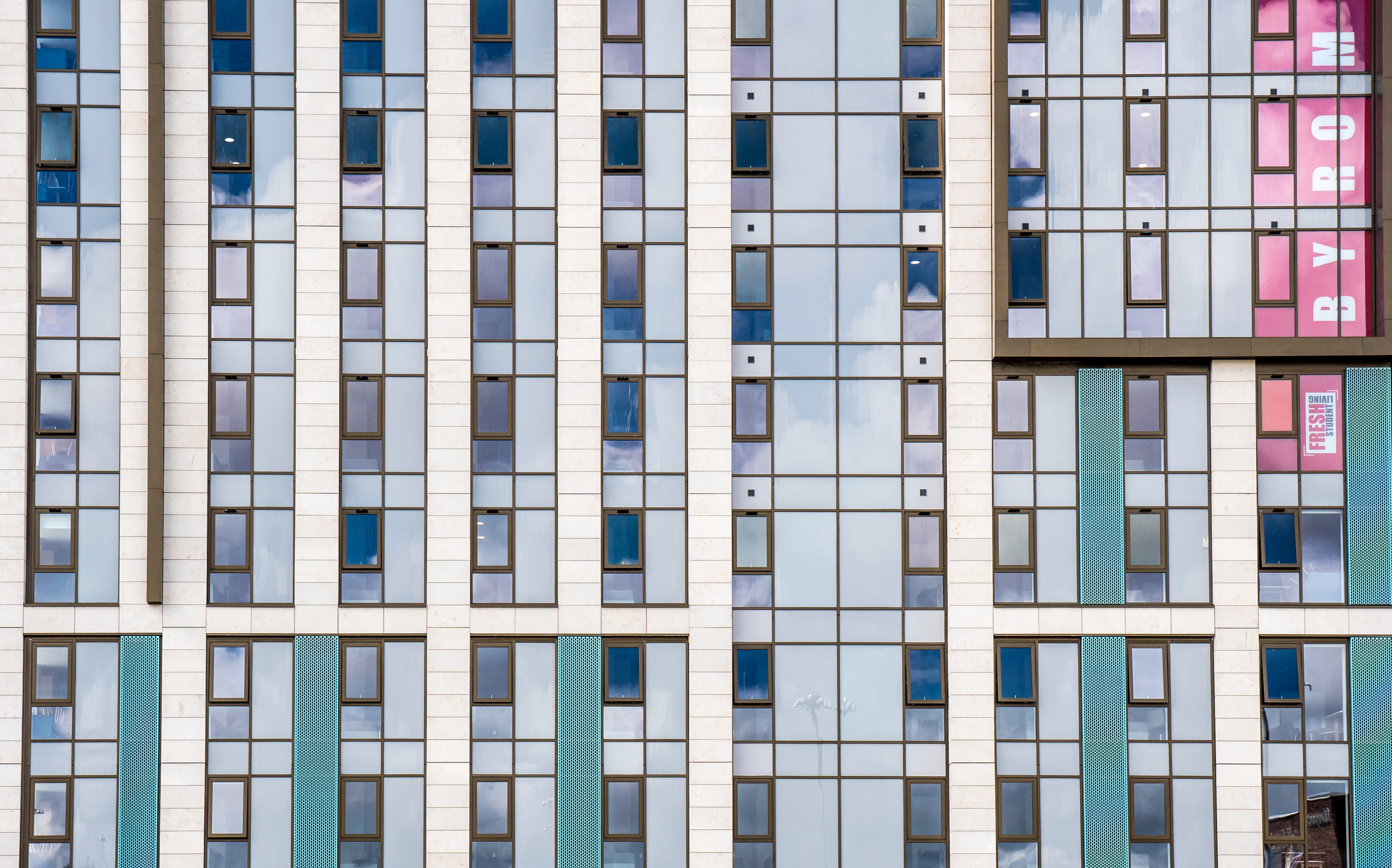
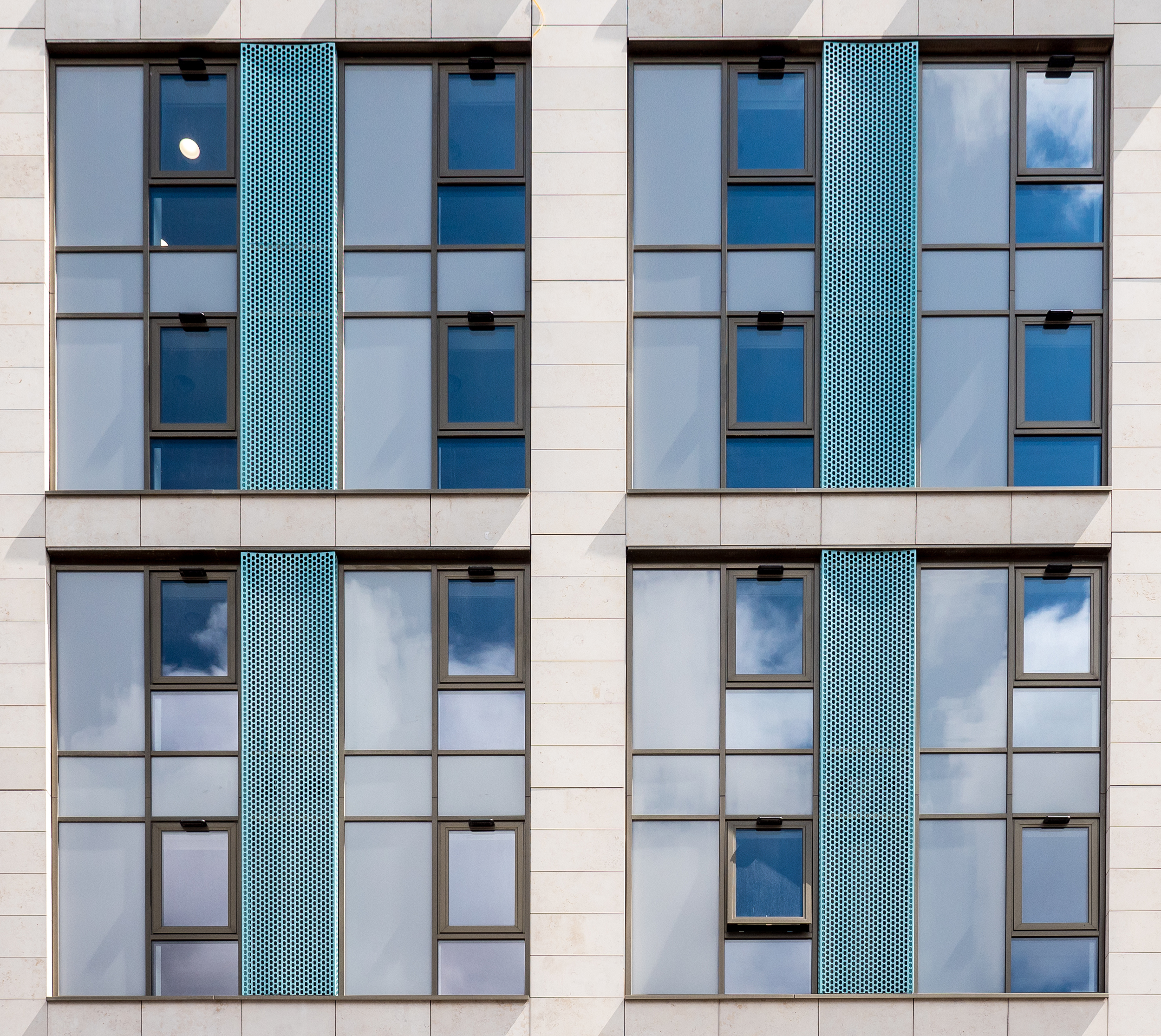
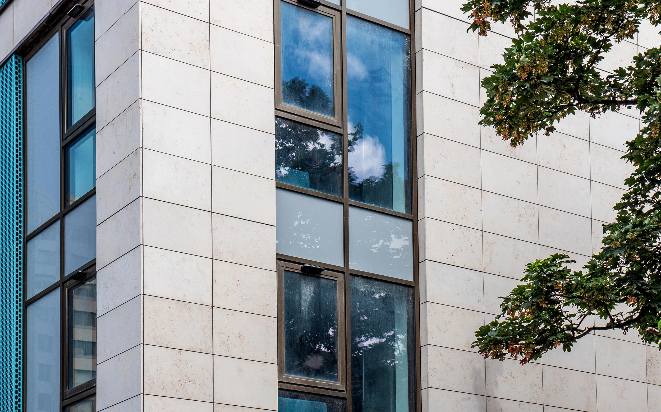
The buildings facade makes good use of both colour and materials in order to create divisions between the buildings faces, this reduces it's bulky form and makes it a colourful addition to the surrounding landscape. The pale stone cladding sits nicely in contrast with the bolder elements surrounding the windows and gives the building a high quality finish. 

Byrom Point - Photography: Copyright © Alex Upton

Byrom Point - Photography: Copyright © Alex Upton

The building is now nearing completion with the first students expected to arrive in September, currently there are still minor works taking place around the base of the tower to make way for the retail section.

Byrom Point - Photography: Copyright © Alex Upton

Byrom Point - Photography: Copyright © Alex Upton

Falconer Chester Hall, the architects behind this scheme have delivered a number of student accommodation projects around the country, and unlike many student accommodation buildings which too often appear value engineered and lacking in any creative verve, their buildings tend to make clever and considered use of materials, form and colour to enhance the students living spaces.

Byrom Point - Photography: Copyright © Alex Upton

Byrom Point - Photography: Copyright © Alex Upton

A more detailed selection of photographs documenting Byrom Point can be found in the projects section of my portfolio.

Lexicon Tower by Skidmore Owings & Merrill by Alex Upton

Lexicon Tower - Photography: Copyright © Alex Upton

Development: Lexicon 261 City Road
Architects: Skidmore Owings & Merrill (SOM)
Location: City Road, Islington, London
Height: 115m (36fl)

Lexicon Tower - Photography: Copyright © Alex Upton 

The Lexicon is a residential development by Mount Anvil which stands adjacent to Canaletto Tower on the waterfront, just beside City Road. It is one of a number of new high-rise buildings to spring up on this stretch of road, alongside Make architects Atlas Building, Foster and Partners 250 City Road and the recently completed The Eagle and Montcalm Signature Tower developments by Terry Farrell & Partners and Squire & Partners collaboration with 5plus architects respectively.

Lexicon Tower - Photography: Copyright © Alex Upton

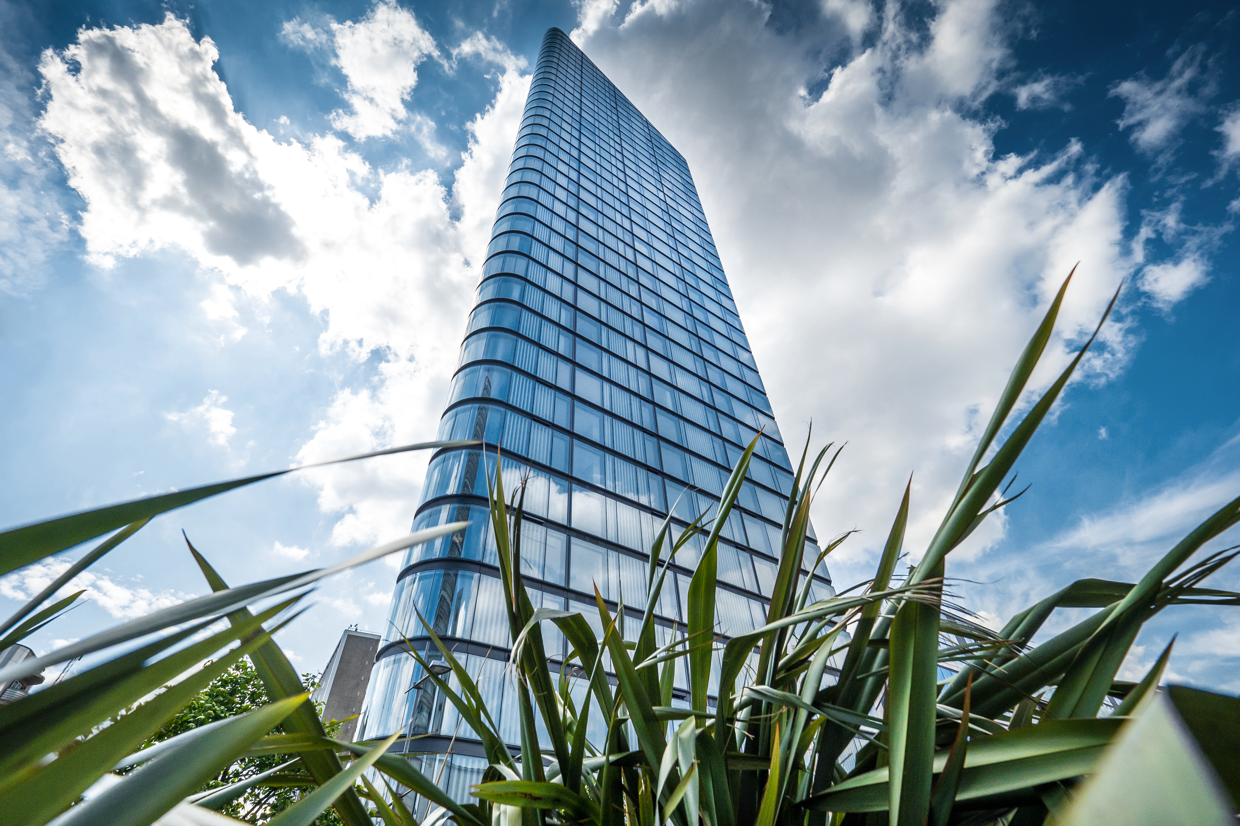
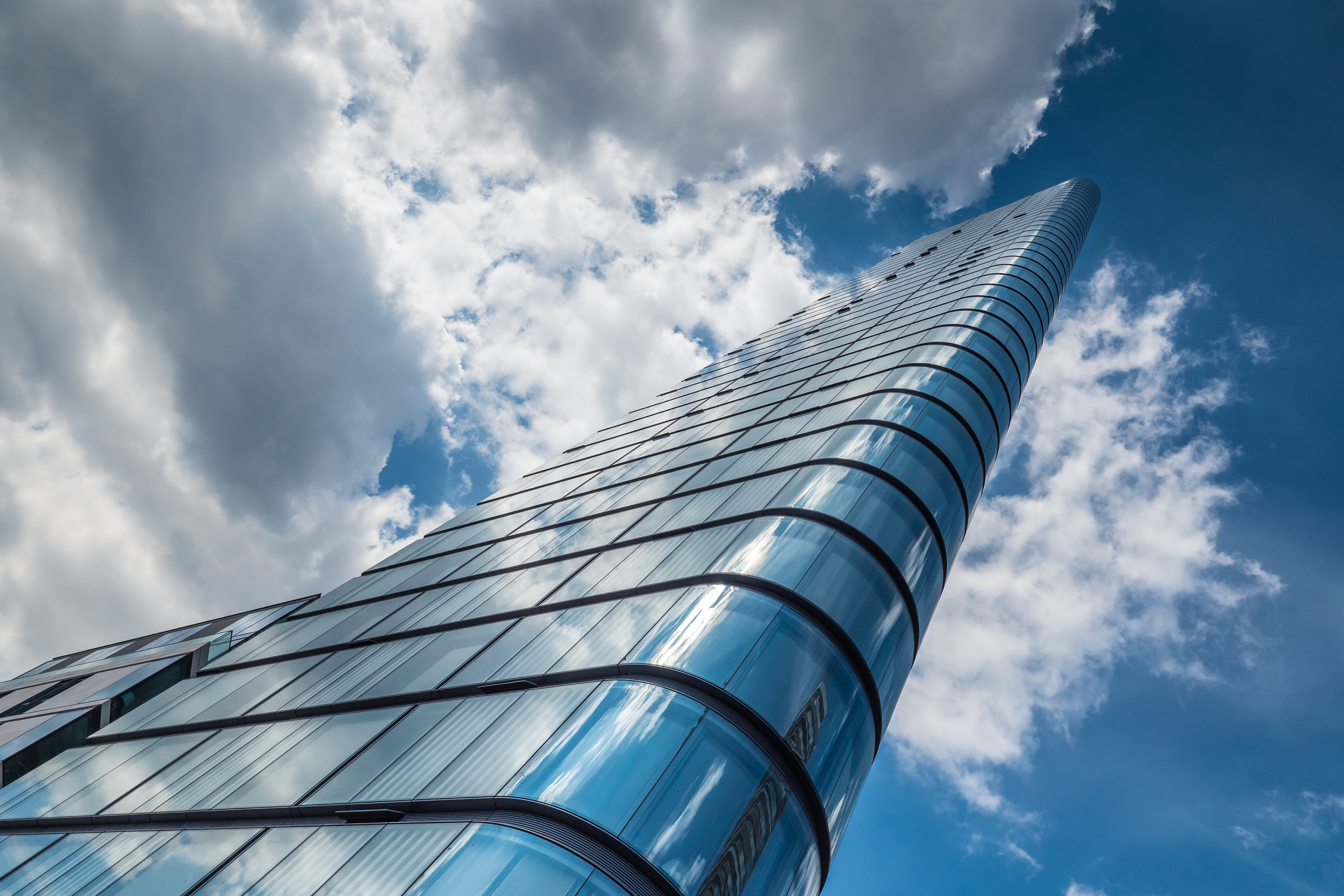
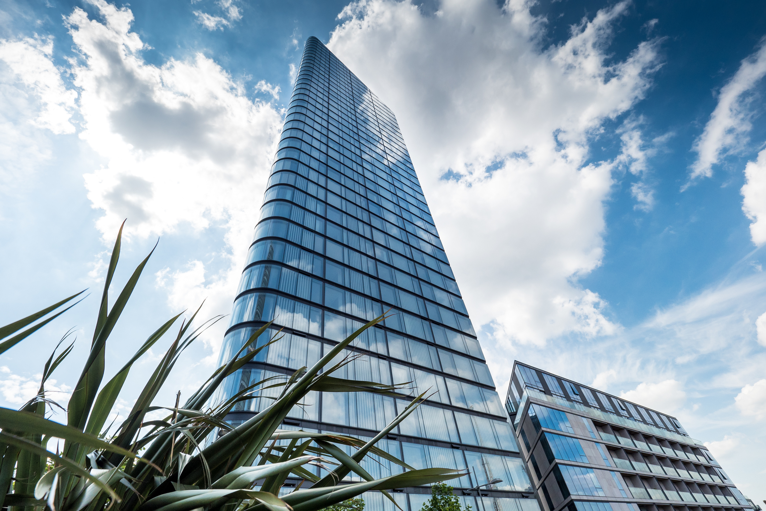
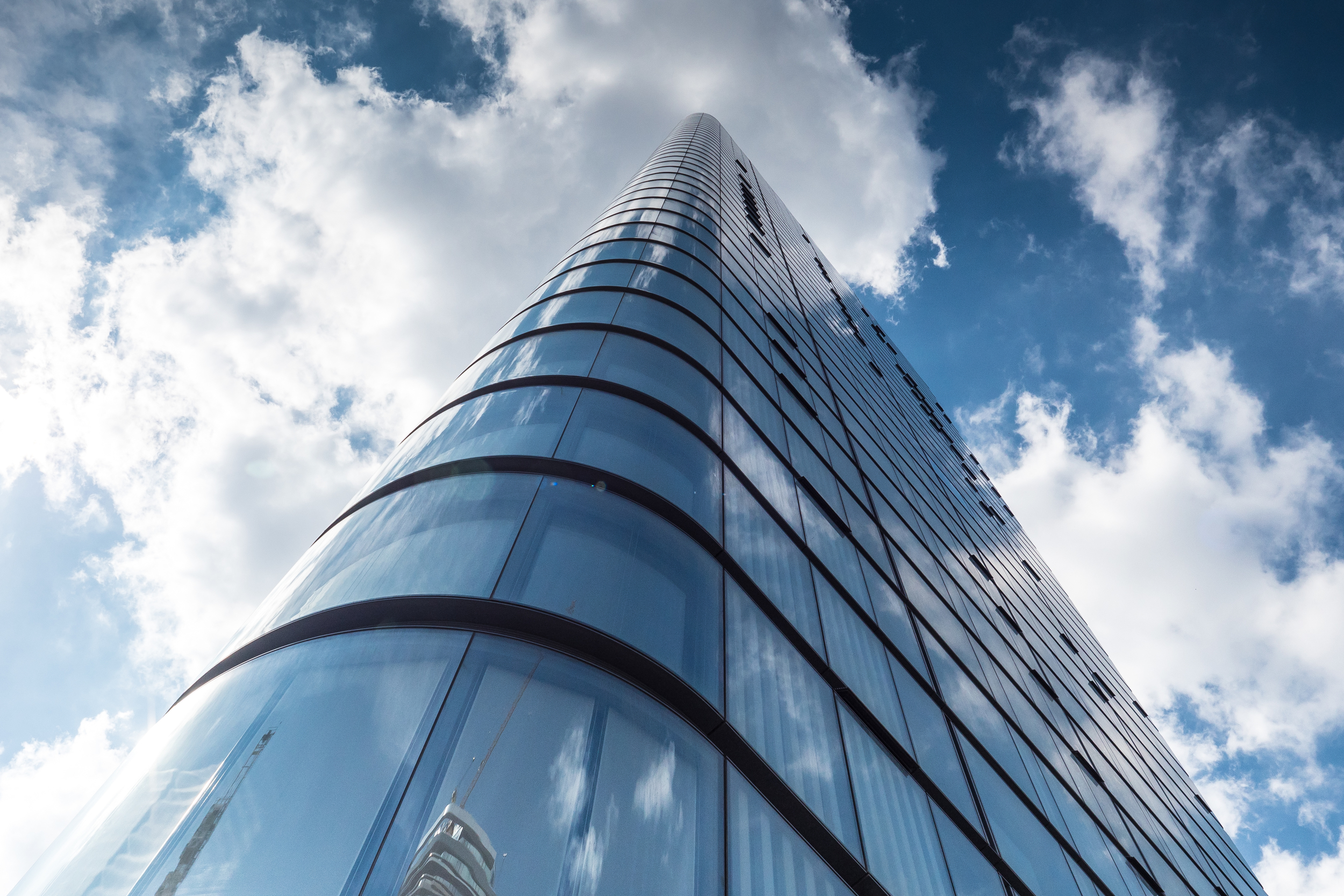
This sleek tower was designed by Skidmore Owings & Merrill (SOM) architects - the team behind the world’s current tallest building Dubai’s Burj Khalifa - and features both a high-rise and low-rise element. The Lexicon's minimal aesthetic is accented by its use of high quality materials, the façade being covered with a beautiful clear class which curves at the corner sections. There are 146, one, two and three bedroom luxury apartments within spread across the buildings 36 floors.

Lexicon Tower - Photography: Copyright © Alex Upton

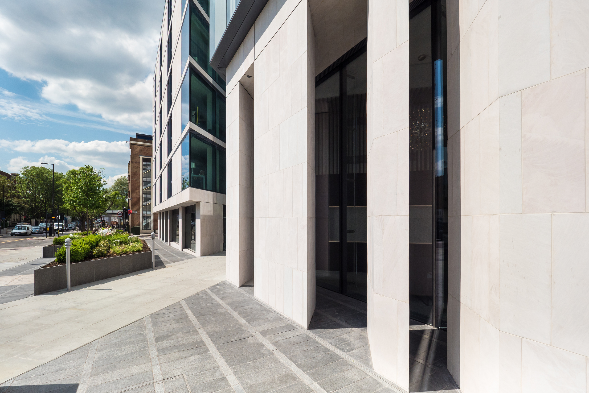
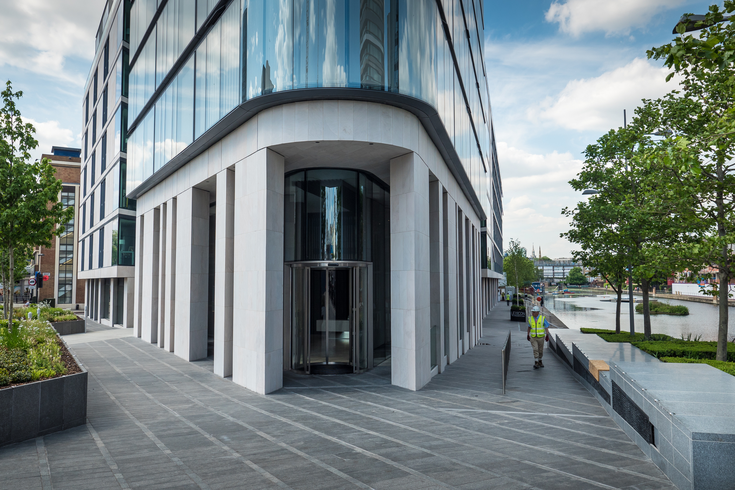
The stone clad detailing around the base of the tower becomes sharp and angular, cutting into he surrounding space projecting an interesting play between light and shadow. This lower portion of the building complements the more restrained and curvaceous upper portion by contrasting both form and materials, and in doing so breaks up the monotony of what could have been a singular design feature.

Lexicon Tower - Photography: Copyright © Alex Upton

I am looking forward to returning to this area over the coming years and photographing the new developments, most of which are still at the ground works stage. Once Lexicon and Canaletto are joined by Norman Foster's 250 City Road this small area will be home to some truly iconic architecture by three leading architectural practices.

Canaletto by UNStudio by Alex Upton

Canaletto 259 City Road - Photography: Copyright © Alex Upton

Development: Canaletto 259 City Road
Architects: UNStudio
Location: City Road, Islington, London
Height: 90m (31fl)

Canaletto 259 City Road - Photography: Copyright © Alex Upton

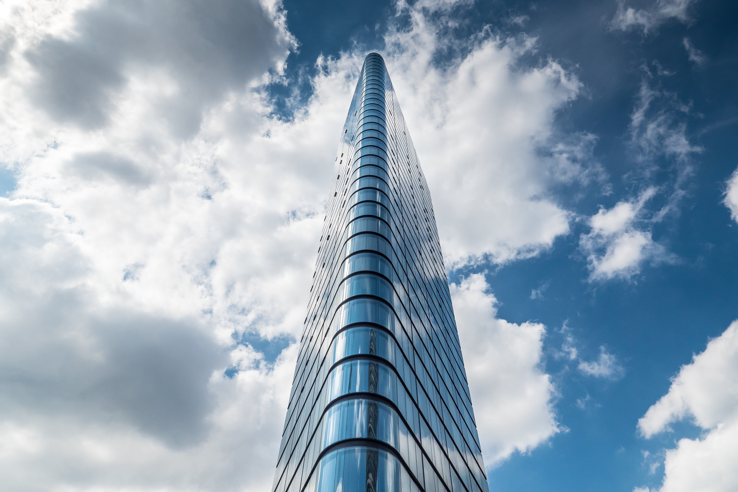
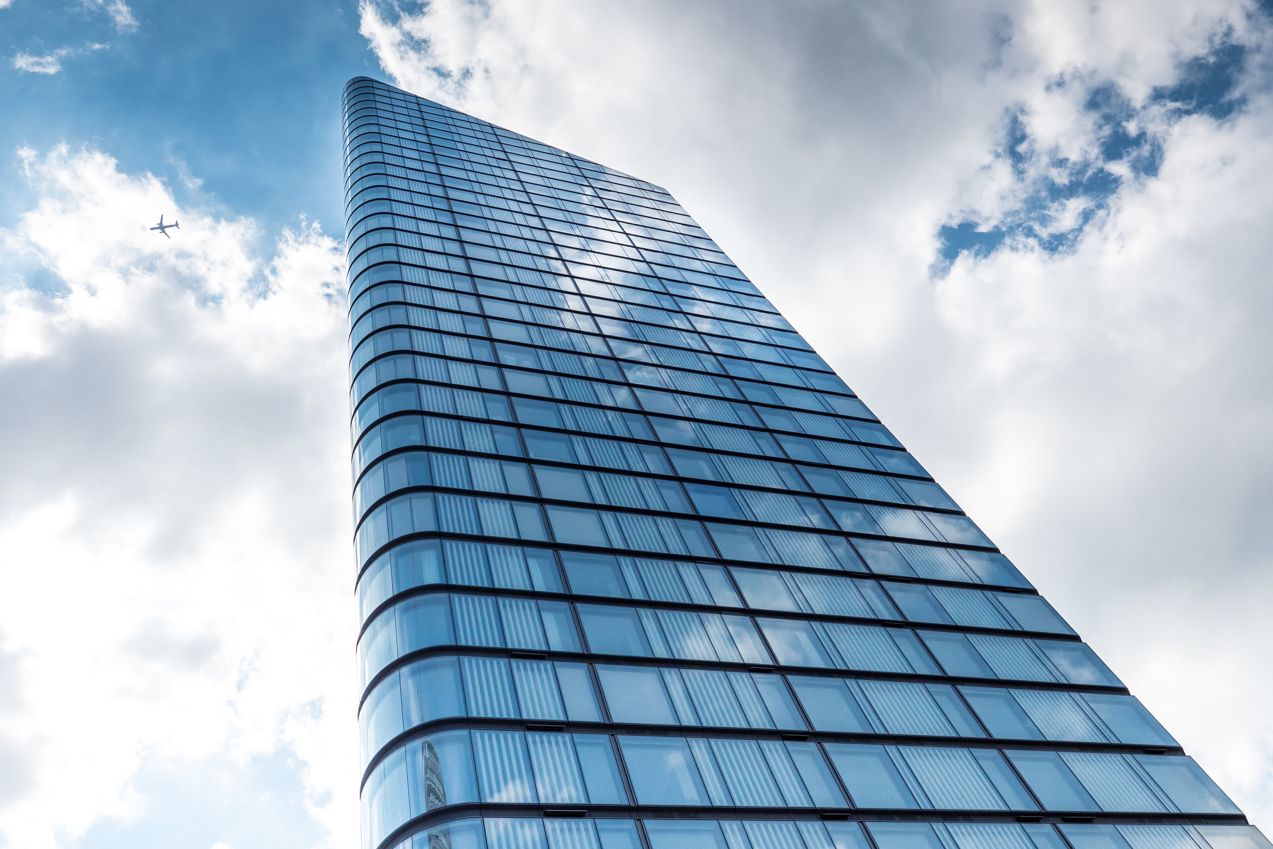
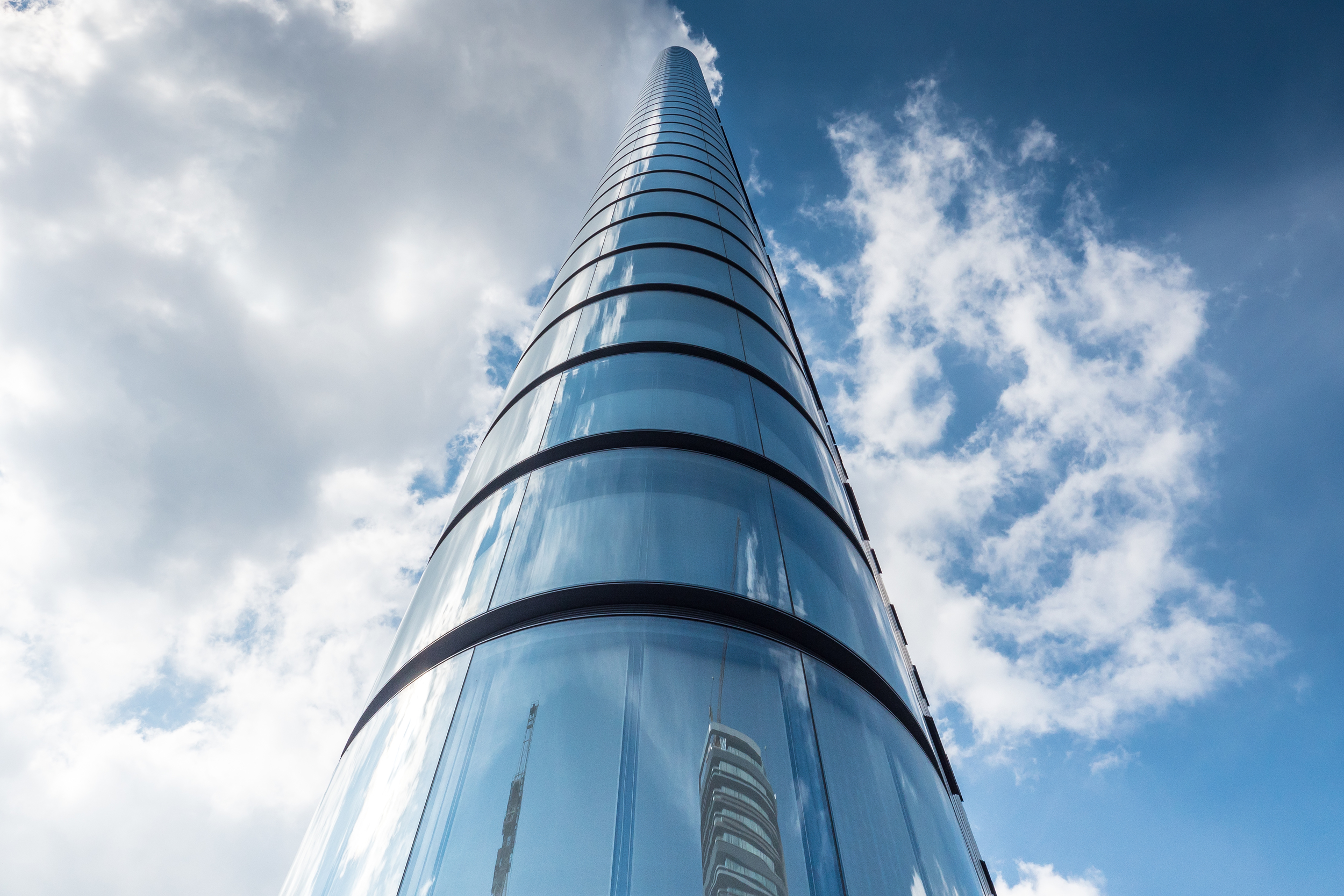
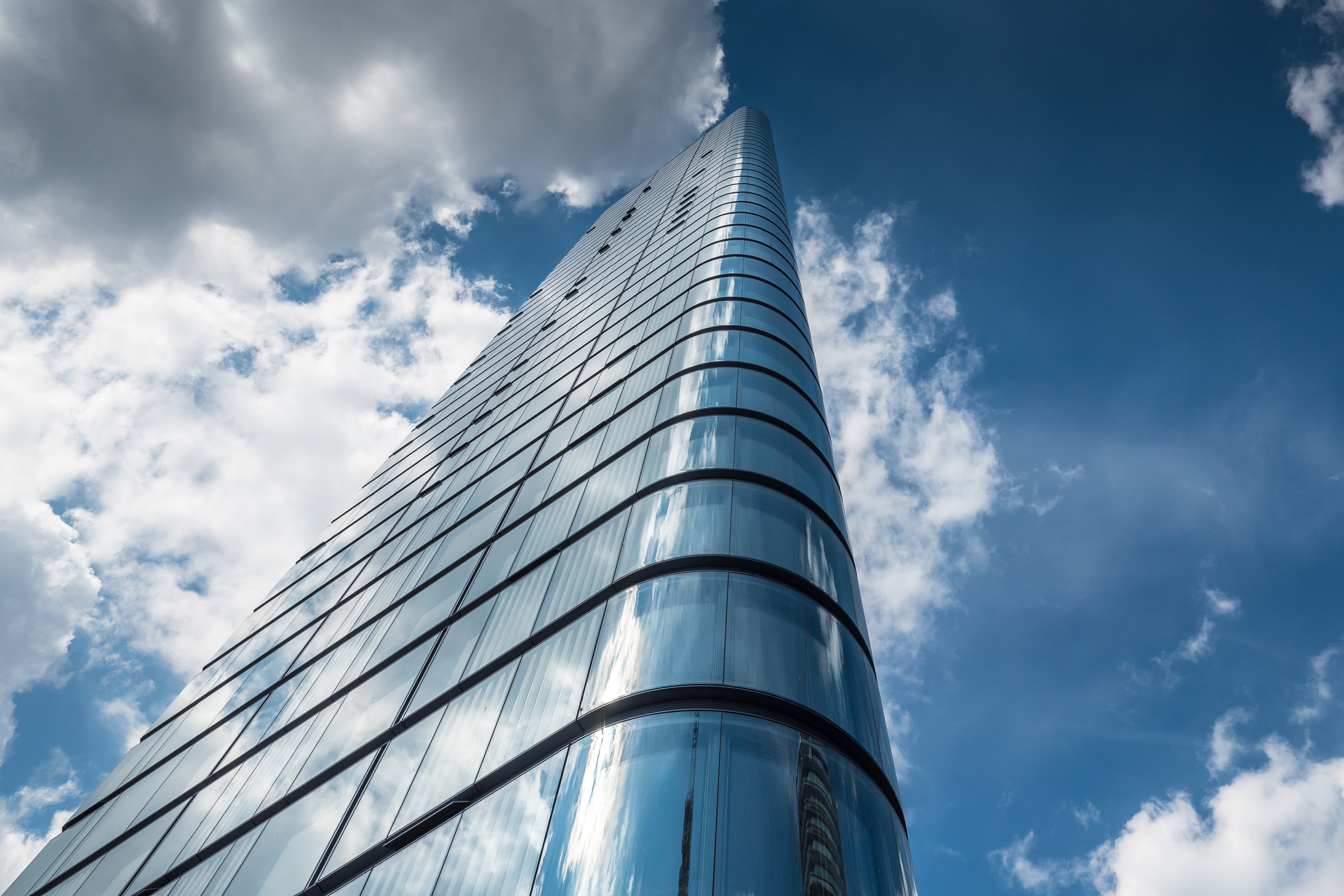
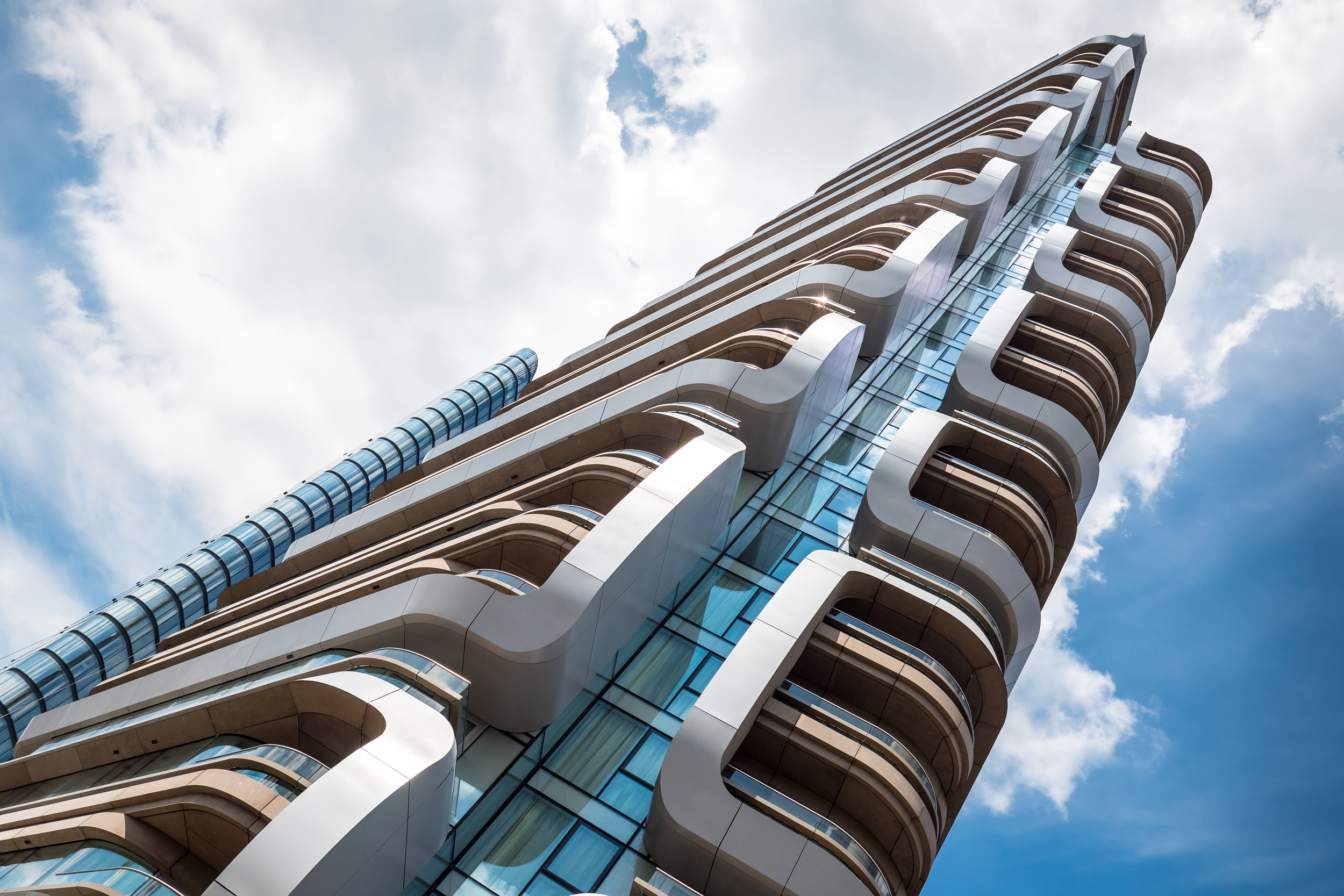
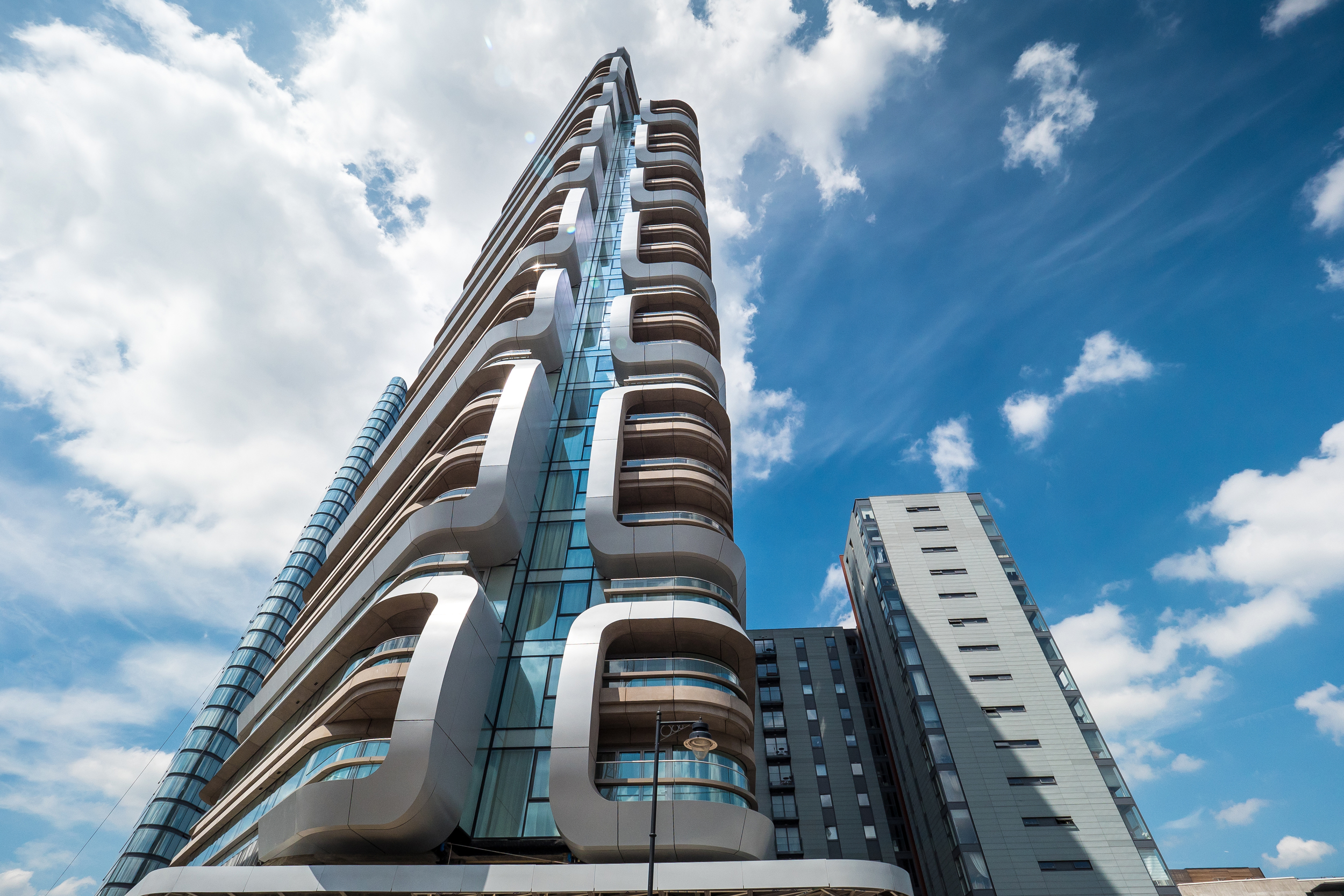
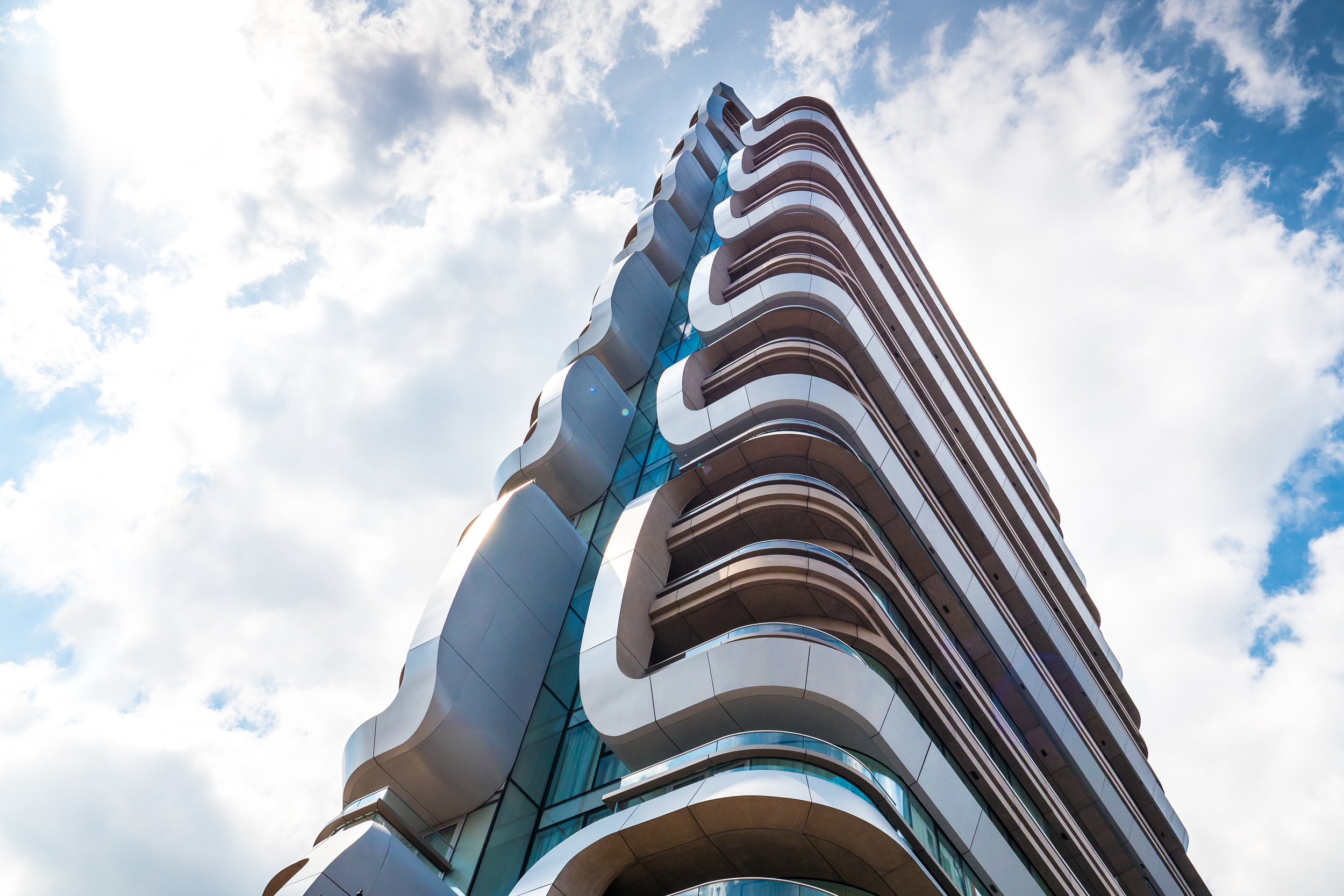
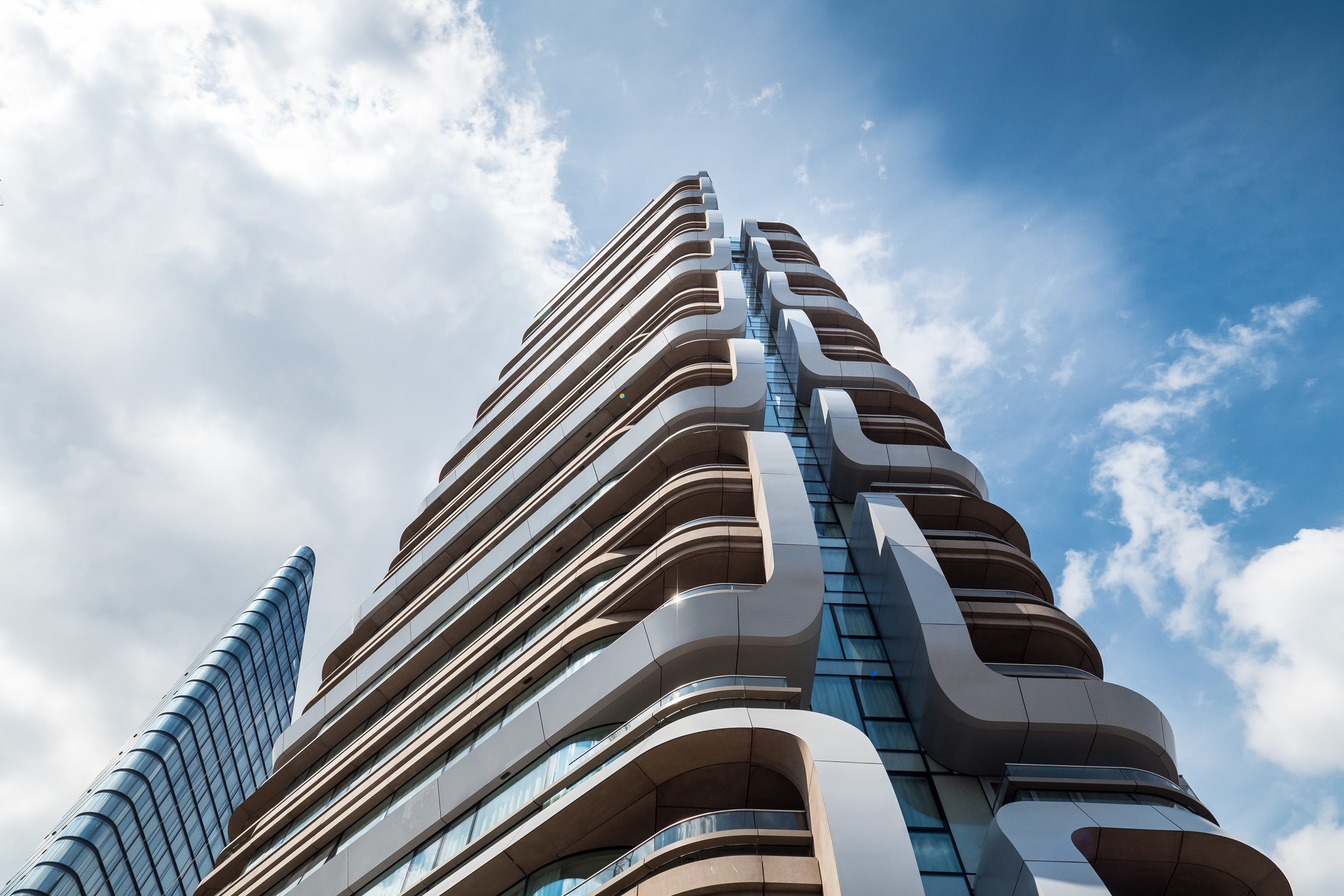
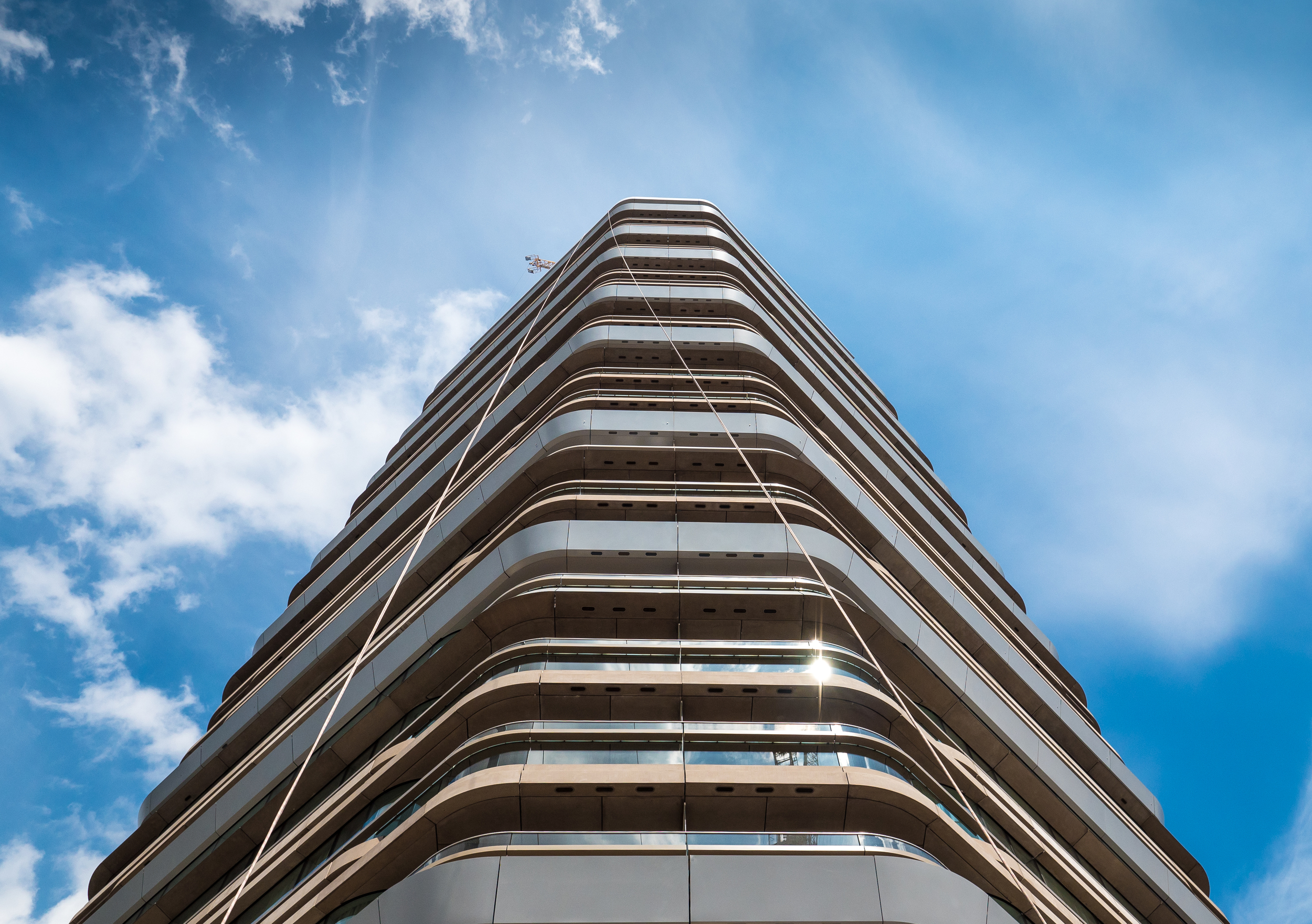
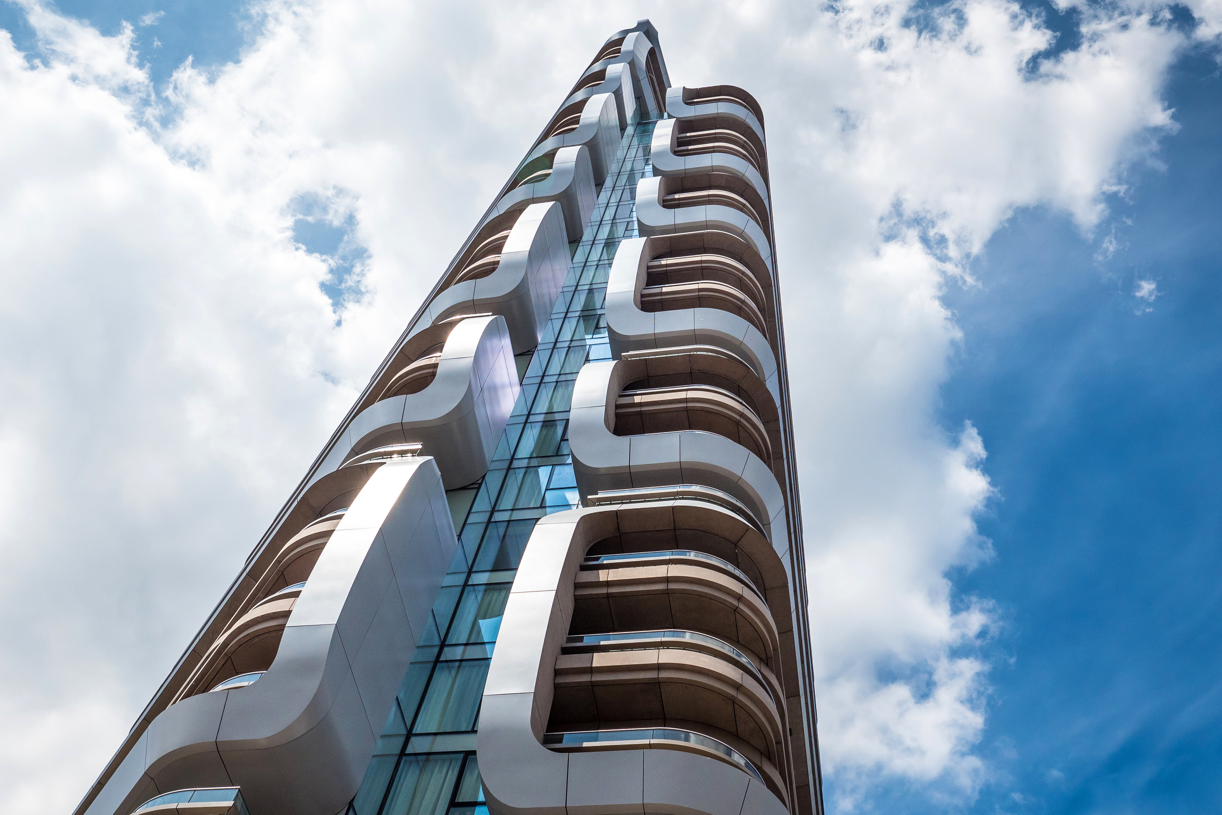
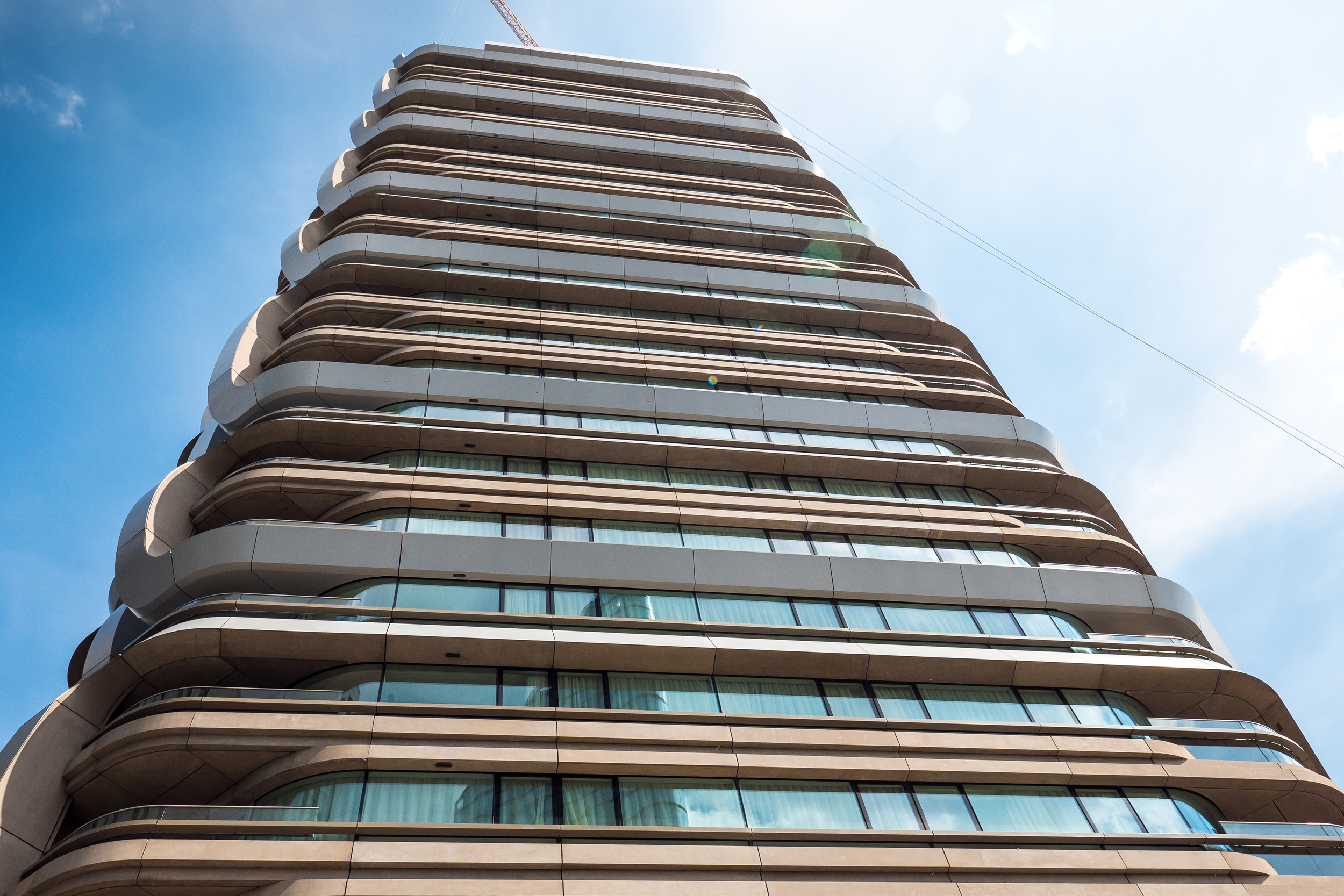
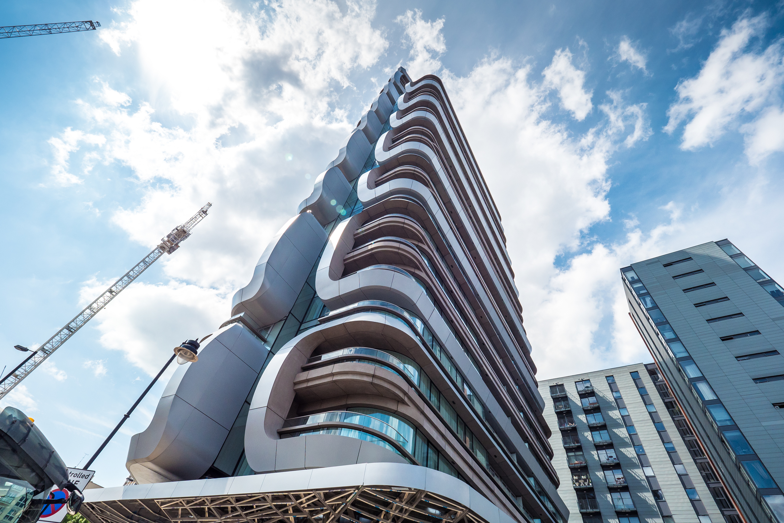
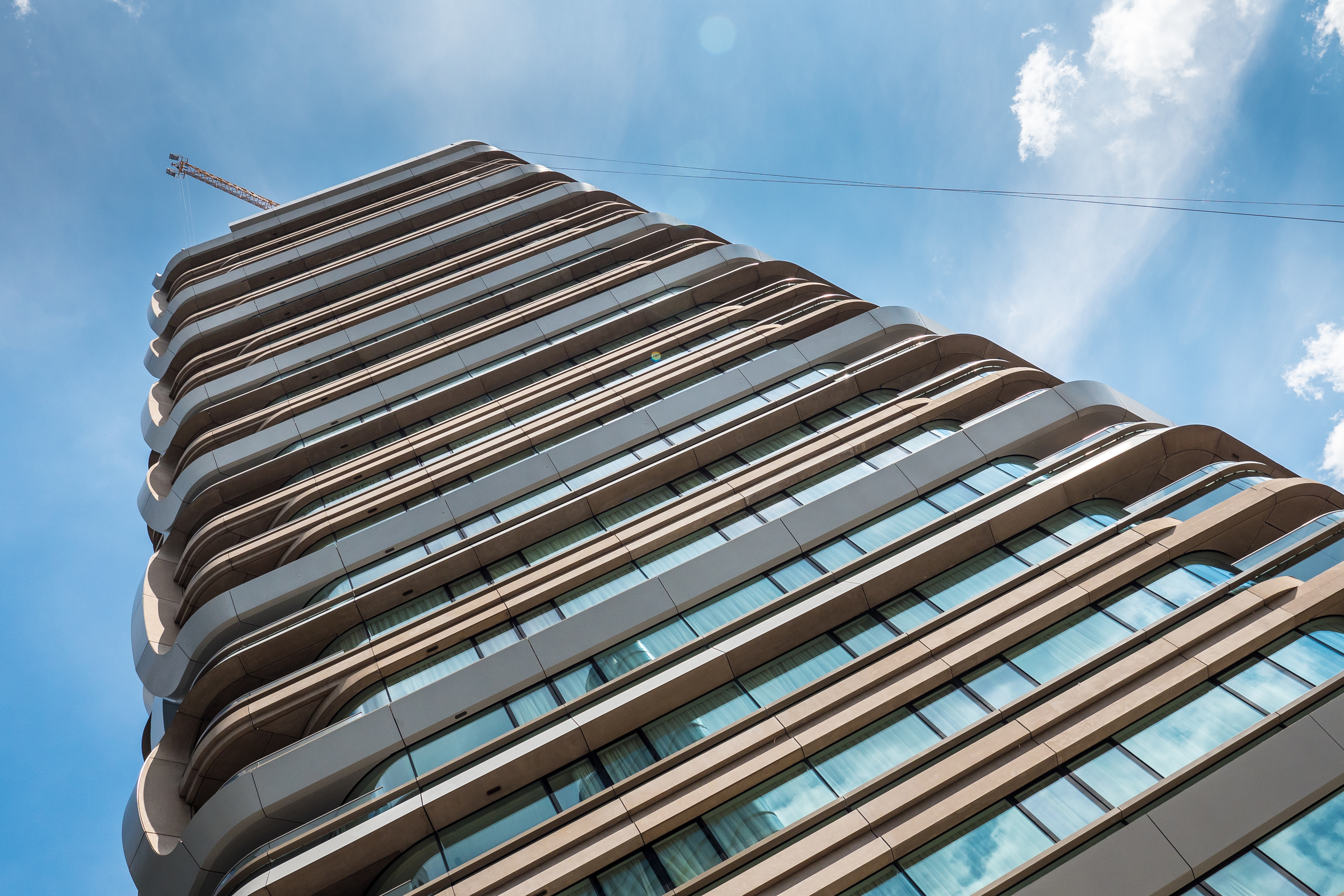
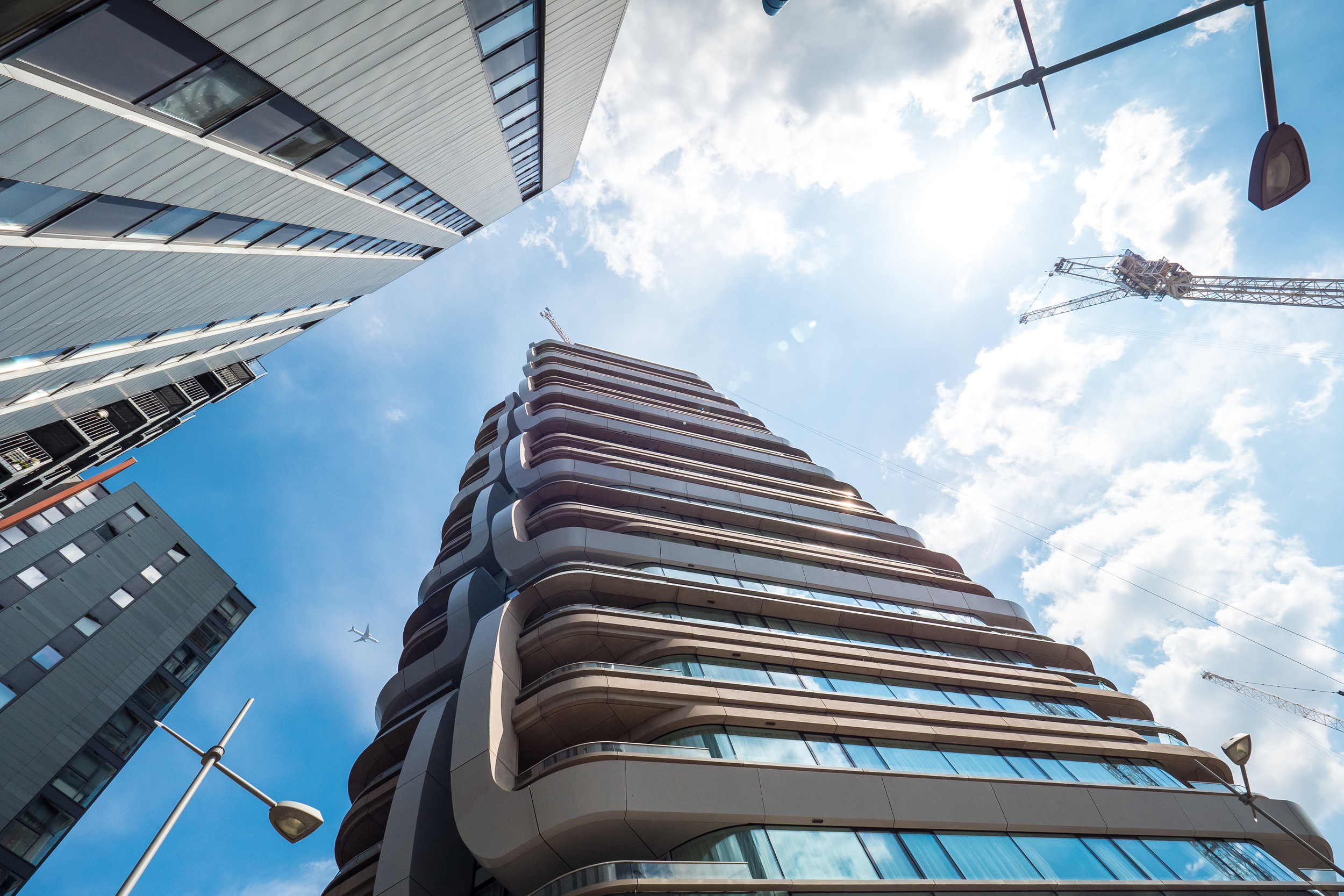
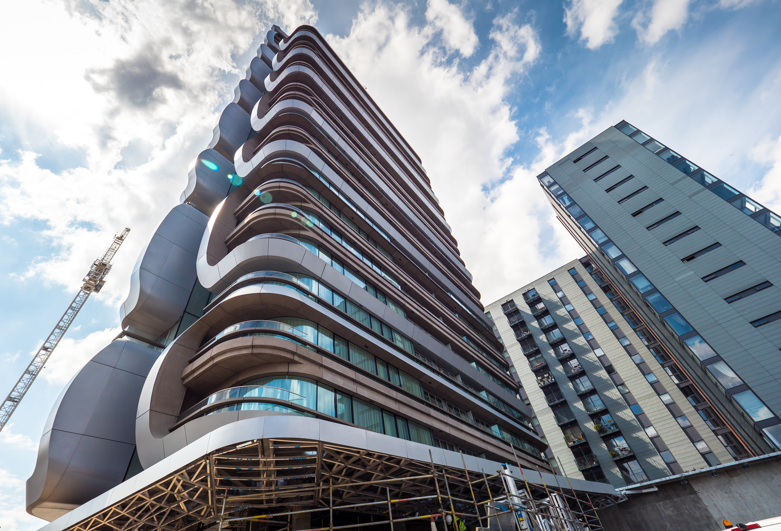
Canaletto is a residential tower designed by Dutch architect Ben van Berkel of UNStudio. The building is located at 259 City Road which borders on Islington, The City, Shoreditch and Clerkenwell. Construction is still on going with most of the work now taking place at the base of the tower where the concierge area is being fitted out, these architectural photographs capture Canaletto's current progress.

Canaletto 259 City Road - Photography: Copyright © Alex Upton

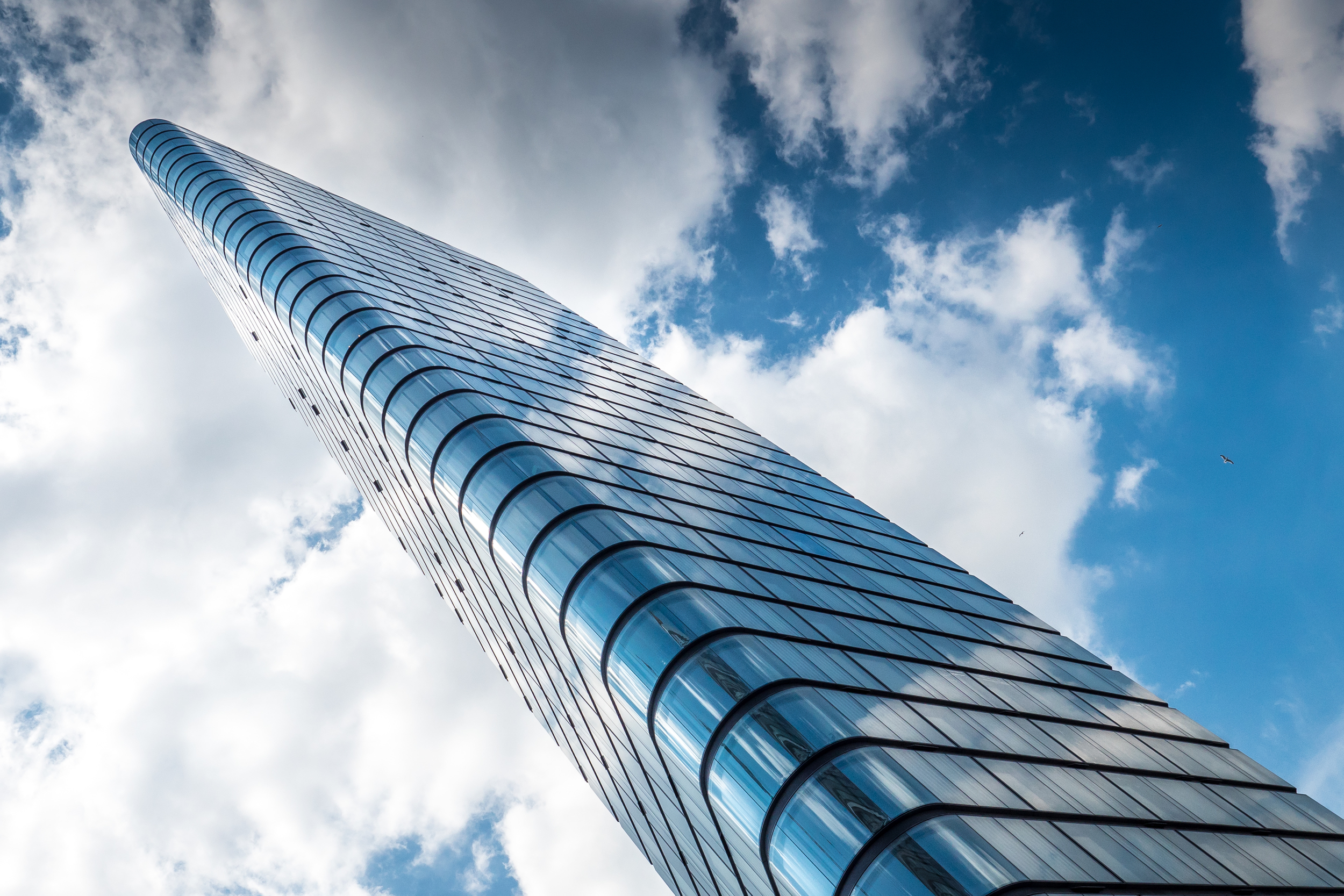
Returning from a trip to the recently opened Yayoi Kusama exhibition at the Victoria Miro Gallery - which for prospective residents is conveniently located a minuets walk from the Canaletto building along with a McDonald's Drive Thru, a real melting pot of high and low brow culture - i happened to chance upon these beautiful cloud formations passing over the tower. These photographs of Canaletto are the result of me trying to recalibrate my senses after being dazzled by Kusama's infinity mirror installations, which by the way are well worth a visit. 

Canaletto 259 City Road - Photography: Copyright © Alex Upton

The lucky residents of this tower will have access to a wide range of facilities including what will be a stylish restaurant, private screening room, swimming pool and gymnasium and a 24th floor private club and sky terrace. The innovative design by UNStudio incorporates balconies into the linear and somewhat bulbous chrome clad panels that wrap around the buildings façade, which according to the architects create 'sustainability benefits achieved through surface modelling, with opportunities for shading, balancing good internal daylight and views with reduced heat gains'. Along with their sustainable credentials these panels produce some beautiful forms which for and architectural photographer offer endless opportunities for new and exciting compositions.

Canaletto 259 City Road - Photography: Copyright © Alex Upton

Canaletto is located in an area which is currently seeing a lot of developments start to rise, with Foster and Partners 250 City Road residential apartments just beginning to break ground over the road and the adjacent Lexicon building also nearing completion - for which a photograph update will follow shortly. 

Canaletto 259 City Road - Photography: Copyright © Alex Upton