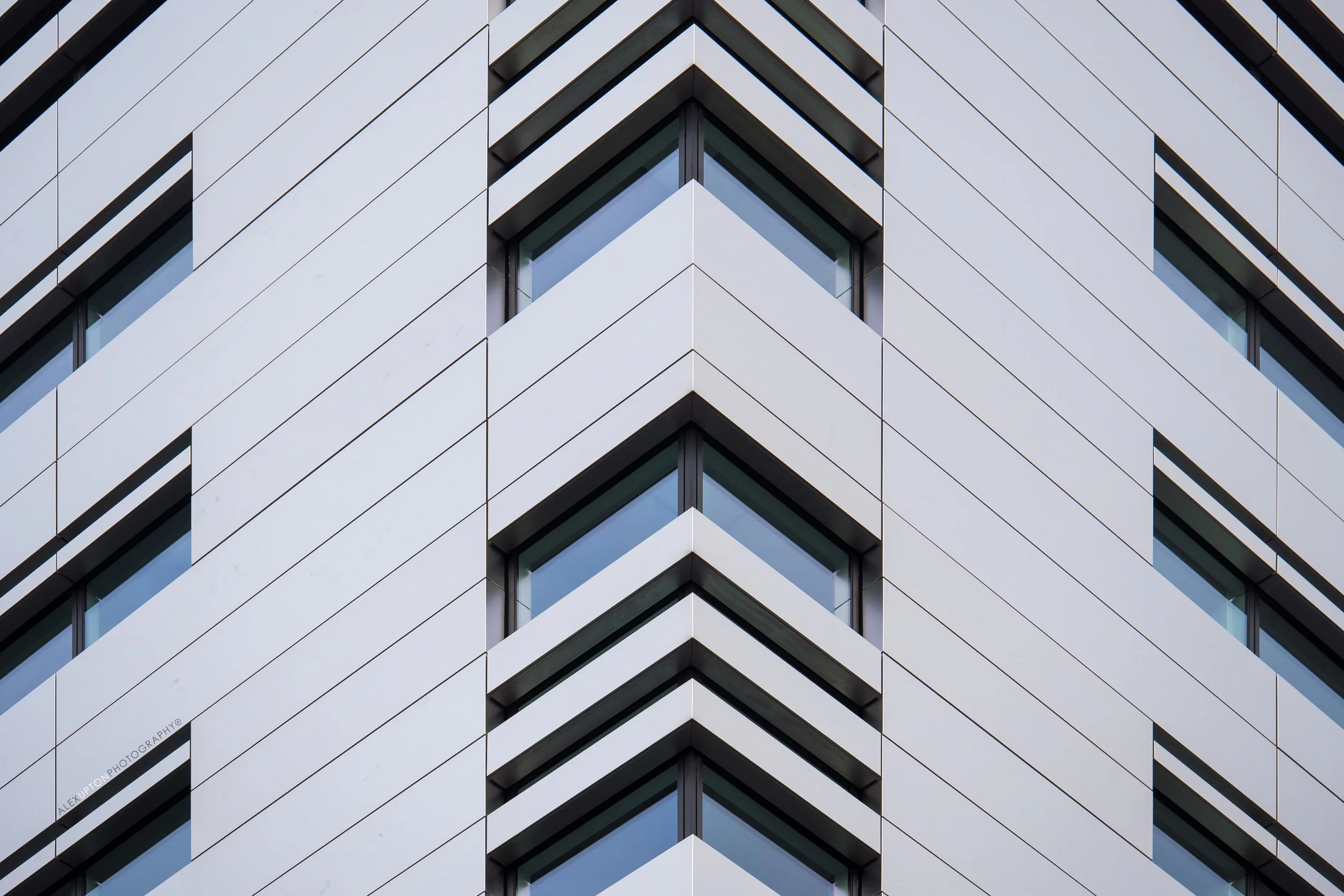
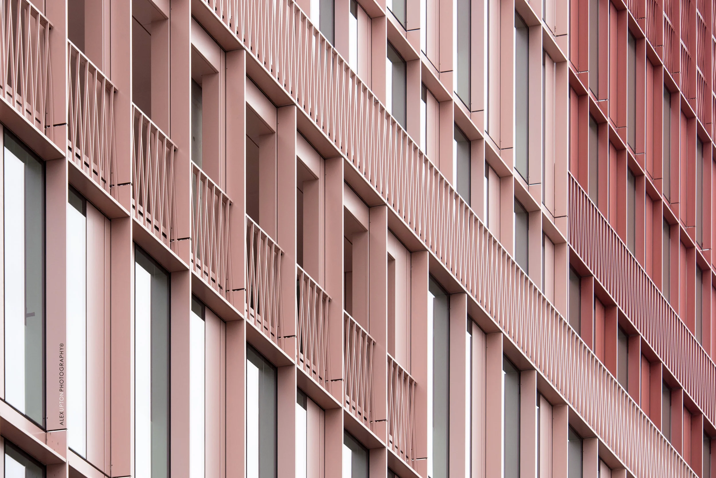
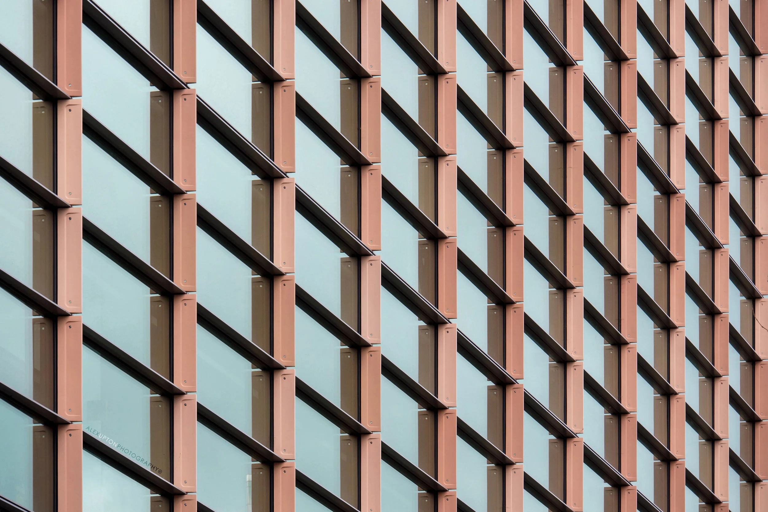
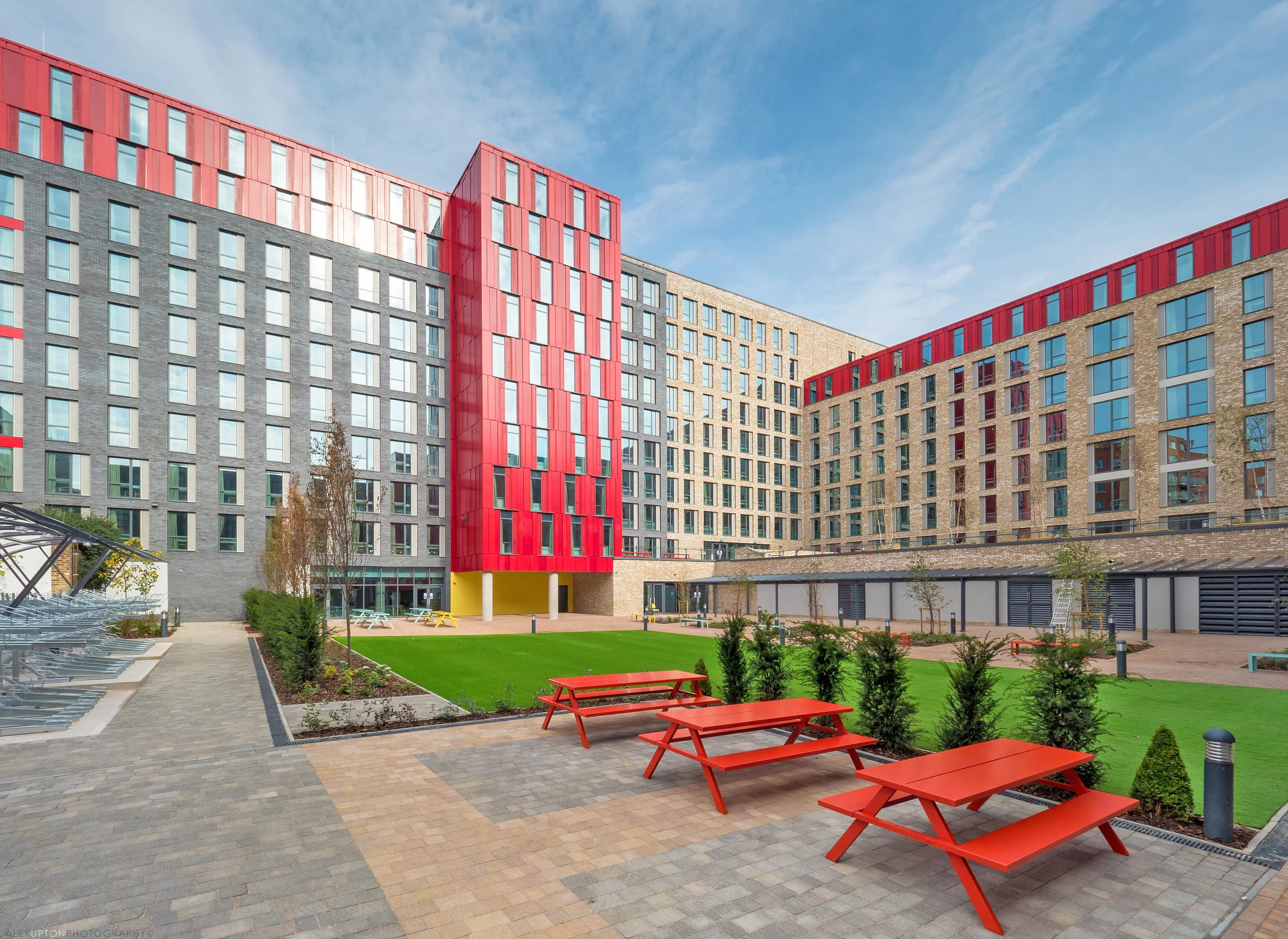
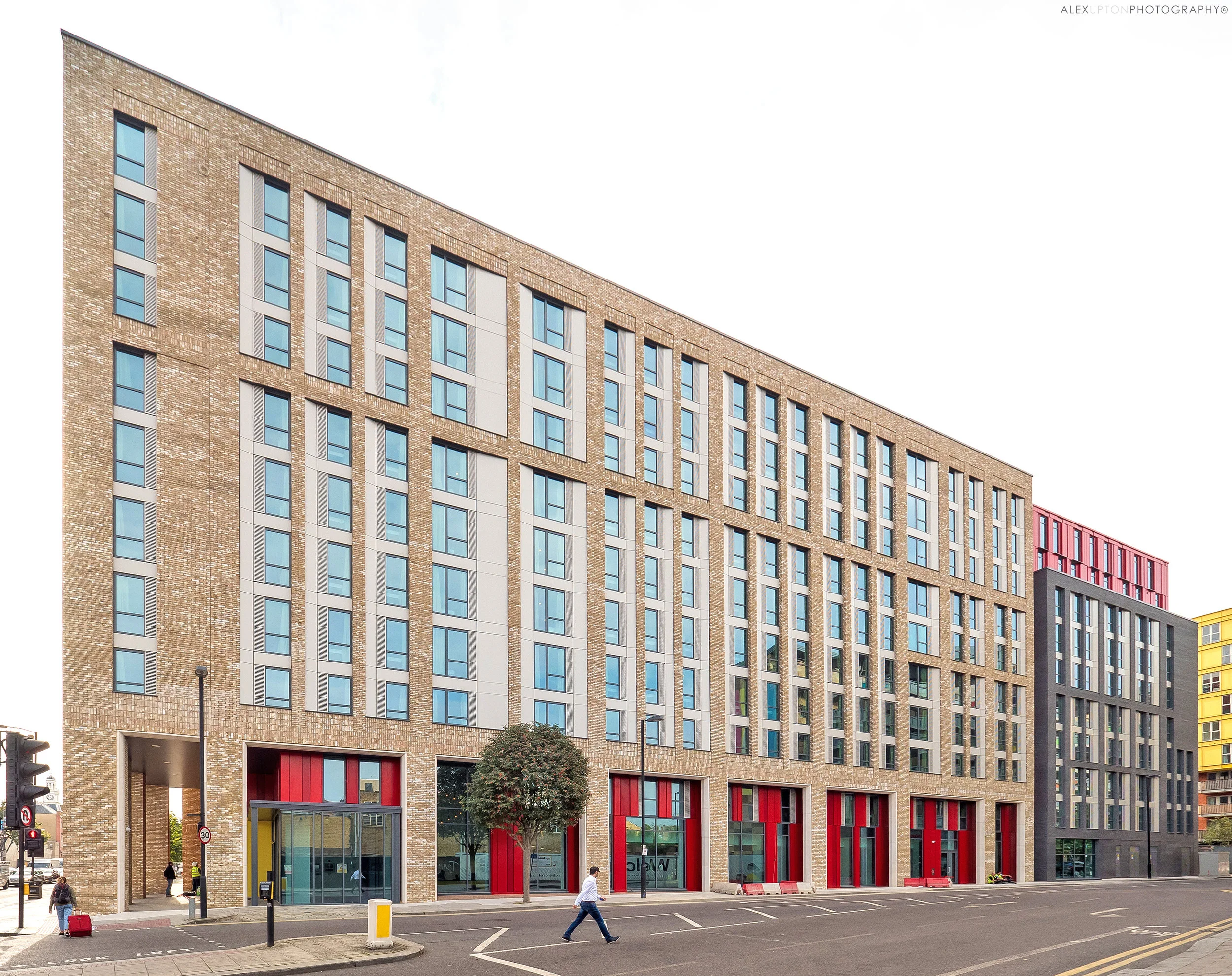
Hercules House Park Plaza Hotel by ESA Architecture by Alex Upton

Hercules House Park Plaza Hotel by ESA Architecture - Copyright © Alex Upton

Hercules House Park Plaza Hotel by ESA Architecture - Copyright © Alex Upton

Architectural Photography of Hercules House, Park Plaza Hotel

Location: Hercules Road, Waterloo, London
Architect: ESA Architecture
Developer: Park Plaza Hotels Europe
Client: Taylor Maxwell

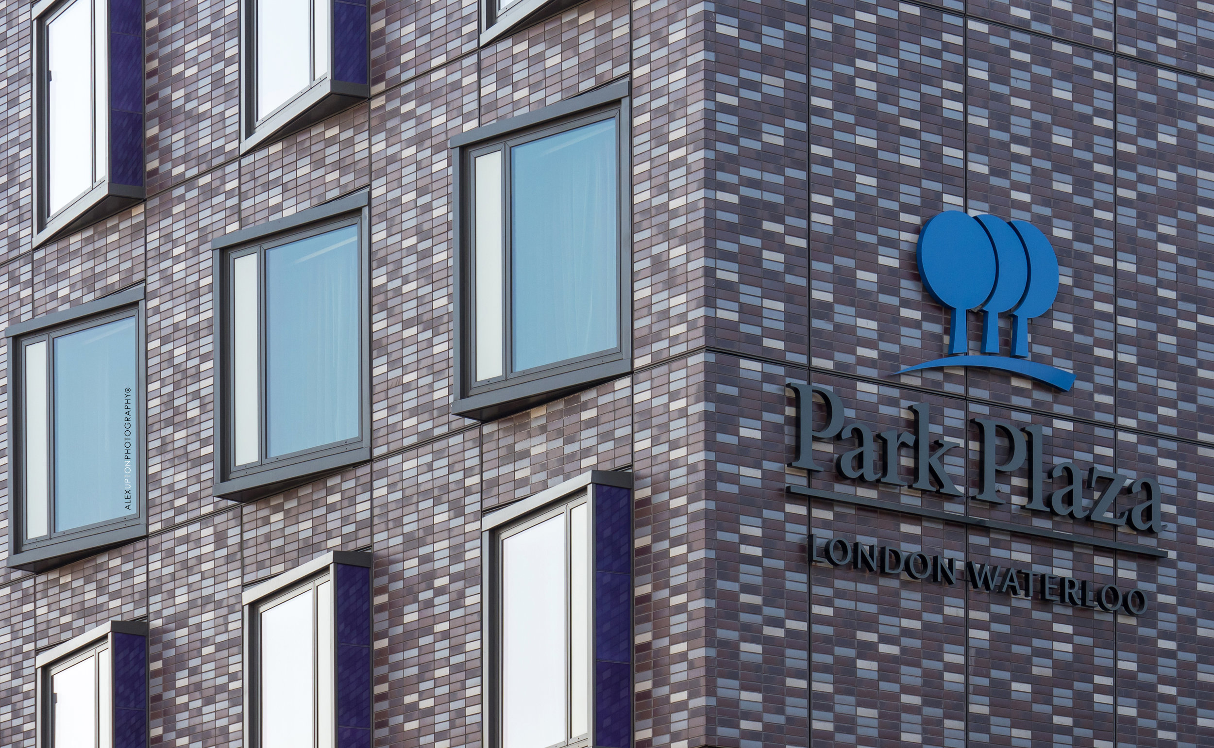
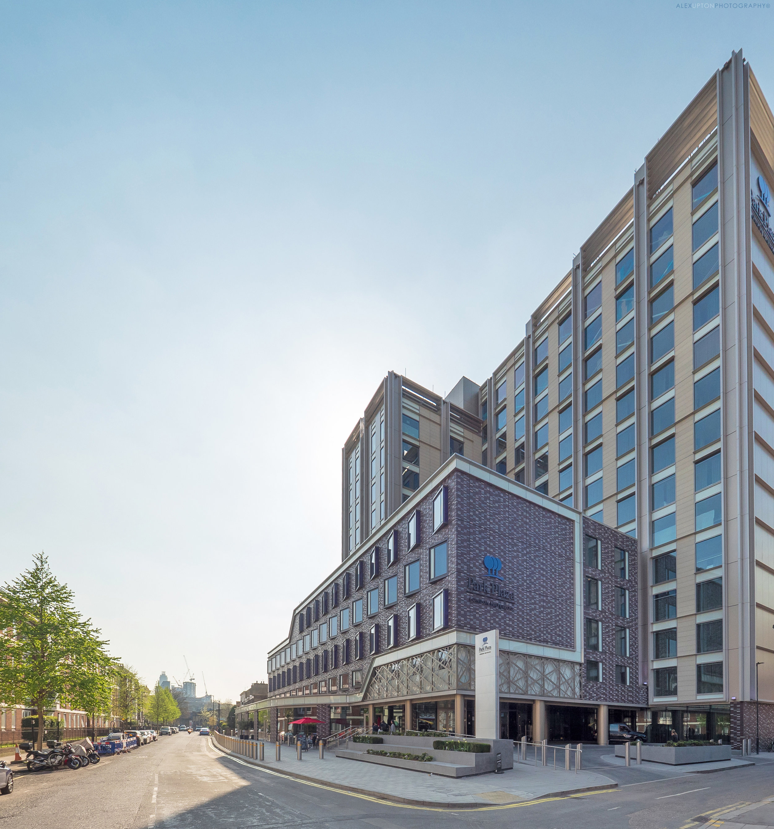
In keeping with the theme of my recent posts, Hercules House is another redevelopment of a former office building, this one originally built in the 1960's, which now finds a new lease of life as a 500 room Park Plaza Hotel. In light of this repeated evidence, it would appear London's tired, forlorn architecture from the later half of the 20th century is everywhere, quietly shedding its drab skin in the manner of a despondent concrete reptile and eagerly sliding into sleek new outfits befitting of the 21st century.

The redevelopment of Hercules House was undertaken by London architectural and design practice ESA Architecture. Its central location, just south of Waterloo and the river bank provides convenient, accessibility to many of London's tourist attractions.

Hercules House, Facade Detail - Copyright © Alex Upton

Hercules House, Facade Detail - Copyright © Alex Upton

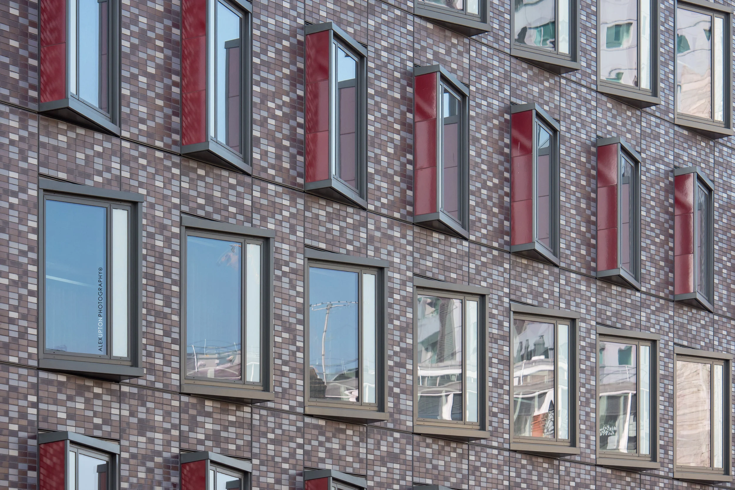
The building is composed of two distinct elements; the lower half that fronts the road is adorned with a purple Corium cladding system, supplied by the client Taylor Maxwell and subject of my photography, while the upper half, which sits to the back of the structure rises several storeys higher. The windows on the lower portion are notable for their alternating, diagonal protrusions, which defiantly reject conformity to the structures otherwise flat horizontal plane.

Hercules House, Cladding Detail - Copyright © Alex Upton

Hercules House, Cladding Detail - Copyright © Alex Upton

Notes on the Photography

Like many of the buildings i happen to find myself photographing in London, Hercules House was located on a fairly compact site and offers limited viewing points from which the building, in its entirety, can be shot. It just so often happens, that the ideal position for taking the photograph is in the middle of a precarious road junction, where life and limb have to be risked for the sake of the perfect image, who said architectural photography was a profession for the timid? 

After such adrenalin inducing circumstances it seemed appropriate to return to a state of calm by sampling the delicacies in the Hotels public cafe, which runs along the ground floor of the building, below the rooms with the excited windows. After a rather embarrassing attempt at ordering a Salmon sandwich in the convoluted, suspiciously French sounding nomenclature penned on the surface of a tiny sheet of white card and plunged into the bread on a cocktail stick - like a for sale sign outside a French Mansion - i took a seat in the impressively decorated interior. It was at this point that i felt a little dismayed that i was only there to photograph the exterior as from what I could see the interior was very impressive indeed and merited further exploration.

Hercules House, Front Elevation - Copyright © Alex Upton

Hercules House, Front Elevation - Copyright © Alex Upton

It is hoped Hercules House will be a catalyst to further regeneration in the area. For now it provides a impressive space for tourists visiting London as well as for locals wishing to sample the food on offer in the cafe, bar and restaurant. ESA Architects considered use of colour in the cladding and the separation of the mass into distinct parts provides an nice aesthetic and is a welcome improvement to what was a former, no-descript office building.
Seventy Wilson by Astudio Architects by Alex Upton

Seventy Wilson by Astudio Architects - Copyright © Alex Upton

Seventy Wilson by Astudio Architects - Copyright © Alex Upton

Architectural Photography of Seventy Wilson

Location: 70 Wilson Street, London
Architect: Astudio
Developer: Stanhope / Threadneedle / Low Carbon Workplace Trust

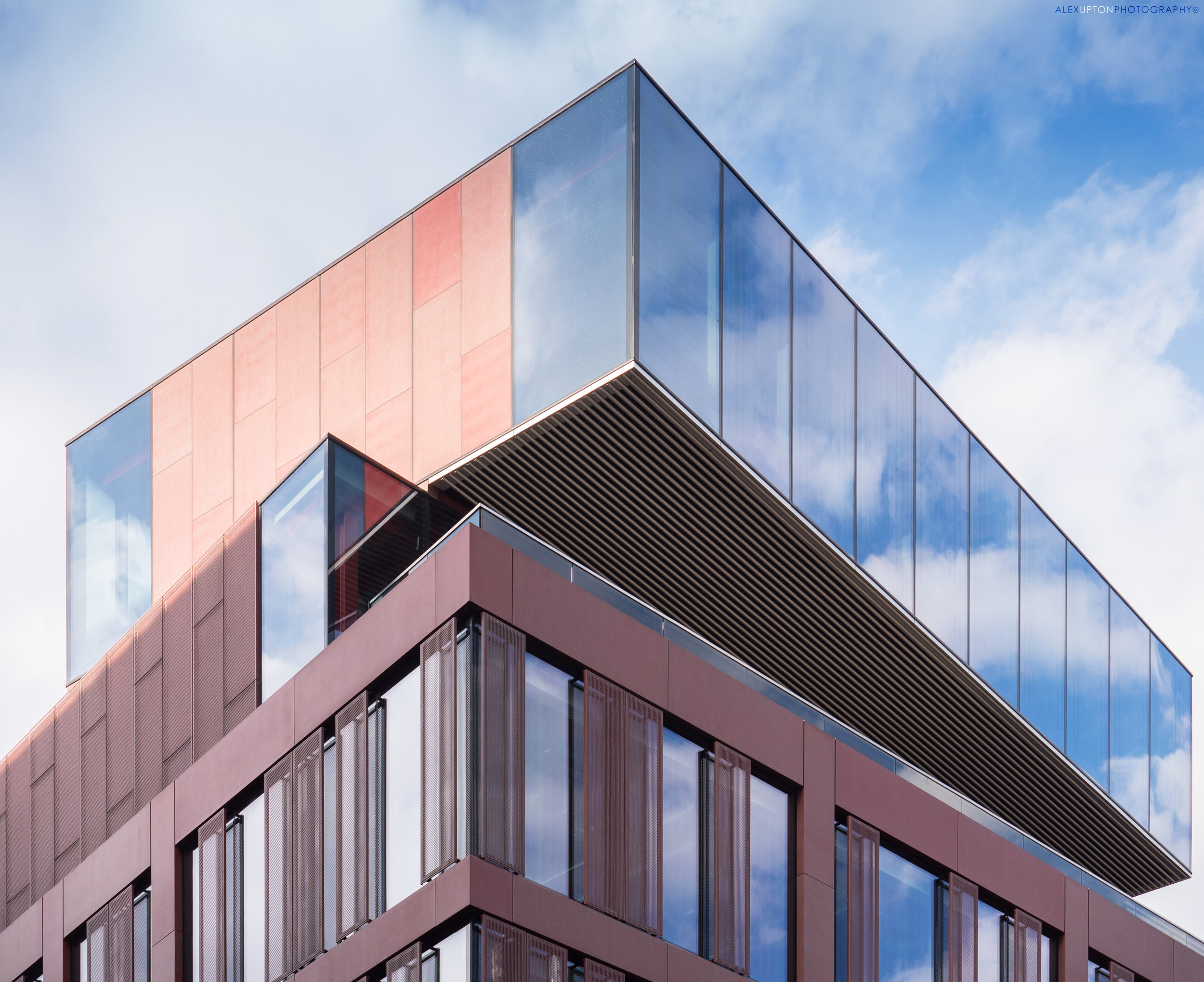
I encountered the small architectural gem that is Seventy Wilson purely by chance, when for reasons which evade memory, I diverged en route from my all to familiar amble back to Liverpool Street Station via Broadgate. The building, designed by London architectural practice Astudio, is located on Wilson Street and replaces a 1980's office development once known as Summit House. Incorporated into the new office is the grade II listed, 4-storey building visible to its left. The fortuitous excursion that led to these architectural photographs of Seventy Wilson was also aided by a momentary break from the rain, the clouds parting just above the building as I walked past, as if inviting me to photograph it in all its rain soaked splendor.

Seventy Wilson Street View - Copyright © Alex Upton

Seventy Wilson Street View - Copyright © Alex Upton

Rather than completely demolishing the original structure the new building is in fact a refurbishment and extension of the original, which, considering its radically divergent appearance is quite an achievement. It also boasts enviromentally friendly credentials, Astudio having worked in collaboration with Low Carbon Workplace to create a highly efficient office space, which achieved a BREEAM Excellent rating based on its low carbon standards.

Seventy Wilson Roof Detail - Copyright © Alex Upton

Seventy Wilson Roof Detail - Copyright © Alex Upton

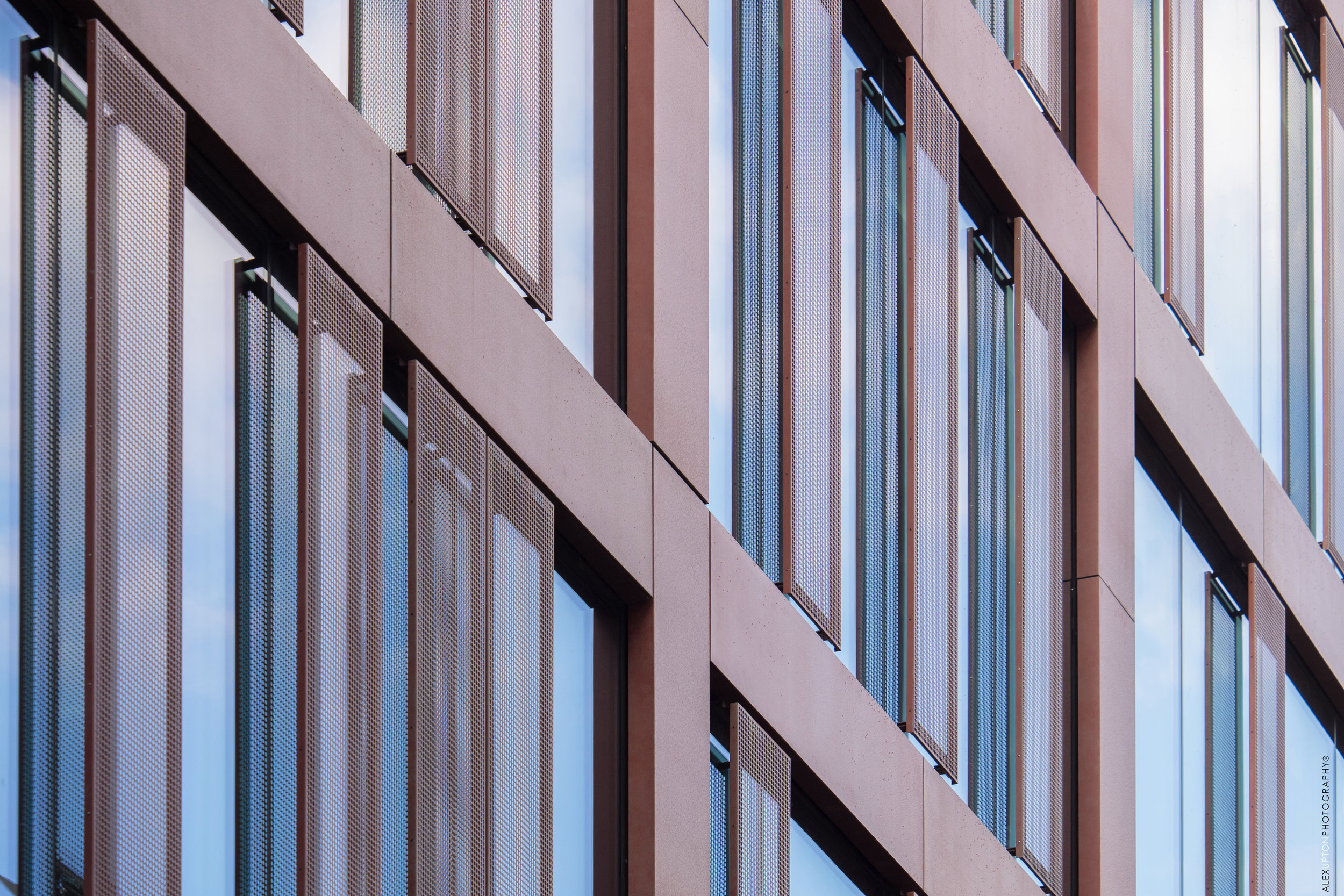
The building's distinctive roof is just one of its many defining features, with rectangular, glass blocks seemingly pivoted on top of one another at opposing angles. The reflective glass beautifully captures the sky, while panels of pastel red cladding, some perforated, add interest to the facade. The building also incorporates a deceptive feature, as one walks past the refurbished Grade II listed building it at first appears to come to an end, but after a few steps down Worship Street it magically reappears, albeit in a somewhat different form and composition. Unfortunately, by the time I had made this discovery the rain had stubbornly resumed and hence no photographs exist to evidence it.

Seventy Wilson Facade Detail - Copyright © Alex Upton

Seventy Wilson Facade Detail - Copyright © Alex Upton

Seventy Wilson, while possessing a name reminiscent of a 1980's production-line robot, is a wonderful building, which has utilised the existing structure and incorporated the Grade II listed element to great effect. It plays with levels, form and material in a unique way and offers technology companies a generous 71,000 sq ft of energy efficient, modern workspace. It is a great addition to the area and worth returning to, I will therefore endeavor to photograph the other elevation at a later date.

103-109 Wardour Street by Sheppard Robson by Alex Upton

103-109 Wardour Street, Soho by Sheppard Robson -  Copyright © Alex Upton

103-109 Wardour Street, Soho by Sheppard Robson -  Copyright © Alex Upton

Architectural Photography of 103-109 Wardour Street

Location: 103-109 Wardour Street, Soho, London.
Architect / Client: Sheppard Robson
Developer: Legal & General Investment Management

103-109 Wardour Street, once home to Pathé Films has been transformed by Sheppard Robson Architects and their interior division ID:SR Interiors into 13 luxury apartments, a gym and two duplex penthouses. I was recently commissioned by Sheppard Robson to photograph the road side elevation which features the beautifully restored Portland Stone Edwardian facade. This was not the first intervention to give the early 1900's building a new lease of life, in 1996 all but the frontage had been removed and replaced with a structure of somewhat lesser design quality. Sheppard Robson's approach has been to create a more coherent rapport between the facade and the rest of the building, maintaining a consistency of quality while still being unabashedly modern in its approach.   

103-109 Wardour Street Facade Detail -  Copyright © Alex Upton

103-109 Wardour Street Facade Detail -  Copyright © Alex Upton

Notes on the Photography

The building is located in the vibrant district of Soho along a dense stretch of narrow road. The window for photographing the building under the ideal lighting conditions was narrow and coincided with the early morning deliveries being made to replenish the local cafes and bistros. With several parking spaces inconveniently acting as magnets for delivery vans and other four wheeled obstructions, it was no easy task to photograph, especially when compounded by its proximity to the adjacent buildings. Timing, agility and awareness were once again pushed to their limits, which led to a spontaneously choreographed performance between photographer, impatient van driver and, don't block my way, i'm late for work, city worker.

103-109 Wardour Street Arched Window Detail -  Copyright © Alex Upton

103-109 Wardour Street Arched Window Detail -  Copyright © Alex Upton

The original detailing on the facade, from the stone-work to the intricate lead spacers between the window panels is now harmonious with the opulence of the newly created interior. In addition to its aesthetic qualities the building also offers high sustainability credentials, achieving BREEAM Eco-homes Excellent for the refurbished elements. With the respectful marriage of classic and modern elements architects Sheppard Robson have created a high quality space which will no doubt be a highly desirable place to live.

Belmont House Refurbishment by TP Bennett by Alex Upton

Belmont House, Uxbridge by TP Bennett -  Copyright © Alex Upton

Belmont House, Uxbridge by TP Bennett -  Copyright © Alex Upton

Architectural Photography of Belmont House

Location: Belmont Road, Uxbridge, London.
Architect: TP Bennett
Developer: Aviva Investors
Clinet: Taylor Maxwell

As winter was drawing to a close i received a commission by client Taylor Maxwell to photograph Belmont House, located in Uxbridge Town Centre, West London. Upon my arrival i experienced a flashback to one of my previous architectural photography jobs: West Croydon Bus Station. Again i found myself confronted with a building situated amidst a busy transport juncture. Each time as I carefully composed my shot and the decisive moment approached, I would be confronted by a blur of red as an unconcerned bus driver divided the space between my camera and the building. Fortunately my brief was to focus on the facade, which mitigated some of the frustration and prevented an architectural photographer having a tantrum by the road side.

Belmont House Roadside Elevation, Uxbridge by TP Bennett -  Copyright © Alex Upton

Belmont House Roadside Elevation, Uxbridge by TP Bennett -  Copyright © Alex Upton

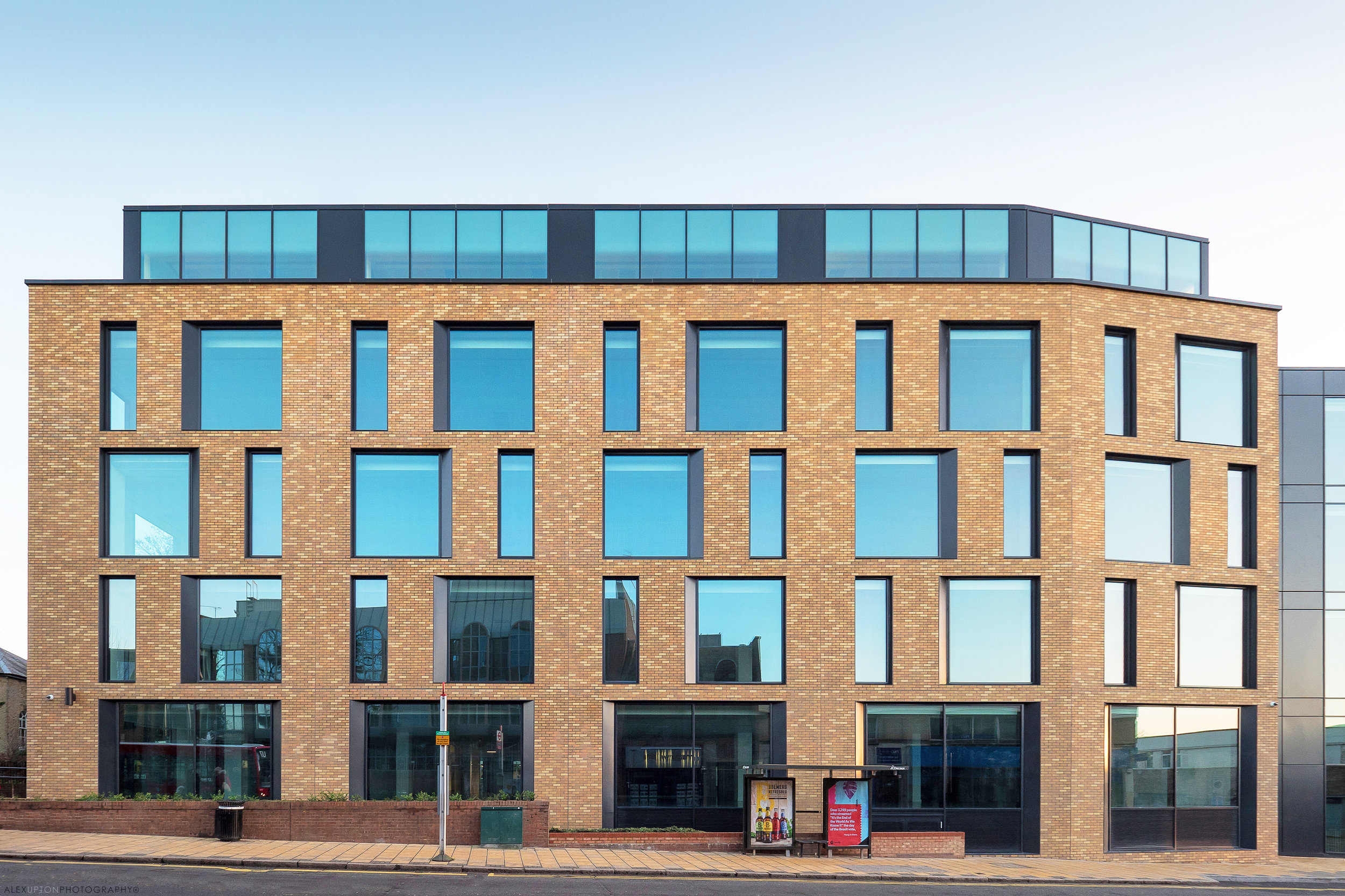
The site on which Belmont House stands was formally home to a 1980's office block, rather than completely demolishing the existing building developers Aviva Investors commissioned London architectural practice TP Bennett to design and undertake an extensive refurbishment of the original structure. Stripping back the building to its concrete frame the architects then set out to modernise the space to cater for contemporary office requirements. At the rear of the building an additional floor was added, taking it to 5-soreys in total providing 145,000 Sq Ft of office space. The Grade A redevelopment cost a total of £30 million.

Belmont House Facade, Uxbridge by TP Bennett -  Copyright © Alex Upton

Belmont House Facade, Uxbridge by TP Bennett -  Copyright © Alex Upton

The buildings facade, which i was commissioned to photograph, utilities Taylor Maxwell's innovative CORIUM cladding system. Where time and site restrictions may prevent the use of traditional masonry the CORIUM panels, which are formed of genuine facing brick, slide into place on a frame attached to the structure. Belmont House is distinctive for its use of irregular-shaped windows which divide the space between these brick panels. Arriving at the site at just the right time, with the sun hanging low in the sky, it generously scattered a beautiful array of colour over the buildings facade.

Belmont House Roof Terrace, Uxbridge by TP Bennett -  Copyright © Alex Upton

Belmont House Roof Terrace, Uxbridge by TP Bennett -  Copyright © Alex Upton

With refurbishments its understandable how an existing structure could lead to restrictions in the creative process, but with Belmont House architects TP Bennett have created a distinctive space which utilises a restrained set of materials to great effect. The building manifests no signs of its former life and makes a great addition to Uxbridge's Town Centre. To see more of my architectural photographs of Belmont House please head to the projects section of my portfolio.  

Archinect UK In Focus Feature by Alex Upton

Alex Upton Architectural Photographer Archinect Interview

Archinect UK Interview with Architectural Photographer Alex Upton

I am proud to announce that kind people at Archinect UK recently interviewed me as part of their ongoing In Focus features; an editorial space where they profile the work of architectural photographers giving exposure to their work and seeing what it is that motivates and inspires them. Please do head over to their wonderful site and read the interview where I talk about why i got into architectural photography, what my favorite aspects of the job are and what informs my practice when photographing buildings. You can also see some selected images of my work and one bonus shot of me in action.

Friday Five: Architecture Up-close by Alex Upton

Ok its no longer Friday! but lets not allow dates to get in the way of a catchy name. Being an architectural photographer living in London there's never a short supply of wonderful buildings to shoot and such abundance has led to several hard-drives worth of images. Rather than adding them directly to my portfolio i'll begin to share some exclusively here adapting a theme where possible. So here's the first five with this weeks theme focusing on up-close geometries in architecture.

5 Broadgate -  Copyright © Alex Upton

5 Broadgate -  Copyright © Alex Upton

5 Broadgate

Located in the City of London, Make Architects' 5 Broadgate building, home to Swiss Bank UBS, is a giant aluminium-clad office building which looks like it has descended from outer-space. The facade features a series of intersecting windows which appear as cuts in its ultra-modern surface. The irregular detailing makes for great close-up compositions. 

10 Upper Bank Street -  Copyright © Alex Upton

10 Upper Bank Street -  Copyright © Alex Upton

10 Upper Bank Street

This KPF Architects (Kohn Pedersen Fox Associates) designed tower in Canary Wharf inconspicuously blends in with the neighboring skyscrapers. What distinguishes it is the numerous white fins that run vertically down its facade 32-storey facade, up-close these can be contrasted with the lower glazed portion of the building as photographed here.

R7 Handyside Facade

R7 Handyside

Injecting some colour into the already diverse, yet harmonious, architectural landscape of King's Cross is Duggan Morris Architects' R7 Handyside building. The building's metal-clad facade is composed of red and pink sections which contrast nicely breaking down the buildings large mass.

One Pancras Square Facade

One Pancras Square

Another building forming part of the King's Cross masterplan is David Chipperfield's One Pancras Square. Its distinctive 396 cast iron columns recall traditional materials and structures and the woven patterns which adorn them are a "reminder of the site’s industrial past and a nod to Gottfried Semper’s theory about the role of weaving in the evolution of man-made structures." Here the structure is contrasted with some of the more traditional brick buildings which surround it.

The Francis Crick Institute Facade

The Francis Crick Institute

Staying in King's Cross here we have HOK Architects' Francis Crick Institute, home to one of Europe’s largest biomedical research centers. The building viewed from above is shaped like a giant X shaped chromosome. Here the fins stretching across the glass portion of the facade create some wonderful patterns when isolated from the rest of the building.
For image sales or prints of any of these photographs please contact me.

Stapleton House by Architecture PLB by Alex Upton

Stapleton House: Photography: Copyright © Alex Upton

Stapleton House: Photography: Copyright © Alex Upton

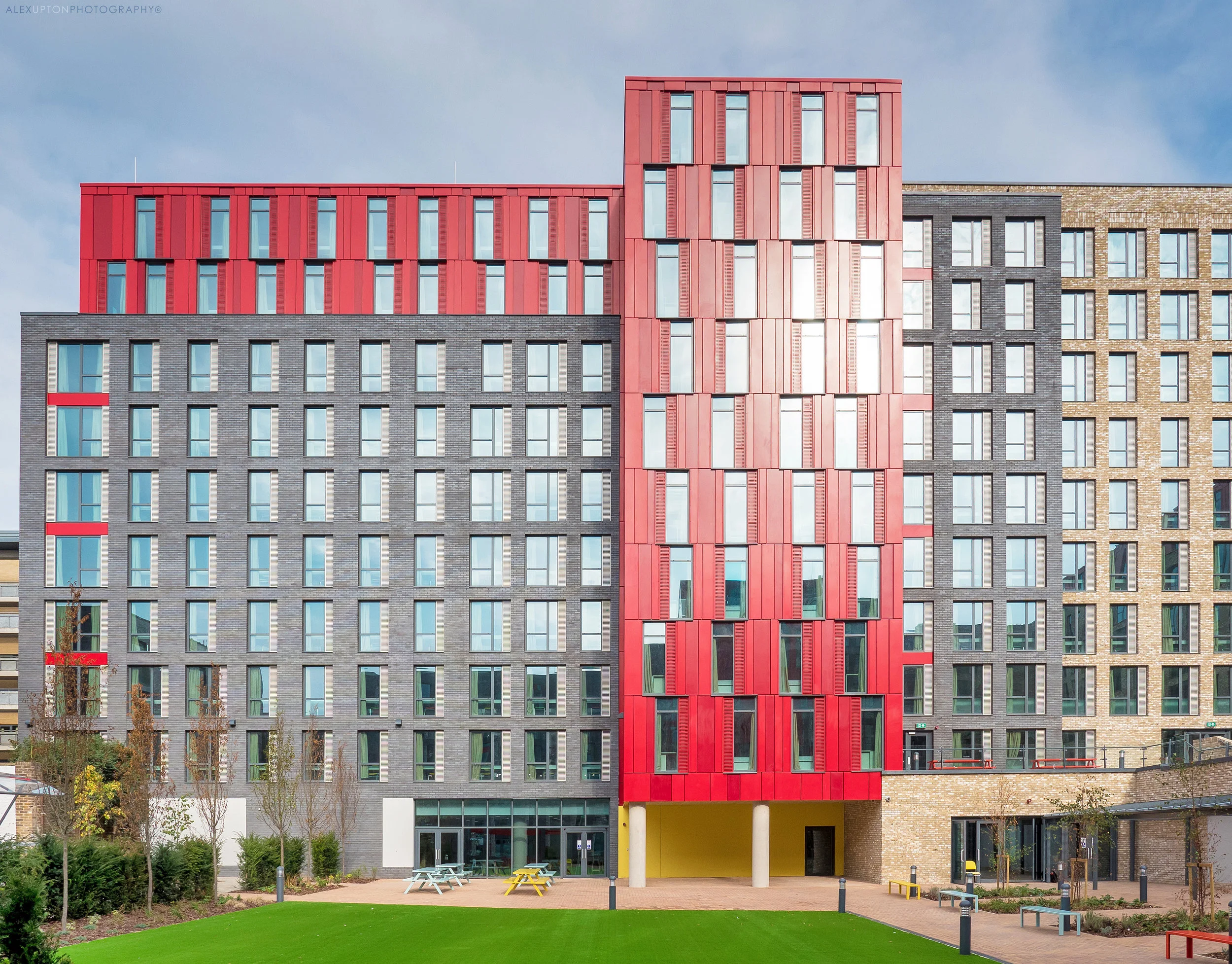
In the closing days of summer 2016, days which possessed a warmth that is now a distant memory, I was commissioned by cladding specialists Taylor Maxwell to photograph Stapleton House, a very large student accommodation building located at a busy junction on Holloway Road, Islington. The building which was designed by Architecture PLB provides 862 bedrooms for students and is strategically located opposite the London Metropolitan University campus so as to mitigate the chances of any excuses made by students for not turning up to lectures on time. The building forms part of The Unite Group’s growing portfolio of London Student housing and like many of these new student living quarters it attempts to embody the diversity and liberal expressions of its youthful inhabitants through its own architectural liberalism, albeit within the constraints of the developers budget.

Stapleton House Facade: Photography: Copyright © Alex Upton

Stapleton House Facade: Photography: Copyright © Alex Upton

As with many student housing projects, including Byrom Point which I previously photographed, the buildings break down their otherwise large overbearing masses through interspersing a variety of forms, materials and colours. With Stapleton House the buildings external road facing elevation is reconfigured on the external courtyard facing elevation; the same materials are utilised but reassembled and given different levels of prominence in relation to each other. These materials include a variety of brick, stone and red metal cladding which combine to create a vibrant and diverse space. This kind of architecture stands in stark contrast with the monolithic student builds of years gone by where students were uniformly housed in oppressive towers of brown and grey.

Stapleton House: Photography: Copyright © Alex Upton

Stapleton House: Photography: Copyright © Alex Upton

Stapleton House is so large and detailed I could have easily spent all day photographing its many facets, it is one of those buildings that through its contrasts and divisions offers the architectural photographer an overwhelming set of possibilities for framing and composition and requires restraint for each image can necessarily be quite different and equally pleasing. This hints at a level of success on part or the architects, developer and material suppliers as it certainly hasn’t created a building that could be in any sense labeled boring, not in the eyes of an architectural photographer anyway.

Stapleton House: Photography: Copyright © Alex Upton

Stapleton House: Photography: Copyright © Alex Upton

As well as being gracious in its abundance of detail the building also imparted a sense of nostalgia on me for my days living in university halls - with time generously clouding those moments of utter despair when at 6:00am I was still awake listening through ears muffled by screwed up tissue paper to the monotonous bass produced by a communal kitchen DJ five floors above. Thankfully through the cherry picking of memories I was instead remind of the more positive experiences that come from communal living such as the exchange of ideas, culture and the making of new friends. It is within these more architecturally considered student living spaces that such interactions can be encouraged and take place. With the boom in student numbers accelerating and the ensuing creation of newer more spacious living spaces it is important that the considerations shown in buildings such as Stapleton House aren’t neglected in the rush to profit from rental fees, fortunately, while most student housing developments won’t come close to winning the RIBA’s sterling prize anytime soon, they are starting to show a creative divergence from their older utilitarian counterparts of the 20th century. To see more architectural photographs from my visit to Stapleton House please head to the projects section of my portfolio.

One Tower Bridge by Squire and Partners by Alex Upton

One Tower Bridge: Photography: Copyright © Alex Upton

One Tower Bridge: Photography: Copyright © Alex Upton

Development: One Tower Bridge
Architect: Squire and Partners
Location: Southwark, London
Developer: Berkeley Homes

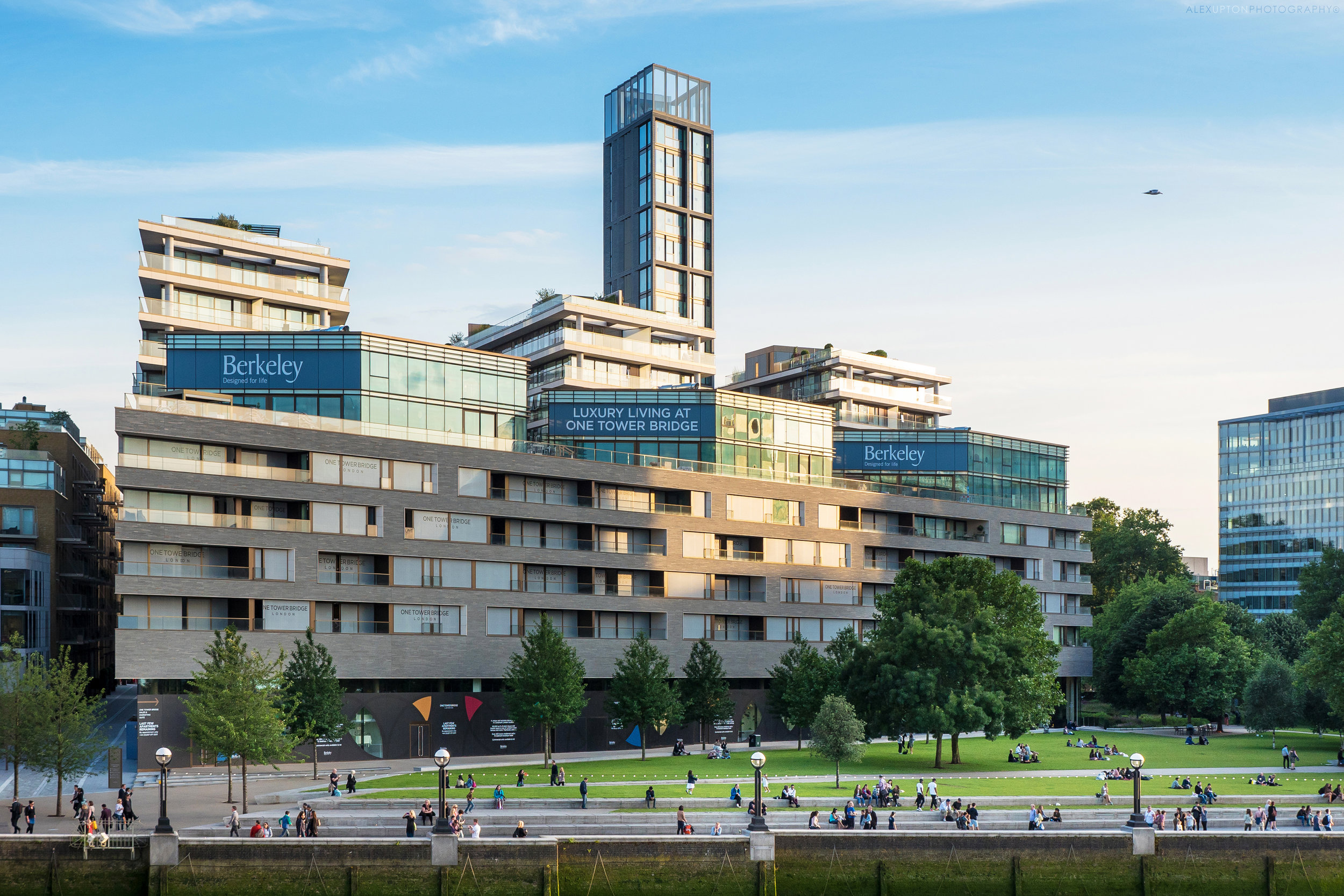
As its title not-so-subtly proclaims One Tower Bridge is a luxury residential development situated in close proximity to the historic landmark and Grade I listed Tower Bridge. As if being in the company of one iconic London landmark wasn't enough to enhance its prestige, the development also finds itself sitting parallel to the Tower of London - located just over the river - and slightly west from Foster & Partners’ City Hall and More London. With such distinguished neighbours it comes as no surprise that the apartments on offer here lean towards the more affluent end of the market.

One Tower Bridge: Photography: Copyright © Alex Upton

One Tower Bridge: Photography: Copyright © Alex Upton

The development which includes 400 apartments, retail and cultural space is formed from nine architecturally varied and independent blocks, each utilising different materials and forms to break up the potential monotony of such a large site. Sat behind the three eleven-story blocks with projecting stone balconies are two buildings clad in a yellow London stock brick, it was these two buildings - Windsor House and Lancaster House - that I was commissioned to photograph on behalf of the brick supplier Taylor Maxwell.

One Tower Bridge: Photography: Copyright © Alex Upton

One Tower Bridge: Photography: Copyright © Alex Upton

This section of the development with its projecting timber balconies and basketweave brickwork references the former warehouses that once lined the riverbank, some surviving examples of which are located not far away along the historic riverside street that is Shad Thames, although these warehouses now also find themselves being utilised as high-end living quarters.

One Tower Bridge: Photography: Copyright © Alex Upton

One Tower Bridge: Photography: Copyright © Alex Upton

Situated between the two buildings is a new pedestrian route named Duchess Walk, which architects Squire and Partners have positioned to maximise views through the site from Tooley Street to Tower Bridge. Walking down this alley you can see the high quality architectural detailing and spruce potted shrubbery which only such a development can afford. If you crane your neck upwards from the framed view of Tower Bridge towards the projecting balconies which cascade off towards the horizon you may be graced with the presence of a lucky occupant looking down upon you from 'The Tower' also known as building number five.

One Tower Bridge: Photography: Copyright © Alex Upton

One Tower Bridge: Photography: Copyright © Alex Upton

This section of the development which rises above all the others is a thin, multistory, mini-edifice which from a distance has the appearance of a fire station drill tower. Fortunately on closer inspection its appearance is much more dignified if not looking somewhat incompatible with the rest of the design. The peak of the tower appears to contain a miniature sky garden and viewing platform which must accommodate great views in all directions.

One Tower Bridge: Photography: Copyright © Alex Upton

One Tower Bridge: Photography: Copyright © Alex Upton

Squire and Partners’ scheme was not the first proposal for the site, the first being outlined a number of years before by Ian Ritchie Architects, which would have seen a cluster of small Dalek-like residential towers – more in keeping with City Hall, but not Tower Bridge – lining the riverbank. Although initially approved it later met resistance from the London Borough of Southwark and the scheme was eventually terminated. This highlights the difficulties for an architect in addressing such a location, context is paramount and if the building tries to outdo its neighbour – a structure which was also seen as contentious and outlandish upon its conception – then it is inevitably going to be open to heightened criticism, objection and the inevitable refusal. This seems to leave only one option open to both developer and architect; create something which is high quality yet indiscreet, something that contextualises itself within the locations past at the expense of its present. Such token gestures can at times be restrictive and stifle innovation and creativity producing an architecture which is subservient to its surroundings, but such restrictions can also offer a framework to channel new ideas and make sure a project doesn’t submit to the developer’s predisposition to maximise profit and the expense of good architecture. One Tower Bridge seems to settle somewhere in the middle of this predicament, it is undoubtedly of a high quality, with careful attention to detail and utilises materials and elements which reference the sites history, although as a whole, while not even slightly unpleasant it seems somewhat restrained and muted from being what it wants to be. To see more of my architectural photographs of One Tower Bridge please head over to the projects section of my portfolio.